Key Takeaways
- Magenta stands out as a strong hue that blends red’s passion with purple’s depth.
- It can convey creativity, dynamism, and optimism in many design or branding projects.
- Across various cultures, magenta holds different connotations, reminding us that context matters.
- Balancing magenta with other colors can highlight its energy without overwhelming.
- Designers, marketers, and artists often turn to magenta for bold, impactful statements.
Why does magenta capture our attention so easily? Some see it as a wild burst of red and violet, while others treat it as a color with its own meaning and character. Magenta is not shy. It beams with a certain spark that pulls us in. Many see it as an emblem of boldness, warmth, or even transformation. Its unusual presence in the color spectrum makes it a prime candidate for deep discussion.
This article dives into the Color Meanings, Color Symbolism, and Color Psychology of magenta in a practical way. It explores how magenta interacts with emotions and design choices. The goal is to deliver an easy-to-digest, yet thorough look at magenta’s charm. Let’s explore how this vibrant hue might speak to you or your audience, and why it matters in art, marketing, branding, and interior design.
The Symbolism and Personality Traits of Magenta
Magenta can feel electric, imaginative, and full of zest. It often merges red’s fiery side with purple’s mysterious undertones. Its personality traits might include optimism, curiosity, and a certain sense of fun. Some might interpret it as reliable or elegant. Others see it as warm, sincere, or even wise. Let’s break down a few core aspects.
Passion Meets Depth
Magenta often reflects warm energy along with a hint of the unknown.
- Red contributes passion, drive, and ambition.
- Violet adds depth and wisdom.
- The blend can feel both exciting and thoughtful.
Does this color project trust? Some believe it can. Others find its energy a bit playful. In designs that need creative spark, magenta shines.
Vibrancy and Resilience
Because magenta sits between red and purple, it may symbolize resilience and flexibility.
- Strong enough to stand on its own.
- Versatile enough to shift moods with subtle tweaks in shade.
Is it a daring choice? Yes, and that boldness often expresses grit. People who connect with magenta might love fresh ideas, unstoppable spirit, or the promise of growth.
Elegance with a Twist
For some, magenta suggests elegance without being too formal.
- A dash of sophistication meets an upbeat vibe.
- It can blend well in refined themes while still sparking excitement.
Does it carry the same weight as black or navy? Not quite, yet it keeps a classy edge that appeals to those who crave style with flair.
Cultural Color Meanings of Magenta
Cultures throughout history have varied interpretations for magenta. While it doesn’t always appear in old texts the same way red or blue might, some traditions do give it unique significance. Cultural context can shift how people view magenta, from celebration to reflection.
Eastern Influences
In some Eastern cultures, bright purples and pinkish-violet hues might stand for ceremony or spiritual development.
- Magenta can represent personal growth or transformation.
- It might appear in festivals or decorative elements.
Is it universally linked to good luck? Not always, but it can reflect a positive, transforming power. That can make magenta a color of anticipation and renewal in certain traditions.
Western Symbolism
In many Western cultures, magenta appears in modern clothing, fashion trends, and marketing campaigns.
- Often associated with creativity and self-expression.
- Might be seen as edgy, rebellious, or forward-thinking.
Could it clash with conservative tastes? Sometimes. Yet its bold charm can appeal to people seeking something fresh and eye-catching.
Global Nuances
Some regions use magenta for celebrations. Others see it as too loud for sacred events.
- Religious contexts might treat it like a royal color.
- Pop culture might view it as rebellious or alternative.
These differences remind us to consider context when choosing magenta for branding or design. Sometimes it works wonders in a universal sense. Other times, it needs cultural insight.
Emotional Impact of Magenta
The Emotional Impact of Color can guide behaviors, moods, and subtle cues. Magenta’s effect on feelings often involves energy, imagination, and an awareness of personal power. Let’s explore how it might sway emotions.
Stimulating Yet Comforting
Magenta has red’s zeal but also has a softer edge thanks to its purple side.
- Can spark enthusiasm without excessive aggression.
- Helps some people feel comforted, like a gentle push forward.
Does it raise alertness? Possibly, but it’s friendlier than straight red. It can be a good choice for designs that want both excitement and warmth.
Bold Expression
Because magenta can dazzle the eye, it might nudge people to express themselves more openly.
- Encourages open-minded thinking.
- Adds flair to creative tasks.
Magenta can open a door to new experiences. When used in marketing or branding, it can push viewers to step outside normal boundaries. That leads to memorable brand experiences.
Gentle Encouragement
There’s a subtle kindness in magenta that invites connection.
- It can evoke small acts of empathy.
- It may inspire generosity or altruism.
Though these connections aren’t universal, many people sense a soft heart behind magenta’s bold appearance. That mix of softness and confidence feels uncommon.
Color Theory and Magenta’s Place
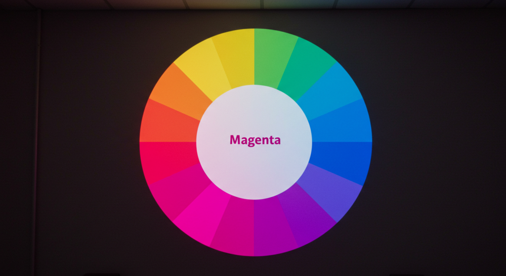
Color Theory helps us understand how magenta fits into the broader spectrum. Though magenta is sometimes called a secondary color in print or a tertiary color in other models, it still stands out. Its unusual nature stems from the way humans perceive color.
Between Red and Violet
In additive color mixing (RGB models):
- Red + Blue = Magenta.
- It’s a key color channel in CMYK printing as well.
Does it truly exist in a spectrum like green or orange? Not exactly. Magenta is a blend our eyes interpret. This makes it feel almost otherworldly or synthetic to some.
Complementary and Contrast
Opposite magenta on many color wheels, you’ll find greens or yellow-greens.
- Contrasting magenta with green can create a lively palette.
- Pairing magenta with lime or chartreuse can bring out each color’s vibrancy.
Is it best to go complementary all the time? That depends on the mood you want. High contrast grabs attention. Softer tones might feel more soothing.
Magenta in Different Color Models
Every color model treats magenta a bit differently:
- CMYK: Magenta is one of the four primary inks.
- RGB: Magenta is made by mixing red and blue at full intensity.
- HSL: Hue, saturation, and lightness can shift magenta’s shade from dark fuchsia to bright pinkish-purple.
This variety means magenta remains flexible for many designs.
Visual Identity Through Magenta

Color Identity plays a huge role in how brands and individuals present themselves. Magenta can create a lasting impression. Let’s see how it shapes a visual identity.
Standing Out in a Crowded Field
Because magenta is bold:
- It helps logos jump off a page or screen.
- It might represent a forward-thinking or energetic brand.
Does it feel safe for every audience? Not always. But if a brand wants to break from the norm, magenta can help it stand apart.
Evoking Emotion and Curiosity
Brands that use magenta often want an emotional response.
- It can spark excitement or draw attention to new products.
- It might hint at openness or a sense of wonder.
This is helpful for startups or ventures hoping to be seen as creative or adventurous. Magenta might attract an audience that values fresh ideas.
Balancing Brand Personality
Some companies pair magenta with neutral shades like gray or black.
- The neutral ground keeps magenta’s pop from overwhelming.
- The brand feels balanced but still dynamic.
In brand identity, magenta’s small splash can convey just enough flair without stealing the spotlight. That controlled approach can foster a sense of trust.
Magenta in Design

When considering Design Color Meanings, magenta can become a key piece of a color palette. In interior decorating, websites, or printed materials, this hue brings a lively spark.
Interior Design Color Meanings
Magenta walls or accents can turn a dull space into a cozy, upbeat spot.
- A magenta throw pillow can energize a neutral couch.
- Adding magenta curtains might brighten an otherwise drab room.
Do large amounts of magenta overwhelm? Sometimes. Careful placement is key. Rooms with too much magenta might feel chaotic. Paired with whites or creams, a magenta accent can feel fresh.
Web and App Interfaces
In digital design, a magenta button or highlight:
- Draws immediate attention for calls to action.
- Adds a sense of modern flair.
Is it always the best choice for large backgrounds? Not always, but it can be effective if used sparingly. A site that wants a bold identity might embrace it more fully. Contrast remains vital for readability.
Print and Packaging
Magenta shines in print because it’s one of the primary inks in CMYK.
- It can provide crisp, vibrant details on packaging or brochures.
- Paired with black text, magenta accent lines can guide the reader’s eye.
People often remember packaging that stands out. Magenta’s strong presence can lock a product into a buyer’s mind.
Magenta in Marketing
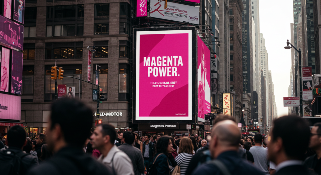
Color Marketing often hinges on how viewers react to certain hues. Magenta’s bold nature can give campaigns an instant flair. It might also carry deeper feelings of originality or energy.
Drawing Attention to Key Messages
Marketing materials often use accent colors to highlight calls to action.
- Magenta can make special offers more visible.
- It may signal urgency or a fun vibe.
Is it overused if done in every banner? Possibly. The trick is to mix it with balanced tones. When used with intention, magenta can reel in viewers fast.
Emotional Branding Tactics
Emotions play a big part in buying decisions.
- Magenta can tap into excitement, playful wonder, or a thirst for adventure.
- This might help brands connect with open-minded audiences.
Is it universal? No color is. Some viewers might find magenta off-putting if they prefer subdued tones. But it has a strong appeal among those who crave bold statements.
Cross-Platform Consistency
When a company adopts magenta for marketing:
- It needs to match in digital ads, print materials, and store layouts.
- Consistency cements brand identity.
A scattered use of many colors could weaken the brand’s message. Magenta can unify campaigns if used as a central theme.
Magenta in Branding

Color Branding relies on distinctive shades that people will link to certain companies or services. A brand that wants to convey vibrancy and innovation can benefit from magenta’s strong visual cue.
Memorable Brand Recognition
A signature color can turn a forgettable brand into one that stands out.
- Magenta can set a brand apart from typical blues or reds.
- People may recall the brand’s visuals after just one glance.
Does it work for formal brands? Some prefer calmer palettes, but bold brands might find magenta perfect.
Niche Markets and Bold Statements
Magenta branding can resonate with niche groups:
- Creative industries and tech startups sometimes embrace it.
- Lifestyle brands that lean on edgy or imaginative aesthetics find it appealing.
This color approach can filter out those who want a more conservative look. That isn’t always bad. It helps the brand focus on the right audience.
Building Trust Through Confidence
Magenta exudes confidence, which can earn trust with certain demographics.
- Younger consumers might appreciate the brand’s boldness.
- Some see magenta as inclusive and welcoming to fresh ideas.
While trust can’t hinge on color alone, a well-chosen palette can reinforce a brand’s values and style.
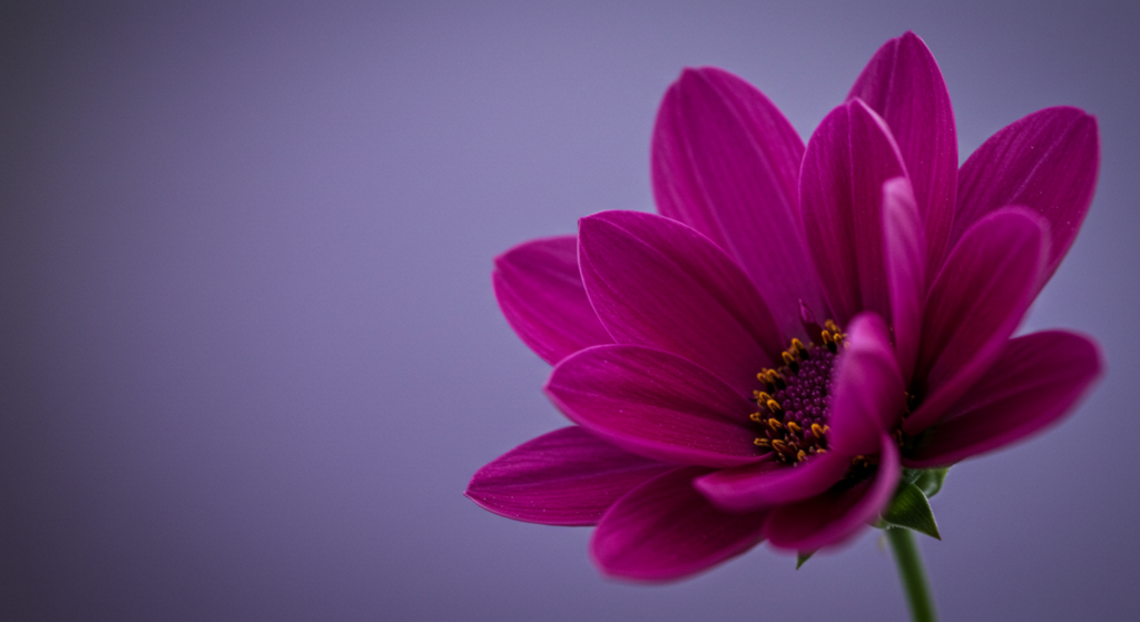
Magenta in Art
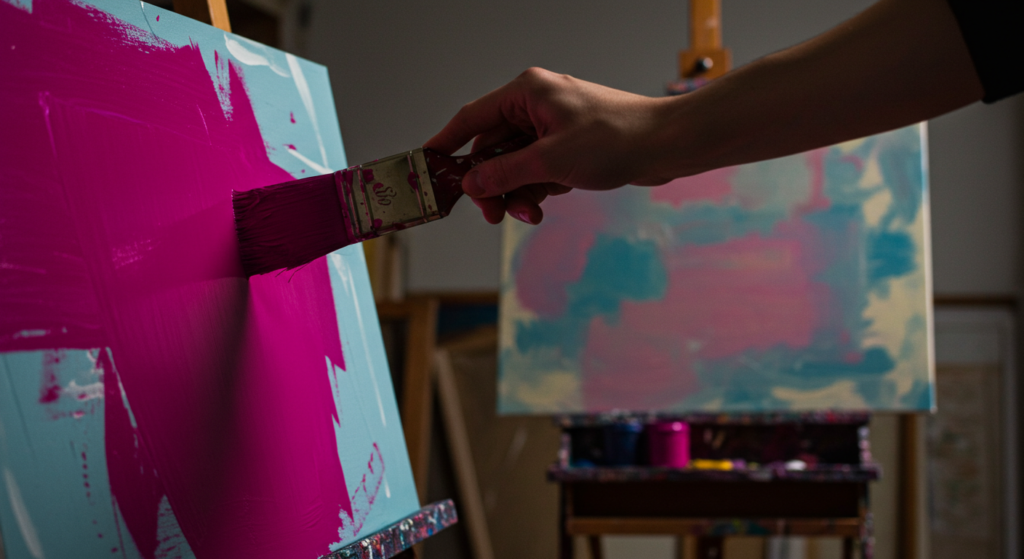
Artists and creatives often explore Colors in Art to evoke moods or express ideas. Magenta’s capacity to merge red’s energy and purple’s mystery opens many doors in artistic expression.
Symbolic Colors in Paintings
Some painters use magenta as a focal point in abstract or expressionist works.
- It can symbolize deep emotion or personal introspection.
- It might reflect a cosmic or dreamy landscape.
In realistic paintings, magenta sometimes appears in twilight skies or floral subjects. This color can create surprising emotional depth.
Color Narratives and Storytelling
In Color Storytelling, magenta can stand for hidden layers or awakened potential.
- It might serve as a hint of change or a spark of creation.
- It can direct the viewer’s eye to key elements in the artwork.
Artists aiming for strong statements use magenta to guide narrative flow. It can unify pieces or highlight dramatic tension.
Modern Installations
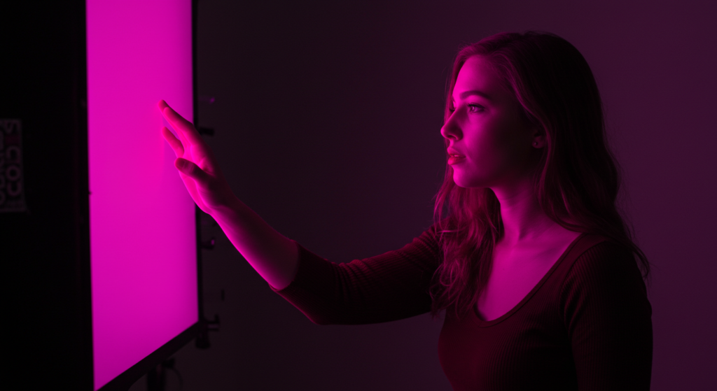
Many modern art installations and digital displays feature magenta lighting.
- Interactive exhibits can use magenta lights to shape atmosphere.
- It might convey a futuristic or otherworldly vibe.
Attendees often mention how magenta sets a mood of curiosity and wonder. It’s a bold color that invites reflection on modern life.
Color Psychology Research on Magenta
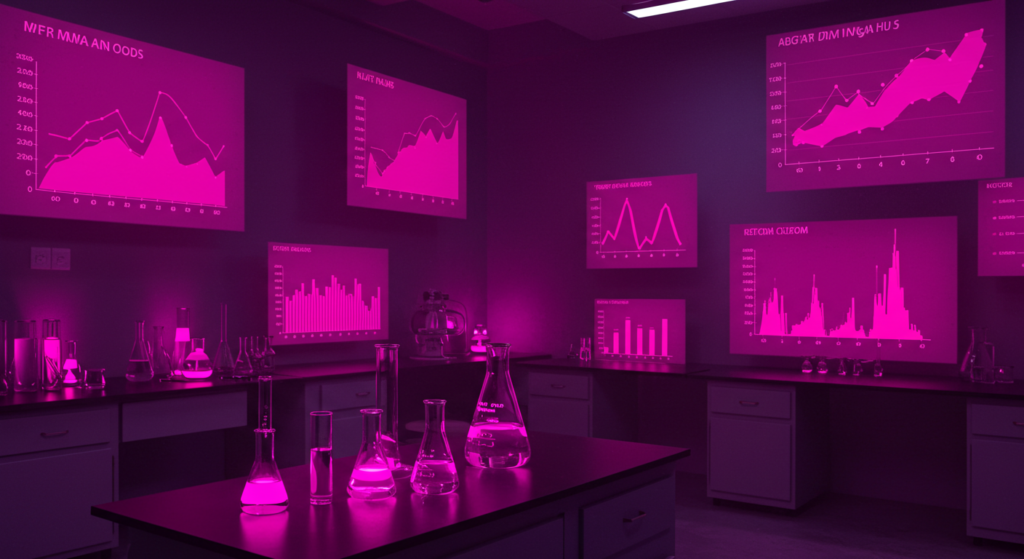
Though color research varies, many Scientific Studies on Color show that bright hues can affect moods and behaviors. Magenta often pops up in labs or marketing test groups for its striking presence.
Observed Emotional Responses
A handful of studies point to heightened alertness or interest when people see magenta.
- Participants might describe feelings of liveliness or mild excitement.
- A smaller group may find it too intense.
Researchers suggest that personal experience and cultural background affect these reactions. There’s no single universal outcome.
Psychological Effects of Color
Some color psychology models link magenta to:
- A balance between logic and emotion.
- A push toward self-expression and creative thinking.
Yet no psychological effect is guaranteed. People’s personalities differ. Still, the data suggests magenta often lights up some emotional pathways tied to curiosity and warmth.
Influence on Choices
Magenta’s presence in branding or store design can sway purchasing decisions.
- People may feel an impulsive urge to examine products labeled in magenta.
- Some may skip over it if they dislike bold tones.
Marketers often test how color influences buyer behavior. Magenta can boost brand recall or drive interest, but results depend on context and audience.
Interpreting Magenta in Different Contexts
Color Interpretation changes with setting. A flashy magenta outfit at a social event might feel fun, whereas a magenta business card at a formal meeting might send another signal.
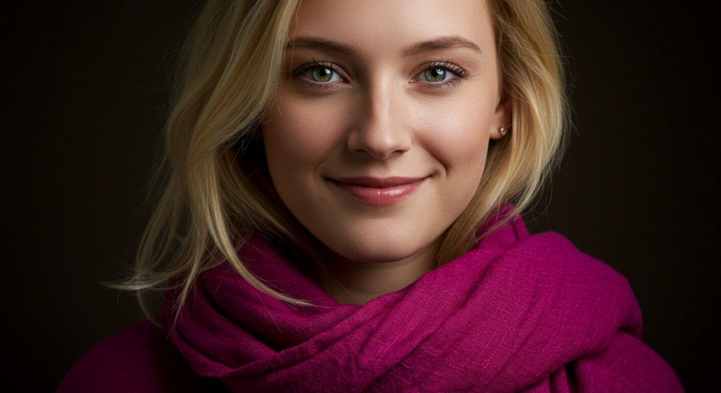
Fashion and Personal Style
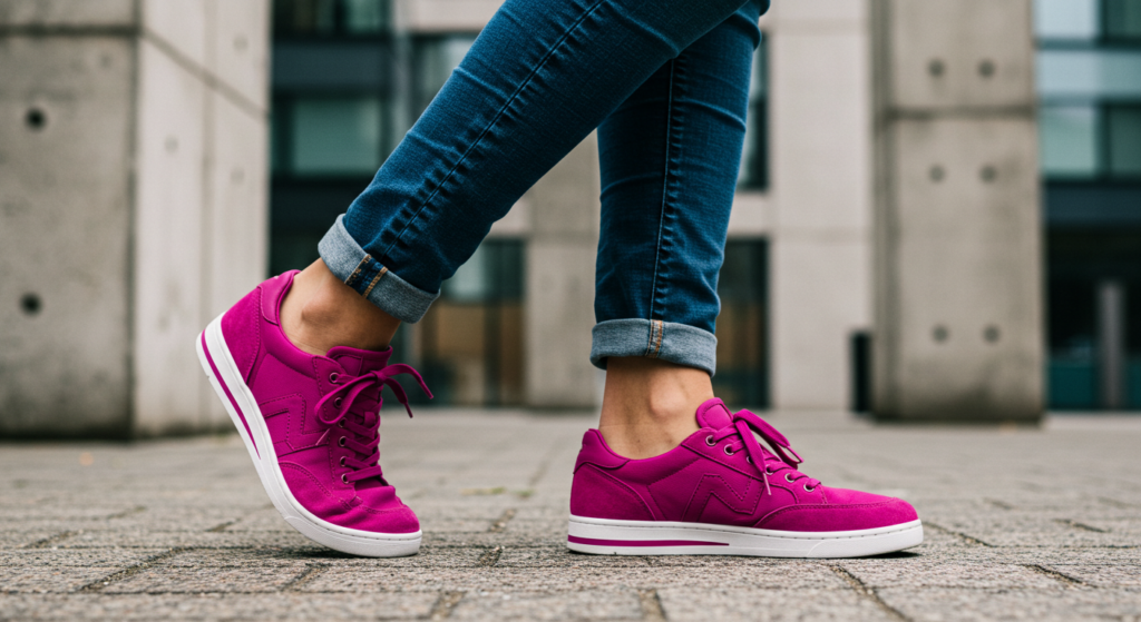
Magenta clothing can radiate confidence.
- People who want to stand out might choose a magenta scarf or shirt.
- In accessories, magenta can bring a pop of color without dominating.
Does it fit every wardrobe? Taste varies. Some find it too bold. But for those who want an eye-catching signature, it’s compelling.
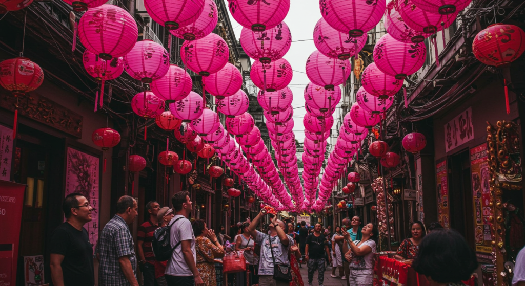
Social Gatherings and Events
Event planners often use magenta lighting or decorations for lively parties.
- Weddings may include magenta in floral arrangements.
- Birthday celebrations might use magenta balloons or banners.
It can set a cheerful, uplifting tone. However, some formal gatherings might prefer subdued color schemes.
Corporate Environments
Businesses that embrace creativity might allow magenta in branding elements, staff attire, or office decor.
- Ad agencies or design firms can place magenta art on walls.
- More traditional offices could limit it to small accents.
In professional spaces, color choice shapes the work atmosphere. Magenta can spark new ideas if used with care.
Magenta as Part of a Color Palette
Color Palette Meanings matter because each color in a set contributes to the overall feeling. When magenta joins a palette, it can play the starring role or a side character.
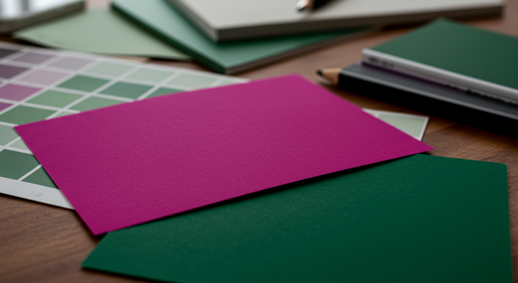
Pairing with Neutrals
Gray, beige, or white can highlight magenta’s intensity.
- A dash of magenta on a neutral background draws the eye.
- More advanced palettes mix magenta with charcoal or cream for a refined finish.
Neutrals keep things balanced. They prevent visual overload and maintain a neat look.
Warm Color Symbolism
Combining magenta with other warm hues:
- Red, orange, or yellow can create an energetic palette.
- This might suit festival posters, upbeat campaigns, or creative advertisements.
Does it risk clashing? Possibly, so picking the right tints and shades is crucial. The aim is a cohesive warmth, not a chaotic clash.
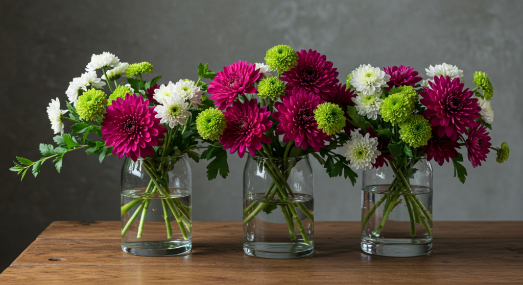
Cool Color Symbolism
Sometimes, magenta pairs well with blues or greens.
- A jewel-toned palette including teal and magenta can feel lush.
- Light turquoise or mint can soothe magenta’s energy.
This mix often works in designs that need a modern but balanced vibe.
Balancing Magenta with Other Hues
The secret to using magenta effectively lies in balancing it with complementary or contrasting shades. Let’s check some strategies that keep the visual experience harmonious.
Gentle Contrasts
Soft greens or muted blues:
- Provide gentle contrast that soothes the eye.
- Prevent color fatigue in designs or living spaces.
This approach might suit those who admire magenta but want a calmer effect. It highlights magenta’s brightness without causing strain.
Monochromatic Variations
Magenta’s family includes lighter pinks and darker maroons.
- A monochromatic spread can look cohesive and artsy.
- Add texture differences if using it in interior design.
This style can still feel strong, so consider a small dose of neutral or metallic for balance. An entire room draped in magenta and pink might feel loud, yet some love that dramatic flair.
Accent Highlights
Some prefer magenta purely as an accent:
- A thin magenta line in a logo or on a website header.
- Magenta highlights on a painting or sculpture.
These subtle touches give a pop of color without taking over. This approach works in formal settings or minimalistic designs that need a spark.
Modern Color Trends Involving Magenta
Color Trends come and go, but magenta resurfaces time and again. Lately, many creative industries have recognized its power to spice up design. Let’s glimpse how magenta appears in today’s projects.
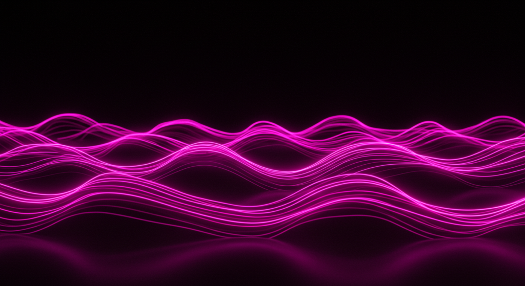
Digital Art and Animation
Magenta is popular in futuristic or neon aesthetics:
- It pairs well with other bright colors like cyan or lime green.
- It fits right into glowing, high-energy scenes.
Game developers or web designers might use it to create illusions of depth or give user interfaces a neon flair.
Fashion Runways
In fashion shows, magenta often catches the spotlight.
- Designers experiment with magenta gowns, jackets, or shoes.
- It can break the monotony of standard black or white collections.
This trend supports the idea that magenta serves as a statement piece. Wearers can stand out without screaming for attention.
Innovative Interiors
Home decorators and architects sometimes accent modern rooms with a magenta wall or furnishing.
- It might become a conversation piece in an open-concept layout.
- Smaller items like vases or throw rugs can work if a full wall is too much.
The idea is to embrace color in a creative way. Magenta suggests a space that encourages forward-looking ideas.
Conclusion
Magenta stands out among the Universal Color Meanings as a blend of vigor, reflection, and warmth. It fuses red’s energy and purple’s mysterious allure, forming a hue that sparks curiosity and boldness. Whether it’s used in branding, art, marketing, or interior design, magenta has the power to command attention and stir emotions.
By understanding its Emotional Color Meanings, Color Associations, and symbolic traits, anyone can use magenta to support a clear vision. It can bring playfulness or sophistication, depending on context. It can pair with complementary tones or serve as a solo showstopper. Through balanced application, magenta can convey a sense of identity that appeals to individuals looking for something both spirited and deep.
If you’re searching for a way to breathe life into a design or brand, magenta might be the spark you need. It carries a layered message that merges fantasy with realism, ultimately inviting onlookers to explore new possibilities.
Summary Table

| Aspect | Key Point |
|---|---|
| Symbolism & Traits | Merges red’s passion with purple’s depth. Often conveys creativity. |
| Cultural Color Meanings | Varies by region. Some link it to celebration or change. |
| Emotional Impact | Can spark excitement with a gentle undercurrent of warmth. |
| Color Theory | Formed by mixing red & blue light in additive models. |
| Visual Identity | A bold hue that helps brands stand out in crowded spaces. |
| Design | Works as an accent color or main tone in interiors and digital layouts. |
| Marketing | Draws attention to key messages or campaigns. |
| Branding | Often used by creative or edgy brands to show confidence. |
| Art | Adds emotional depth in paintings, installations, or digital media. |
| Research | Some studies suggest it sparks lively reactions in viewers. |
| Different Contexts | Fashion, events, or workplaces can harness its energy in varied ways. |
| Color Palette | Balances well with neutrals, complementary greens, or matching tones. |
| Balancing with Others | Pair magenta carefully to avoid visual strain or chaos. |
| Modern Trends | Seen in digital art, fashion runways, and innovative interiors. |
FAQ

1. Is magenta a natural color or man-made?
Magenta doesn’t appear in the visible light spectrum like green or orange. It’s a blend of red and violet that our eyes perceive as its own color. While it can appear in natural settings, the hue is usually recognized by our perception of mixed wavelengths.
2. What emotional response can magenta create in a design?
Many people feel an upbeat or energizing vibe from magenta. It can spark curiosity and prompt creative thought. Some might find it too strong if overused, so it’s best to balance magenta with calmer tones.
3. Can magenta be used for a formal brand?
Yes, but it depends on brand identity. If the brand wants a progressive or unique edge, magenta can work. For more traditional businesses, a subtle magenta accent might add a refreshing touch without breaking formality.
4. How do I pair magenta with other colors in my home?
Try neutrals like beige, gray, or white to let magenta accents pop. For a striking palette, pair it with lime or turquoise. Test small doses first, such as a magenta rug or vase, to see if the overall ambiance fits your preference.
5. Are there specific cultures that use magenta for special ceremonies?
Some cultures associate magenta or similar purple hues with rituals or celebrations. Others reserve bright tones for joyous events. It’s wise to research a region’s color customs before choosing magenta for a significant occasion.
6. Does magenta work better in print or digital formats?
Magenta appears well in both. In CMYK printing, it’s a primary ink that delivers vivid results. Digitally, magenta stands out on screens and can boost visual interest when applied in moderation.
7. Is magenta the same as hot pink or fuchsia?
They are similar but can differ slightly in hue and shade. Magenta often leans more purple, while hot pink tilts more toward a bright pink tone. Fuchsia can sit very close to magenta but might be a touch darker or more violet.
8. What kind of brand personality fits magenta?
Brands that value creativity, fun, and bold statements may benefit most. Magenta can hint at free-thinking and innovation. It can also reflect a sense of approachability, especially when paired with softer colors.

Neha Z. is not just any writer; she’s a storyteller who has graced the online world with her evocative prose for over half a decade. Venturing into the intricate nuances of women’s lives, she weaves stories that range from life’s highs and lows to the multifaceted essence of femininity. Each piece she pens radiates sincerity and artistry. As you delve into Neha’s musings, you’ll find reflections that echo your own journey and insights that inspire. Immerse yourself in her world, and let her stories touch your heart.
Reviewed By: Joanna Perez and Anna West
Edited By: Lenny Terra
Fact Checked By: Matthew Mansour
Photos Taken or Curated By: Matthew Mansour
