Key Takeaways
- A well-chosen accent color gives your decor a punch without overpowering the room.
- You can introduce accent shades through pillows, drapes, rugs, or even furniture.
- Mixing a bright accent with a neutral base helps balance boldness and calm.
- Contrasting colors can shape how big or cozy a space feels.
- Sample small paint swatches first. Observe them in both daylight and nighttime.
- Rotate accents by season to keep your decor fresh and fun.
- Cohesion makes any room look more polished. Try to tie accent pieces with a repeated color.
Have you ever stared at your living room and thought, “It feels kinda flat?” I once made that mistake by painting every wall the same sandy color and ignoring accent possibilities. The space felt so bland that I’d dose off anytime I walked in.
I eventually realized accent colors add harmony plus spark. Then I added a few bold pillows, a rug with a surprising shade, and a matching vase. My living room turned from dull to dynamic overnight. You might want that transformation too, right?
Accent colors can do wonders for your home design. They boost visual appeal, steer attention to focal pieces, and unify a room’s overall style.
Think about it this way: your main color sets the scene, but your accent hue brings the show to life. In these pages, we’ll explore 14 valuable sections on finding, placing, and loving accent colors in a variety of interior design styles. We’ll go step by step, so you can pick and choose ideas that fit your vibe.
Whether you crave an energetic splash or a subtle elegance, accent colors let you express your personal taste in ways big or small. Let’s see how you can experiment with vibrant or quiet details, so your home feels uniquely yours. No special design degree needed. If you keep reading, you’ll find tips, product ideas, and strategies to combine shades like a pro. Let’s jump in!
The Role of Accent Colors
Understanding Accents and Why They Matter
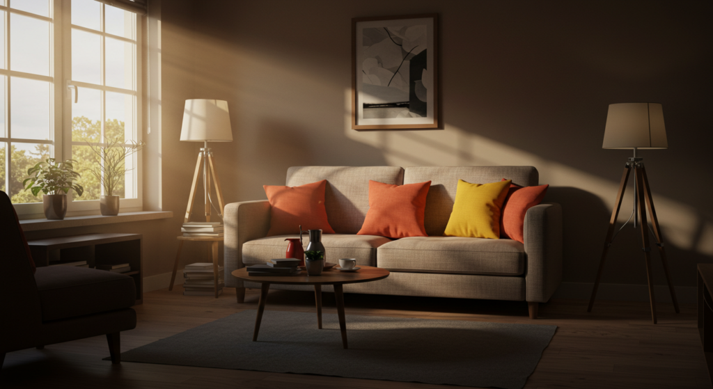
Accent colors work as exclamation points in a room. You have your backdrop—often a neutral or muted tone—that sets the main atmosphere. Then your accent pieces step in to spark contrast. Picture a gray couch with bright turquoise cushions or a calm off-white wall with emerald photo frames. This interplay gets your eyes dancing around the space. It’s kinda magical how a single bright color can highlight the subtle ones around it.
Got a minimalistic living room? Throw in a mustard ottoman or a single piece of art with orange tones. The accent stands out without overshadowing the entire vibe. By choosing a hue that’s distinct from your base color, you gain dimension. You also emphasize key areas, like a reading nook or a fireplace mantel. Many folks use accent colors to guide a guest’s focus. It’s a neat trick.
Setting a Focal Point
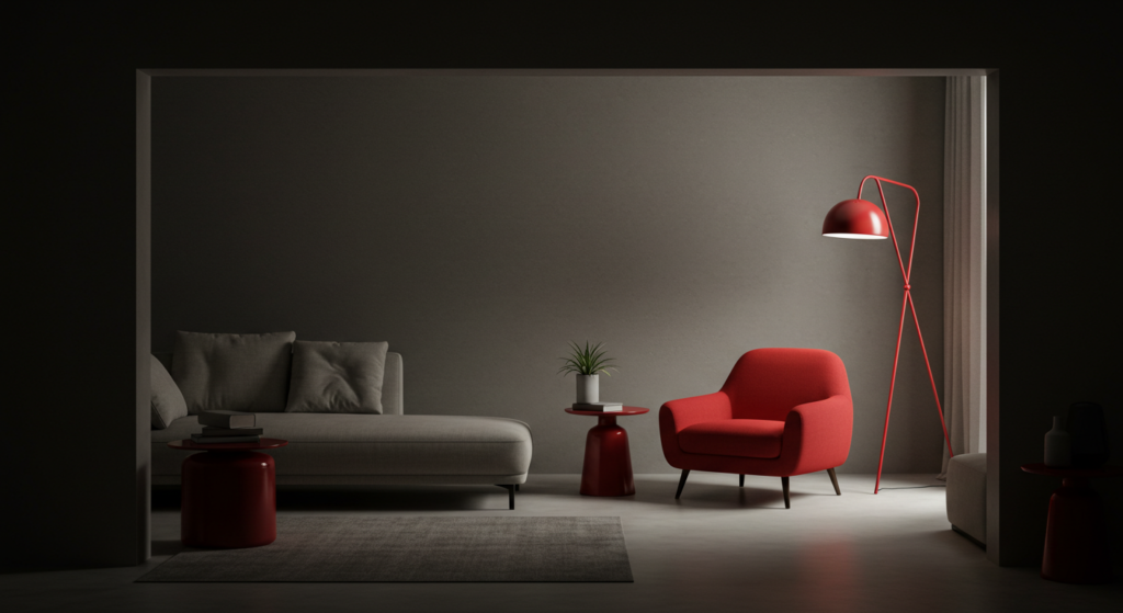
Why bother setting a focal point anyway? Simple: it helps your room avoid that weirdly scattered look. A focal point is the item that draws immediate attention. You can achieve it with a bold accent. For instance, a red lounge chair in a mostly pale living area. That single pop of color says, “Hey, look here first.”
Of course, color alone won’t do all the work. Place your focal accent in a spot that feels natural when you enter the room. Maybe near a large window or next to a cozy lamp. It organizes the space visually and, ironically, can make the rest of the colors feel more united. If you overdo accent placements, your eye gets confused. If you focus on one or two strong accent objects, the entire design feels more cohesive.
Balancing Main Tones and Accents
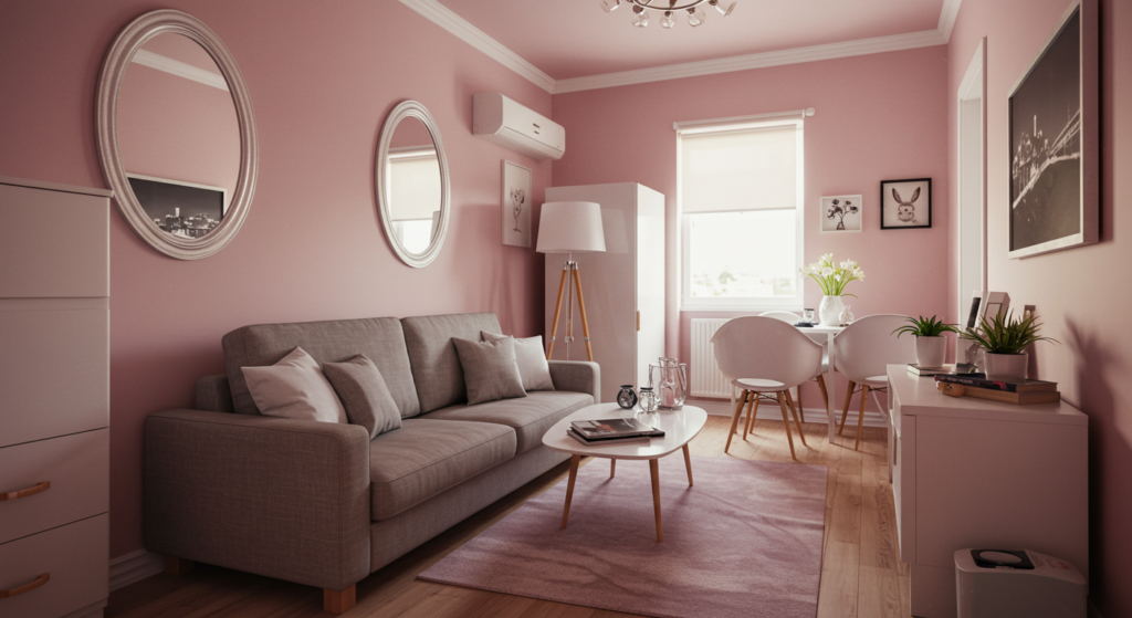
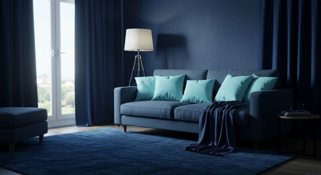
Balance is key. Too many bright accents create a chaotic environment. Too few can leave your space feeling cold. Start small: pick one main accent color that complements your base tone. This might be your favorite color or something that pairs nicely with what you already have. If your walls are off-white, consider navy or teal. If your backdrop is a smooth beige, consider forest green.
Try a 70/20/10 rule. 70 percent of your room in a primary tone, 20 percent in a secondary tone, and 10 percent for your accent. This splits your color usage. You’ll see your accent pop without hogging the stage. If 10 percent seems too low, you can push it to 15 or 20, but watch out for any sense of overload.
Picking the Right Accent Shades

Start with Neutral Bases
Using a neutral base opens up freedom for bolder accent shades. Whites, grays, tans, and creams set a serene atmosphere that can easily adapt to accent updates. Need a splash of color in the spring? Swap out throw blankets or small decor items. Want a moody vibe in the fall? Introduce deeper colored drapes. A neutral base acts like a blank canvas that suits multiple accent choices.
Does neutral sound too dull? You can vary textures to keep interest high. Throw in a fluffy rug, a woven basket, or a hammered metal lamp. Then top it all off with a lively accent color. When done right, these neutrals become your best friend because they match many accent combos without looking forced.
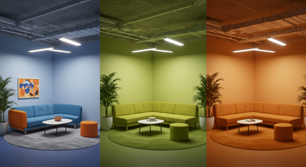
Evaluate Lighting
Natural and artificial lighting can change how a color reads. A bright yellow sofa might look sunshine-perfect in daylight but turn brassy under warm bulbs at night. If you’re not sure how an accent will look, grab a sample or test patch. Look at it in different lights before committing. That approach lowers regrets and re-painting costs.
Also consider your window direction. Rooms facing north might make blues or greens appear a bit muted, while a south-facing space might intensify warmer tones like orange. If you have limited windows, consider how lamps or overhead lights affect your accent color. Sometimes, a softer lamp can create a cozier impression of your accent piece.
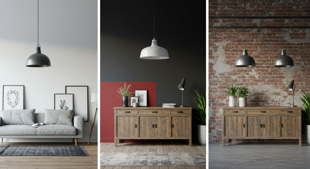
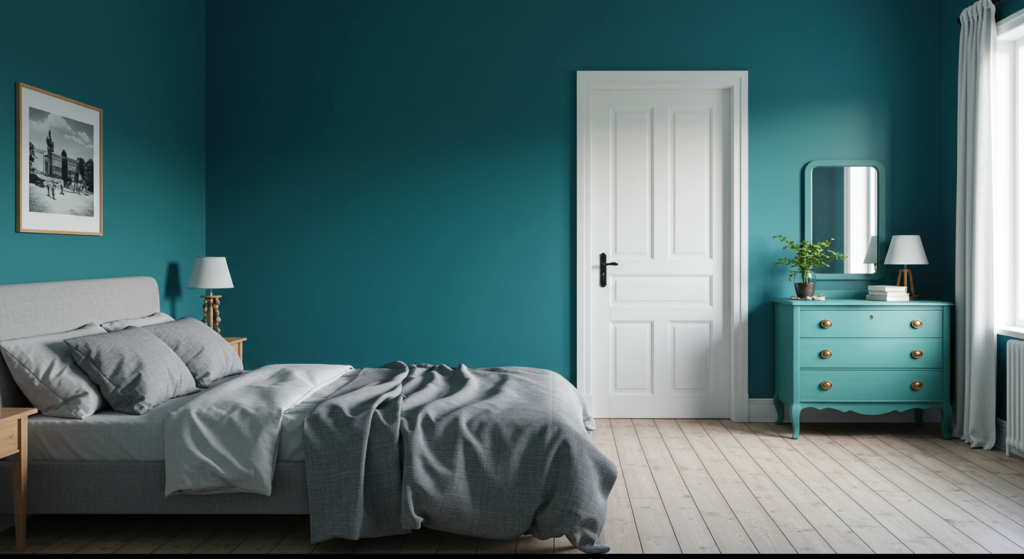
Warm vs. Cool Undertones
When you pick accent colors, consider whether your main room tone leans warm (like creams, beiges, or mild taupes) or cool (like grays or whites with a hint of blue). Matching accent undertones helps the room feel harmonious. If your walls have a warm base, try warm accent colors like terracotta, saffron, or rust. For a cool base, choose teal, navy, or charcoal.
That said, a warm accent can also pair with a cool foundation to create contrast. For example, a cool gray wall with a bright coral accent. It’s fun to experiment, but keep an eye on undertones so you don’t mix an orange-leaning red with a blue-leaning green in ways that jar the eye. Trust me, that mismatch can stand out in a not-so-nice way.
Experimenting with Different Color Combinations
Complementary Pairings
Complementary colors sit opposite each other on the color wheel. For instance, purple pairs well with yellow, and green pairs nicely with magenta hues. When you use these pairings in moderation, the resulting look can be lively. One classic example is a navy backdrop with gold accessories. Another is a pale mint with subtle pink pops. The interplay can be dramatic but balanced.
But keep your ratio in check. If you go too heavy on complementary colors, you risk an overly loud scheme. Stick to one main color, then sprinkle in its complement. A pair of decorative pillows, a small rug, or wall art might be enough. That approach makes your place feel stylish, not messy.
Analogous Hues
Analogous colors sit next to one another on the color wheel (like red, orange, and yellow). They can merge to form a soothing effect because they share a common base tone. For instance, you can blend teal, aqua, and a subtle green in your decor for a flowing coastal vibe. Or you can use a range of pinks and reds for a warm, romantic atmosphere.
Watch out for how strong each color is. You can let one color take the lead, then support it with a couple of tints or shades from the same family. It’s also helpful to have one neutral color around so your design doesn’t become a rainbow swirl. Neutrals help ground your analogous palette.
Triadic Schemes
Triadic color schemes use three colors spaced evenly on the color wheel (like red, blue, and yellow). This set brings a cheerful feel, but can be tricky to handle in home decor. If you want a triadic look, consider toning down one or two of the colors to more muted shades. For instance, you might pick dusty pink, pastel teal, and muted saffron. That way, they don’t clash but still give an interesting twist.
A triadic setup can shine in a child’s playroom or a creative workspace. The wide variety of colors injects an upbeat vibe. If you crave a calmer environment, you might still use a triadic approach, but apply it in smaller doses or with gentler pastel versions of each color. The key is to keep the overall look cohesive, not cartoonish.
Finding Inspiration in Interior Design Styles
Modern Minimalism
Modern minimalism focuses on simplicity. You see crisp lines, open spaces, and neutral palettes. But minimalism doesn’t mean zero color. A single bright accent can turn a stark living room into a statement. For instance, a sleek white sofa with a black coffee table might become more interesting if you add a single bright green throw or a bold metal sculpture. That one color element stands out as an intentional design choice.
Because minimalism cuts out clutter, every object you include carries weight. If you incorporate a red accent wall in a white bedroom, that red color gains major impact. Or if you keep the walls neutral but place one bright painting, people notice it immediately. Minimal spaces thrive on purposeful accent usage.
Rustic Farmhouse
Rustic farmhouse style feels cozy, with weathered wood, vintage furniture, and warm textures. Accent colors help highlight the homey vibe. Think about earthy tones like sage green, dusty rose, or a mild mustard. These can appear in upholstery, distressed cabinets, or whimsical tin signs. The softness of these accents complements natural materials.
You can also try pairing rustic textures with a more lively accent. A bright turquoise cabinet against wooden floors can create a boho twist. Or a set of cheerful pillows on a barn-wood bench. This style encourages mixing old-timey charm with a dash of color that feels lived-in. Everything doesn’t have to match perfectly, but it should feel welcoming and restful.
Industrial Chic
Industrial chic style emphasizes raw and edgy materials: exposed brick, metal fixtures, and open layouts. Accent colors in industrial decor might be a bold black or a striking metallic. If your base is mostly grays, steels, or concrete, a vibrant accent color can break the monotony. Some people pick burnt orange or olive green for a loft-like setting.
Metallic details—like copper pendant lights or brass kitchen handles—can serve as accents too. The metal finish gleams against rougher surfaces. A black accent wall can deepen the industrial mood, while a bright rug might add softness. Make sure your accent color doesn’t clash with the overall industrial vibe. If the environment is very edgy, keep your accent somewhat understated.
Practical Ways to Introduce Accent Colors
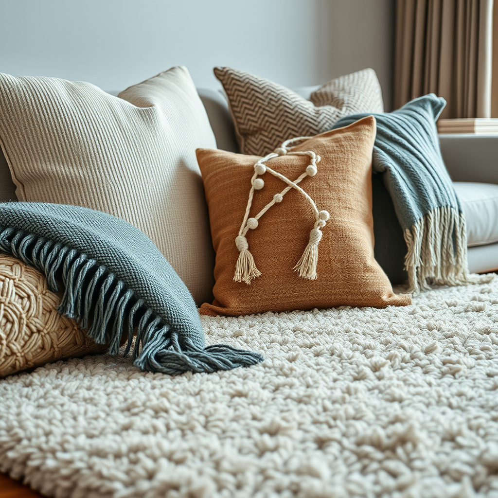
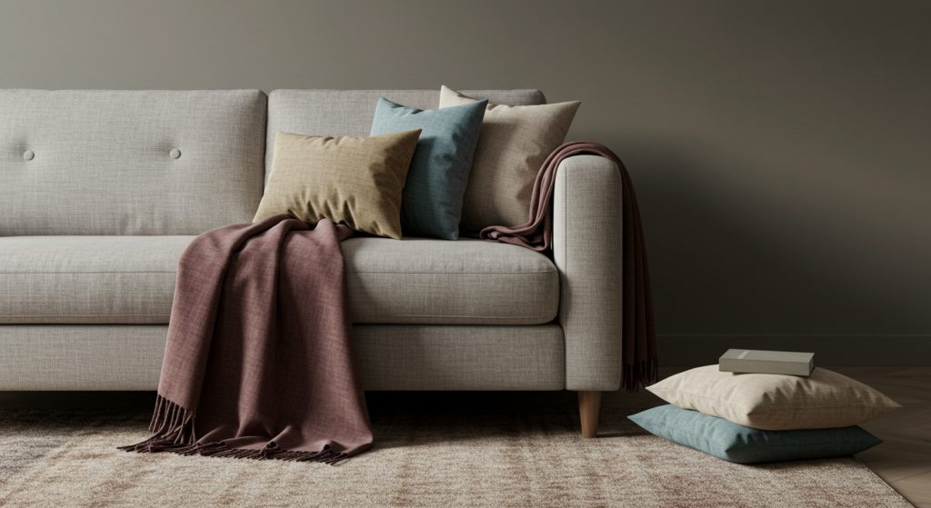
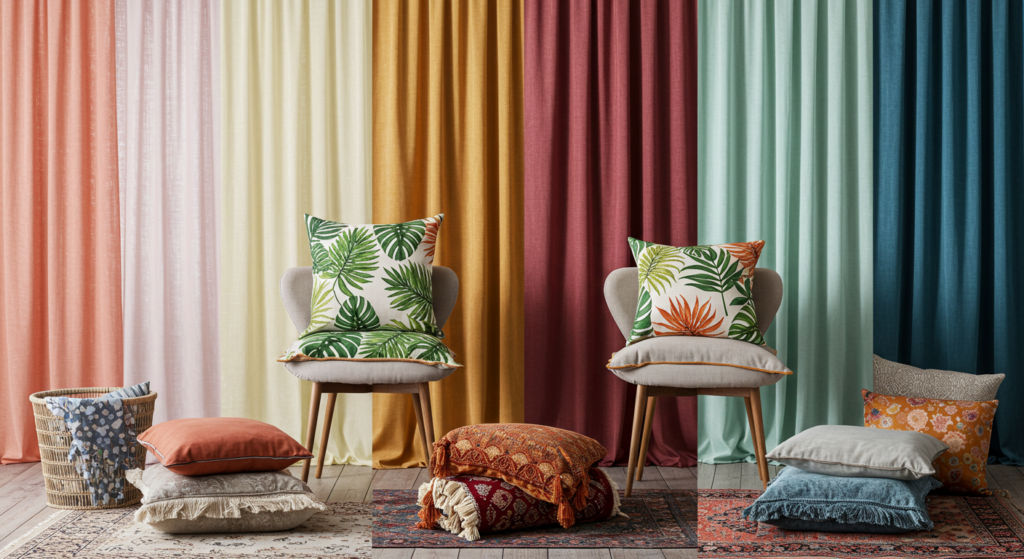
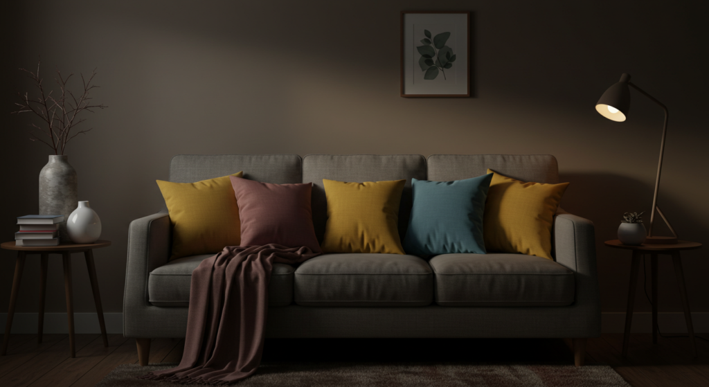
Pillows and Throws
Decorative pillows and throws are some of the easiest ways to test new accent colors. If you get bored of them or they clash, you can swap them out with minimal effort. Put a set of vibrant pillows on your couch or bed to get a quick color infusion. Mix and match patterns or textures, but keep a unifying tone so they don’t appear random.
A pro trick: layer a big solid-colored pillow behind a smaller patterned pillow that includes the same hue. This layering adds depth while keeping a consistent look. A throw blanket in a similar shade can tie the seating area together. If you find it too matchy, add a second accent color in a small detail, like a tiny pillow stripe or trim.
Area Rugs
Area rugs anchor a room, define zones, and offer an accent color on the floor. Choose a rug that features a pattern with your chosen accent. For example, if your accent color is burgundy, find a rug that has burgundy details on a neutral base. This approach ensures your accent color flows through the space but doesn’t overwhelm.
Also consider texture. A fluffy rug can soften modern lines. A woven rug can bring a natural vibe to a sleek area. Pay attention to scale: a rug that’s too small makes a room look off-balance. A big rug, on the other hand, can unify multiple pieces of furniture under one accent scheme, especially in open-concept homes.
Curtains and Drapes
Curtains can greatly impact a room’s mood. Choose drapes in your accent color to highlight windows and control how much light enters. If you have tall windows, floor-length curtains in a bold shade can look dramatic. This approach also helps your eyes travel upward, making a room feel taller.
Sheer curtains in a soft pastel accent can bring a gentle charm. Heavier drapes in a deep accent color add luxury. If you want a more subtle effect, consider curtains with a border or trim in your accent color rather than a fully solid curtain. Remember to check how natural light influences the curtain’s color glow in the room.
Paint and Wall Treatments
Accent Walls
An accent wall is a classic way to boost color drama without painting every surface. Pick one wall and give it a bold color that harmonizes with the rest of the space. This wall might hold a fireplace, a TV console, or artwork. The accent paint draws attention to that specific area. If your main walls are off-white, a teal accent wall can appear crisp and refreshing.
Check the undertones in your existing paint. If the other walls are warm-toned, a cooler accent might clash. You can also experiment with patterns on your accent wall. A simple geometric design or wide stripes can add extra flair. Just keep the rest of the room fairly streamlined to avoid visual overload.
Painted Furniture
Tired of your old side table? Paint it in a playful accent shade instead of buying new furniture. A bright cobalt nightstand in a neutral bedroom can be a fun surprise. A pastel pink desk in a white home office exudes a whimsical feel. Painted furniture can inject personality, especially if the rest of the furnishings are subdued.
Don’t worry if the paint finish has a bit of distressing. Lightly sanding edges after painting can give a vintage or shabby-chic vibe. For a more polished look, use a high-gloss finish or a smooth matte. Test your paint color on a small patch first. Different wood grains can affect how the shade appears. Also, use a primer if the piece is heavily varnished or dark.
Stenciling and Wallpapers
Stenciling can add a custom design to walls without the cost of wallpaper. You can stencil your accent color in motifs like leaves, shapes, or subtle patterns. This technique looks good on a small wall area, like behind bookshelves or around a doorway. If you prefer a bolder approach, opt for an accent wallpaper with your chosen color. Florals, geometric prints, or metallic patterns can spice up an otherwise plain wall.
Keep scale in mind. Large prints might make a small room feel tighter, though sometimes that’s the drama you want. Smaller prints might blend better if your room is modest in size. Using wallpaper on a single feature wall can help you avoid overwhelming the space. Pair it with simpler furniture so the wallpaper becomes the main star.
Accessories and Decorative Pieces
Artwork and Wall Decor
A painting or framed print can tie together your accent color in a flash. Maybe you have neutral walls—hang a large piece of art that showcases your chosen hue. Or you can group smaller framed prints that collectively feature your accent color. This arrangement draws attention while keeping your color scheme consistent.
If you can’t find artwork that matches exactly, consider abstract art that hints at your accent color in subtle strokes. You might also decorate with wall-mounted shelves. Then place objects or books that highlight your accent shade. Repetition in small doses can unify the overall design.
Lighting Fixtures
Lighting fixtures shouldn’t always fade into the background. A chandelier or pendant light in a bold color can become an accent piece in its own right. Think about a kitchen with white cabinets and a single bright yellow pendant lamp above the island. The pop of color catches the eye and breaks up the uniformity.
If a colored fixture seems too loud, look for a metal finish that complements your accent color. Brushed copper or gold can highlight a warm accent scheme. Nickel or chrome might suit cooler tones. Also, consider the bulbs’ warmth level. A soft white bulb might read differently on certain fixture colors compared to a daylight bulb. Test it out if possible.
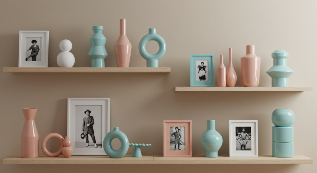
Vases, Sculptures, and Other Decor
Sometimes smaller items can leave a big impression. A bold vase on a console table, a colored sculpture on a mantel, or tinted glass jars in the kitchen can all serve as accent details. Group items in clusters of odd numbers—like three or five—for a balanced arrangement. Use varied heights and shapes to add visual interest.
When you display items in your accent color, think about repetition. Maybe you have one bright red vase and two smaller red candle holders. That continuity ties them together. Avoid sprinkling a random accent piece in a corner without referencing it elsewhere. Repeating the accent at least two or three times helps unify the design.
Coordinating Fabrics and Textures
Upholstery Choices
Your sofa or armchairs can serve as bold accent pieces if you choose a bright or textured fabric. For example, a velvet emerald couch draws attention in a room with neutral walls. If that’s too big a commitment, go for accent chairs in a playful pattern. They still add color without monopolizing the entire space.
Check if the fabric’s texture suits your design style. Smooth leather can feel modern, while linen or woven fabrics can lean rustic. If you prefer frequent style updates, keep your major furniture neutral, then rotate accent pillows or slipcovers. That approach is cheaper and less permanent.
Throws, Blankets, and Quilts
Layering throws or quilts can create a cozy setting. Use a throw in your accent color across the arm of a neutral sofa. In a bedroom, drape a contrasting quilt at the foot of your bed. These fabrics add dimension and warmth. Plus, they’re easy to switch out if your color tastes change.
Vary the textures. Mix a chunky knit blanket with a smoother cotton or linen throw. The difference in textures adds depth, even if the color is the same. You might place a patterned pillow that combines your accent color with a neutral tone, bridging the two elements. This layering keeps your design from looking flat.
Table Linens and Runners
Table linens can reflect accent colors without overshadowing a dining room. A table runner in a crisp accent color can make a neutral wood table stand out. Cloth napkins in a matching shade can tie the theme together, especially if you have open-concept living and dining spaces.
If your decor leans toward a formal style, pick linens with elegant embroidery or a refined pattern. For a more laid-back vibe, use simpler cotton or canvas materials. And watch how your chosen color pairs with dishware. If your plates are white, a bright runner can pop nicely. If you have colorful plates, choose a neutral runner with a subtle accent border.
Changing Accent Colors Through the Seasons
Spring Updates
Spring calls for fresh and lively tones. Swap heavy drapes for lighter pastel curtains. Replace darker pillows with bright floral prints or lighter greens and yellows. You can add small vases filled with flowers or faux blooms in matching colors. These changes breathe new energy into rooms that felt stuffy after winter. No need to break the bank. Simple swaps go a long way.
Don’t forget your entryway. A new doormat or a small wreath with seasonal accent shades can set a cheerful tone before you even step inside. Consider also a few potted herbs or succulents in colorful planters by the window. That subtle detail adds a nature-inspired accent.
Summer Vibes
Summer often means carefree vibes, so aim for breezy and light accents. That might mean bright blues or coral. If you have a neutral couch, pop on pillows with tropical prints or nautical stripes. Hang a lightweight tapestry with a lively pattern. It’s a quick way to shift the mood without major changes.
Outdoor spaces also matter. Update your patio or porch with cushions in cheerful colors. Hang string lights to highlight the accent color at night. Maybe place an outdoor rug with bold geometric shapes. These details make your outdoor area feel inviting and coherent with your indoor design.
Autumn and Winter Tones
As temperatures drop, switch to richer and deeper accent colors. Think about wine-red, burnt orange, or forest green. Heavier fabrics like faux fur throws or velvet pillows create a snug feeling. Add some metallic touches, like gold candle holders, to reflect autumn’s warm ambiance.
For winter, you can go with creamy whites, silver accents, or deeper jewel tones. Some people love a classic red-and-green theme, but you can also pick plum or navy. Layering is key. More pillows, cozy throws, and textured rugs help rooms feel comfortable. If you’re feeling adventurous, add a small accent Christmas tree or decorative branches to highlight your chosen color scheme.
Visual Tricks with Accent Colors
Creating the Illusion of Space
Light accent colors make a small room feel less cramped, especially when paired with a consistent neutral palette. If your living room is tiny, avoid bombarding every corner with different tones. Choose one or two soft accents that reflect light. A pale pastel or a gentle metallic can bounce brightness around.
Another trick: paint the ceiling in a very light hue, maybe a faint sky blue or off-white. This can make the ceiling feel higher. Place one big mirror opposite a window, and use your accent color on its frame. That mirror not only reflects light but also highlights the accent frame, making the room look bigger.
Defining Zones in Open Concept Layouts
Open concept homes often lack built-in boundaries. Use accent colors to define zones. For instance, choose a subtle green accent in the kitchen area (like bar stools or a rug), while the living room corner features touches of navy. This color coding helps differentiate functional spaces without needing walls.
Consistent neutral bases link the zones together. If your walls are the same color throughout, the accent color in each zone stands out more. Keep some element consistent, such as matching metallic finishes or a common design style, so your open space flows. Splitting the entire room with random color choices can create confusion.
Enhancing Architectural Features
Some homes have special architectural details like beams, arches, or built-in shelves. Accent colors can spotlight these areas. Paint a built-in bookshelf a contrasting hue to your main wall, or highlight a ceiling beam with a dark stain that echoes the accent color. This approach draws attention to the home’s unique features.
If your home lacks obvious architectural interest, create one by adding a faux focal area. For instance, install simple molding on a wall, then paint inside it with your accent shade. Or paint your window trim in a bold color. These modifications can add charm and dimension, especially in newer builds that lack character.
Layering Accents for Depth
Multiple Shades of One Color
Instead of a single accent color, choose several shades of the same hue. For a blue scheme, you might have navy cushions, a denim-blue rug, and a vase in pale aqua. This layering of tonal variations creates a cohesive look that feels rich and layered. It works well in minimalist or modern spaces, as the uniform color family keeps it from feeling busy.
Collect samples of each shade to make sure they don’t clash. Some blues might have green undertones, others might be more purplish. Pick shades that complement each other so you get a smooth gradient effect. This approach can also apply to greens, pinks, or even neutrals. Layering neutrals can be surprisingly warm.
Pairing Solids with Patterns
A pattern that includes your accent color unifies the design. For instance, if your accent is coral, you might get a patterned rug that features coral and white shapes. Then pair it with plain coral pillows, plus a white sofa. The pattern piece ties in your accent color while adding a bit of variety.
Try not to overfill the room with multiple busy patterns. It can overwhelm the eye. If you choose a large patterned rug, keep other patterns subtle or limit them to smaller objects. Balance them with solids. The interplay of pattern and plain accent pieces feels lively without turning chaotic.
Using Texture as an Accent
Texture can also function like an accent, especially if it stands out visually. A chunky knitted blanket in a neutral hue can act as a focal point on a sleek, modern chair. A glossy ceramic vase among matte surfaces also catches the eye. Look for tactile differences that pop, even if they share the same color.
Natural elements like wood or stone can be accent features too. A reclaimed wood accent wall might work with a softer color scheme. A stone fireplace can become the star, with the rest of the decor playing supporting roles. These textural accents add warmth or an unexpected twist to your design.
Maintenance and Upkeep of Accent Decor
Caring for Accent Fabrics
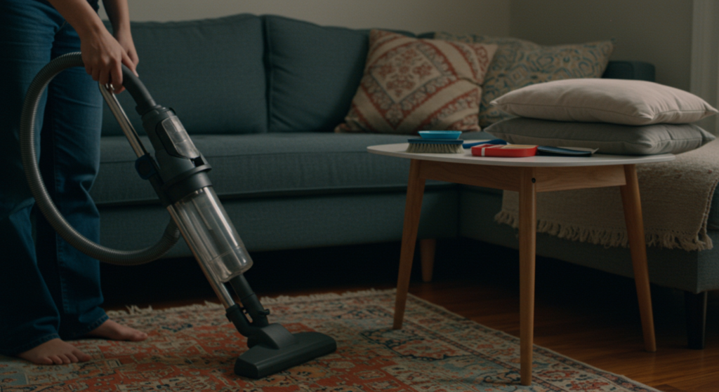
Upholstery, pillows, and rugs need regular care to look vibrant. Vacuum or shake out rugs to remove dust. Some accent pillows have removable covers that you can machine-wash. Check the care instructions so you don’t damage them. If your accent color is a darker shade, it might show lint or pet hair more easily.
Also, protect your fabrics from direct sunlight. Strong sun can fade colors over time. If you have a bright, sunny room, rotate your pillows or place UV film on your windows. If you spot a spill on a bright accent sofa, blot it immediately. Quick action can save the color from permanent stains.
Paint Touch-Ups
Painted accent walls or furniture may chip over time. Keep a small container of the original paint for touch-ups. If you used a special finish, note it, so you can replicate the look later. Wipe down walls periodically with a damp cloth to remove dust or fingerprints. Painted furniture might need gentle cleaning. Avoid harsh chemicals that can strip or fade the paint.
If you change your mind about the color, it’s usually easy to repaint. Furniture can be sanded and refinished. An accent wall can be repainted in a new hue. That flexibility is part of what makes accent color usage so fun. You’re not locked into one choice forever.
Long-Term Decor Rotations
It’s okay to switch out accent items seasonally or when your tastes evolve. That old turquoise pillow might not spark joy next year. Keep a small storage bin for out-of-season or old accent pieces. That way, you can bring them back when you want a fresh twist. Rotating these items helps your home stay interesting without large expenses.
If you invest in higher-end accent pieces, consider their timelessness. Will that intricate patterned rug still hold charm in a few years? If so, it might be worth the cost. For trendier accent colors, stick to smaller, less pricey objects that you can swap out easily if you get bored.
Adding Accent Colors to Non-Traditional Spaces
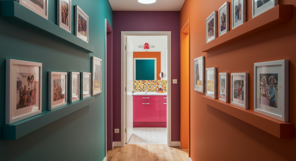
Hallways and Corridors
Hallways often get ignored, but a bold runner rug or a colorful gallery wall can transform them. Try painting a thin stripe along the wall at shoulder height in your accent color. This draws the eye down the corridor. You can also place matching frames along the hallway with pictures or art that share your chosen hue. Now your hallway no longer feels like a forgotten pass-through.
If your hallway is narrow, use lighter accent colors to avoid making it feel cramped. Mirrors on one side can add depth, especially if they have accent-colored frames. Hallway lighting can also show off the accent color. A colorful pendant or sconce can create a focal point in a usually overlooked space.
Bathrooms
Bathrooms benefit from a pop of color, especially if they’re all white or tiled in neutral tones. Switch in bright towels or a cheerful shower curtain. Add a small accent rug by the sink. Some folks even paint the vanity cabinet in a fun shade. This small room is a perfect place to be bold because you won’t have to stare at it as often as a living area. You can enjoy the accent in short bursts.
Wall art in a moisture-resistant frame can also enliven a bland bathroom. Think about a coastal print if you want a beachy accent color, or a modern abstract with a bright hue for a contemporary edge. Just ensure the humidity in the bathroom won’t damage your chosen decor piece. If you want a subtle accent, choose pastel accessories that complement the existing tiles.
Laundry Rooms
Laundry rooms don’t have to be boring. A brightly painted cabinet or shelf can add life to a place where chores happen. Throw in a patterned rug that brightens the floor. Label your storage bins with color-coded tags or stickers matching your accent color. This small step can make laundry duty a tad more pleasant.
Be mindful of moisture levels if your laundry area is near a washer or sink. Use paint and materials that can handle humidity. If you want a functional accent piece, consider a pegboard painted in your accent hue. It’ll hold your tools or clothespins while adding a dash of color. A little fun in the laundry room can go a long way toward making chores less dreadful.
Making Bold Statements Without Overwhelming
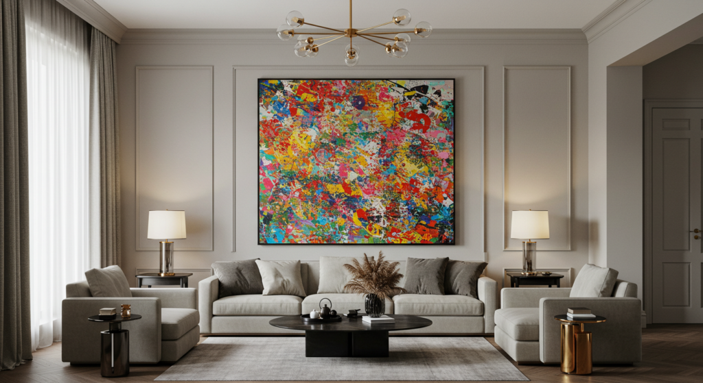
Large Art Pieces
If you have the wall space, a single large-scale piece of artwork in your accent color can make your design feel gallery-like. This piece can dominate an entire wall, leaving the rest of the room to remain neutral. This method is effective if you love the color but don’t want to see it scattered everywhere.
Oversized art might cost a bit more, so if your budget is tight, consider making your own abstract painting or using a large tapestry. You can also look for local artists or use prints in big frames. If you go for huge art, keep other decor minimal. Let that single accent piece own the spotlight.
Statement Furniture
A bold accent piece of furniture, such as a sofa, headboard, or dining table, can define the room’s personality. People often hesitate about large statement furniture because they’re worried they’ll tire of the color. But if you truly love that hue, it can become the heart of your design. Just plan the rest of the space around it so you don’t create visual chaos.
One big advantage of statement furniture is that you don’t need many other accent items. The piece becomes the star, and smaller accessories can stay neutral or match the statement color in lesser amounts. If you do eventually tire of that color, slipcovers or reupholstering could be an option. Or you can consider reselling it if it’s still in good condition.
Contrast with Black or White
Black and white can act as powerful accent colors, even though they’re considered neutrals. A black accent wall behind bright furniture can look dramatic. A white accent piece in a darker room can break up heavy tones. This high-contrast approach works well in modern or monochrome styles. Just be sure to integrate the black or white in at least a couple of spots, so it feels intentional.
For instance, if you use black picture frames, add a black side table or lamp base too. If you choose white, maybe also use white in pillows or vases. This helps tie everything together. White or black can sharpen other accent colors around them. For example, a bright teal pillow on a black couch looks crisper than it would on a random patterned couch.
Budget-Friendly Accent Tips
Thrift Store Finds
Thrift stores are gold mines for unique accent decor at low prices. You might find an old ceramic lamp that you can repaint or a wooden chair that just needs a cushion refresh. Be open-minded. A coat of spray paint can transform mismatched items into cohesive accent pieces. That way, you save money and get a creative look.
Look for vases, frames, or storage baskets that can all be updated to your accent color. Don’t worry about minor scratches. Sanding and painting can fix that. Plan your color scheme before shopping so you focus on items that fit the palette. This approach can be quite fun if you enjoy a bit of DIY action.
DIY Crafts
Sometimes you don’t need to buy brand-new items. Craft your own accent pieces. Paint plain terracotta pots in your accent hue. Create homemade wall art by stenciling or using collage techniques. Sew your own pillow covers if you like to get hands-on. These projects can be personalized to your exact color preference.
You can also try tie-dying pillowcases or curtains for a playful vibe. Or use fabric markers to draw subtle patterns on a throw. You can adapt these crafts to your skill level. The best part is you get original items that no one else has, and you can easily change them if you get bored.
Seasonal Sales and Clearance Racks
When stores swap seasonal inventory, they discount the old stock. That’s a great time to pick up accent items. Even if it’s off-season, you can store them until the right time of year. This approach works especially well for themed accents like holiday pillows or autumn wreaths. Keep an eye on clearance sections for rugs, lamps, or decorative pieces in your color scheme.
Online marketplaces can also be a good spot for discounted items. People might sell brand-new or gently used decor that doesn’t fit their style anymore. If you spot your dream accent color at a reduced price, jump on it. That small move can bring new life to your space without emptying your wallet.
Conclusion
Accent colors can inject energy, character, and cohesion into your home. They’re a potent tool to guide the eye, balance neutral palettes, and celebrate the style you adore. Whether you gravitate toward a bold statement sofa or prefer sprinkling subtle touches across rugs, pillows, and artwork, accent colors let you express personal flair with little risk. If you tire of one color, you can change or rotate it out.
Think about your main color base, your lighting, and the overall vibe you want. Small steps—like testing paint swatches or mixing small decor items—can help you fine-tune your final choice. By layering, pairing textures, and paying attention to undertones, you can create a polished yet comfortable environment. Accent colors aren’t reserved for big living spaces or showy mansions. Even a tiny bathroom corner can benefit from a strategic pop of color.
In the end, your home should reflect who you are. Pick colors you genuinely like. If something feels off, tweak it until it feels right. There’s no absolute rule on how to use accent colors, but thoughtful planning can help you avoid color chaos. So have fun experimenting. Your house can become a canvas for creative color choices that enhance every nook and cranny.
Summary Table
| Element | Accent Color Ideas | Tips |
|---|---|---|
| Walls | Paint a single accent wall, or use stencils or wallpaper | Match undertones with existing palette |
| Furniture | Painted side tables, statement sofa | Test with small items before painting big |
| Fabrics | Pillows, throws, rugs, curtains | Swap seasonally to keep looks fresh |
| Decor & Accessories | Vases, sculptures, table linens, frames | Repeat accent color at least twice |
| Lighting | Bold pendants, lamps, or metal finishes | Check how bulbs affect color appearance |
| Non-Traditional Spaces | Hallway runner, bright vanity, laundry pegboard | Add color-coded storage or organizational bins |
FAQ

1. How many accent colors can I use in one room?
You can use one main accent color plus one secondary if they complement each other. Too many accent colors might cause a cluttered feel. It’s often best to keep it simple unless you really enjoy an eclectic style.
2. Do I have to use bright colors for accents?
Not at all. A subtle pastel or a gentle metallic can be a striking accent if your main palette is very soft or muted. The goal is contrast, but that contrast doesn’t have to be loud.
3. How do I figure out the right accent color if I’m overwhelmed by options?
Start with your favorite color or something you already own. Another approach is to look at your existing neutral base. If it’s warm, try warm accent hues like terracotta or rust. If it’s cool, try teal or navy. Try small items first to see what clicks.
4. Can I use accent colors in very small rooms?
Yes, but pick either lighter or more toned-down hues if you want the room to appear bigger. Small pops of color, like a bright pillow or painting, can keep a tiny room from feeling claustrophobic. Large-scale patterns might be too overwhelming in tight areas.
5. Should my accent color match across different rooms?
It doesn’t have to, but having a general palette can make your whole home feel unified. Some folks prefer each room to have its own personality. There’s no strict rule—do what feels right for your vision.
6. What if I rent and can’t paint walls or change fixtures?
Focus on removable decor like pillows, curtains, rugs, and wall art. Peel-and-stick wallpaper or decals can add color without damaging walls. You can also use bold bedding or furniture covers.
7. How often should I change my accent colors?
That depends on your preference. Some people like refreshing them each season, while others keep the same color for years. If you keep a neutral base, changing accent items is quick and cheap.
8. Are there any accent color rules for open-plan layouts?
Use accent colors to define zones, but maintain enough unity so the space flows. For instance, the kitchen might have green stools while the living area uses green pillows or throws. That repeated hue ties the open layout together.
9. Do I need to match accent colors with existing wood tones?
Wood tones act like a part of your base palette. Consider whether they are warm or cool. If they’re warm, you might pick a warm accent color so it blends naturally. Or pick a contrasting tone to highlight the wood’s richness.
10. How can I avoid clashing with my hardwood floors?
Choose an accent color that complements or contrasts with the floor. If your floors have red undertones, try cooler accents to balance the warmth. If they’re more neutral, you can go bolder with your accent color.
Experiment and have fun. Accent colors bring life to your home design without major investments or renovations. By following these tips, you can create a space that’s both stylish and comfortable, with just the right dose of color to brighten your everyday living. Go ahead and add that special pop of color—you won’t regret it!

Sam Goldman, with his intuitive grasp on the art of color selection, navigates the vibrant tapestry of fashion shades, ensuring each ensemble reflects the pulse of modern trends. His knack for crafting unique yet cohesive color combinations unravels the complexities of the fashion spectrum. Beyond being a mere sentinel, Sam’s dedication transforms every reader’s wardrobe journey into a harmonious blend of contemporary elegance and timeless allure. Dive into his writings and emerge with a refreshed perspective on fashion colors.
Reviewed By: Joanna Perez and Anna West
Edited By: Lenny Terra
Fact Checked By: Matthew Mansour
Photos Taken or Curated By: Matthew Mansour