Key Takeaways
- Color trends are predicted using artificial intelligence that analyzes data from fashion shows, retail sales, social media, and pop culture.
- Warm, earthy tones like terracotta, mustard, and sage green are expected to be popular next year.
- Classic blue was Pantone’s 2020 Color of the Year, representing stability and confidence.
- Colors have psychological associations that influence their popularity like purple suggesting wealth and green evoking nature.
- On social media, bright, saturated colors get more engagement, while muted, pale tones feel more subdued.
- Retailers use color psychology to decorate stores and encourage sales, like red stimulating appetite in restaurants.
- Historical events and technological developments have shaped color fashions over time.
- Personal color analysis helps identify flattering hues based on skin tone, hair color, eye color, and other factors.
- Following color trends isn’t mandatory — choose colors that make you feel happy and confident.
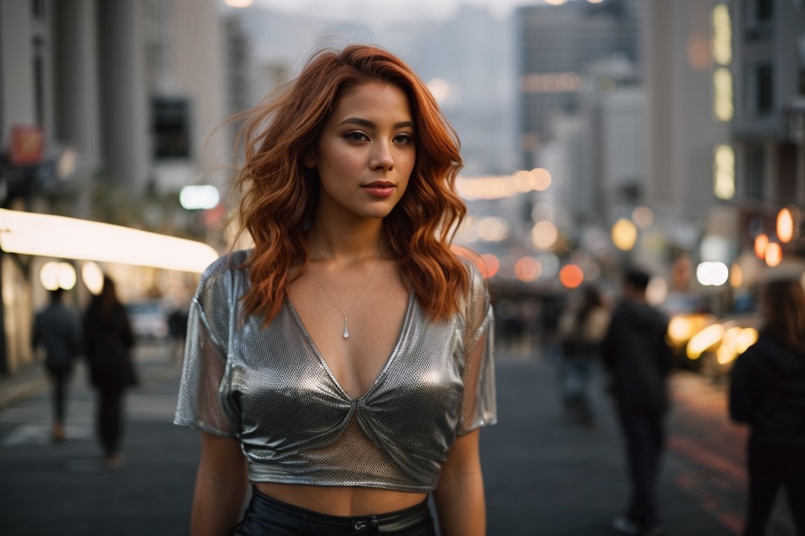
Predicting color trends is a complex process that blends art, science, and intuition. Color trend experts examine data from industries such as interior design, fashion, retail, manufacturing, social media, and pop culture to identify emerging color palettes and forecast the most popular shades for upcoming seasons.
How Runway Fashion Influences Color Trends
The glitzy fashion shows of New York, London, Milan, and Paris have a ripple effect on color trends. Designers use exotic hues to grab attention and set the tone. These runway looks go viral online, building buzz around colors months before they hit stores.
Color Association and Psychology
Beyond aesthetics, designers choose colors to evoke emotional responses and associations. Red conjures excitement, purple feel royal, and neutrals provide flexibility. Colors take on symbolic meanings, like green representing environmentalism. Psychologists study how different hues impact moods and behavior.
Trickle Down Effect
High fashion filters down, influencing mainstream fast fashion within a year or two. Zara and H&M interpret runway trends for the masses. Affordable on-trend pieces generate consumer demand for certain colors.
Feedback Loop
Department stores and fashion boutiques place wholesale orders based on trending catwalk colors. Textile mills and dye houses produce fabrics in these popular runway-inspired shades. The fashion cycle comes full circle when consumers purchase clothing in these in-demand colors, bringing the latest runway trends into their wardrobes.
Big Data Analytics Predict Color Trends
Retail analytics play a vital role in predicting color trends by leveraging artificial intelligence and large-scale big data analysis.
Point of Sale Data
Both online and in-store sales transactions offer clear insights into which product colors are most popular with customers. By using data mining and retail analytics, businesses can track emerging color trends in real time and forecast declines in demand, helping to prevent excess inventory and reduce waste.
Social Listening
AI analyzes Instagram, TikTok, YouTube, and other social media platforms to uncover emerging color trends. The most liked, shared, and viewed posts shape user preferences and popular aesthetics. Using computer vision technology, AI precisely identifies specific color shades within images and photos.
Search Volume
Google and e-commerce search data offers insight on colors sparking interest. When queries for “green dress” or “terracotta pants” spike, it signals rising demand. Natural language processing parses word associations.
Trend Analysis
Advanced machine learning automatically spots color trends across massive data sets. Algorithms notice micro-trends like mauve increasing 0.5% month-over-month before human analysts. They rapidly surface correlations.
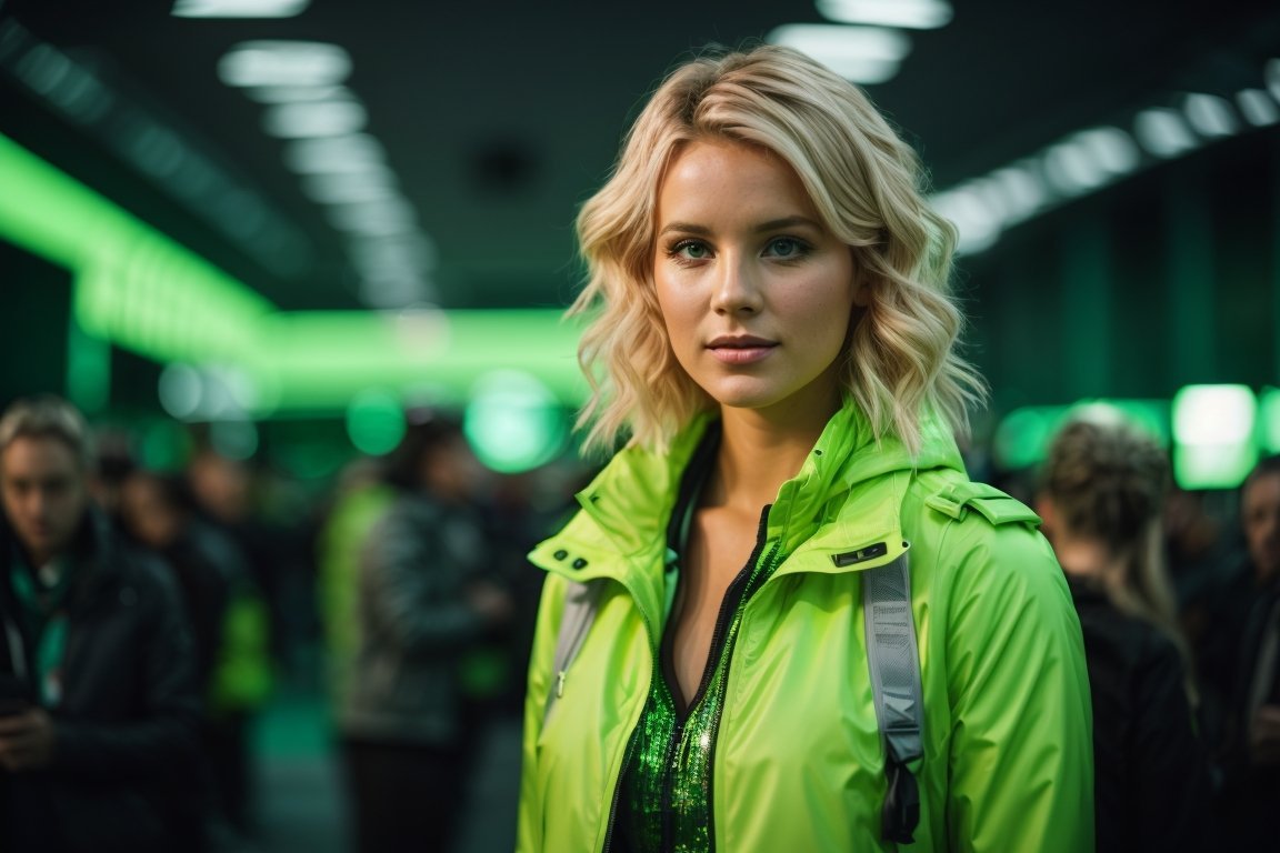
Pantone Color of the Year Dictates Trends
Since 2000, Pantone’s annual Color of the Year dictates tastes across industries. Their selection considers psychology, culture, and technology developments. It spurs product development and appears widely in fashion and industrial design.
Color Meaning and Selection
Pantone analyzes society’s mindset to choose the color with relevant symbolism. 2020’s Classic Blue evoked stability and confidence amidst uncertainty. 2022’s Very Peri represented innovation and fluid perspectives.
Rippling Impact
The announcement cues brands to feature Pantone’s Color of the Year in products and marketing. It’s incorporated into logos, packaging, apparel, housewares, electronics, toys, and more. Consumers are primed to desire this color through osmosis.
Consistent Visibility
Continuous cross-industry adoption ensures the ubiquitous presence of the Color of the Year. It’s in fashion magazines, retail displays, commercial products, and graphic design. This saturation seeds it in the consumer psyche.
How Historical Events Alter Color Trends
Societal shifts caused by major events affect color symbolism and popularity. After traumatic times, optimistic brights trend upward. But uncertainty leads to more neutrals.
- War: Camouflage and khaki peaked during wars. Post-war, patriotic reds, whites, and blues increased.
- Economy: In recessions, consumers gravitate towards stable, versatile neutrals that maximize cost per wear. Colors turn bright and cheerful during prosperity.
- Gender Roles: Second-wave feminism brought empowering bold colors into women’s fashion. More egalitarian roles today enable gender-neutral color preferences.
- Innovation: New pigments and dyes birthed novel colors like cobalt blue and malachite green. They defined eras until oversaturation.
- Digital World: Online visibility favors saturated primary colors. Muted tones risk getting washed out on phone and computer screens with glare.
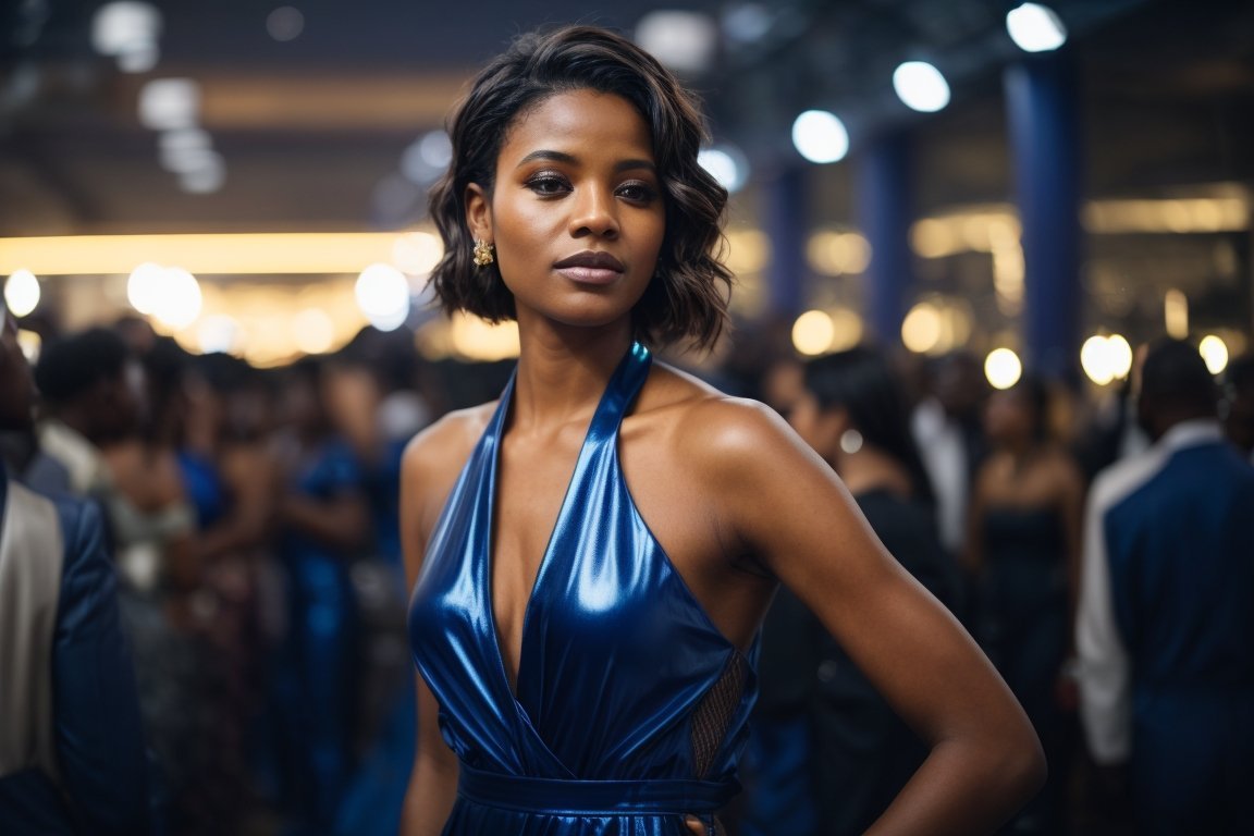
Color Analysis for Personal Style
Color analysis systems categorize individuals into seasonal color palettes based on their complexions. This helps identify the most flattering, harmonious hues to enhance natural beauty.
- Spring: Warm with yellow undertones. Opt for coral, mint green, lavender, peach, and gold. Avoid black, navy, and emerald.
- Summer: Cool with blue undertones. Flatter with sky blue, rose pink, jade green, berries, and silver. Avoid orange, camel, crimson.
- Autumn: Warm with olive undertones. Look great in mustard, terracotta, moss green, taupe, and bronze. Avoid icy pastels.
- Winter: Cool with peach undertones. Stunning in true red, fuchsia, royal purple, cobalt blue, and white. Avoid brown, beige, and dusty shades.
Certain hair, eye, and skin color combinations pair best with specific palettes. Analyzing your natural contrasts helps guide color selection. But don’t adhere strictly to the rules — finding colors you love matters most.
Choosing Personal Colors
- Favorite colors you feel happy and confident wearing. Makes getting dressed easy.
- Versatile neutrals that act as base wardrobe anchors and pair with prints. Black, white, navy, tan, gray.
- Flattering colors near the face like blazers and tops based on color analysis. Avoid what washes you out.
- Pops of color as accents on bags, shoes, and jewelry. Bolder than clothing.
- Whimsical colors that spark joy and self-expression. Don’t overthink it.
- Mix colors mindfully. Ensure adjacent colors complement but aren’t too matchy. Monochromatic can look dull.
The colors you choose to wear impact both how you feel and how others perceive you. Follow trends cautiously, using your favorite hues to craft a signature style.
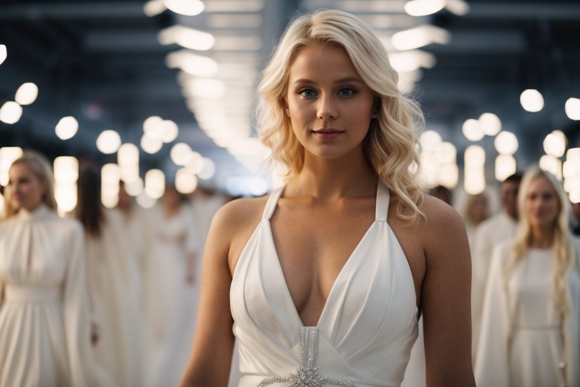
Why Personal Style Matters More Than Trends
Color trends offer inspiration but shouldn’t dictate what you wear. Focus on developing a personal style with colors that satisfy you both physically and psychologically. Here’s why:
- Trends come and go but style evolves slowly over decades. Build a durable wardrobe not disposed of each season.
- Flattering colors boost confidence. Trendy hues may not work for your complexion or preferences. Feel your best.
- Expert coordination is required to avoid looking dated as trends fade. It’s not worth the effort for most.
- Frugality. Stick to versatile classics you love vs continually updating. Shop strategically.
- Individuality. Trends produce homogeny by definition. Customize looks that express your essence.
- Sustainability. Avoiding overconsumption out of obligation to “stay on trend” is eco-conscious.
- Happiness. Science confirms wearing beloved colors makes you smile more than forcing on-trend ones.
The next big color trends offer inspiration to refresh your personal palette. But customize them to suit your taste so you radiate confidence in colors that bring out your spirit.
Summary Table
| Predictor | Methodology | Data Sources |
|---|---|---|
| Runway Fashion | Designers select symbolic colors that attract attention and influence emotions. These looks disseminate through media coverage. | Photos and videos from fashion weeks, textile suppliers |
| Retail Analytics | AI and big data analysis of past sales data, search volume, social media, etc. to forecast future popular colors. | Point of sale data, Google Trends, Instagram hashtags |
| Pantone Color of the Year | Major societal happenings like wars, recessions, social change movements, and innovation alter color symbolism and demand. | Pantone’s proprietary methodology interpreting culture and their color expert opinions |
| Historical Events | Designers select symbolic colors that attract attention and influence emotions. These looks are disseminated through media coverage. | Cultural analysis |
| Color Analysis Systems | Analyze individual’s hair, eye, skin tones and contrasts to categorize into seasonal color palettes with recommended hues. | In-person or photo assessments, skin color testing devices |
Conclusion
Predicting color trends blending science and art. Data analytics offer hard evidence but human interpretation contextualizes. Cultural events infuse color with meaning. Individual factors like complexion and preferences matter too. Consider trends during design processes or wardrobe updates, but make final choices based on what makes you happiest. Colors hold power — wield them wisely.

Frequently Asked Questions
What are the spring 2024 color trends?
For spring 2024, warm earthy neutrals like terracotta, mustard, and sage green are expected to trend, along with vibrant hues like fuchsia, chartreuse, and azure blue. Soft pastels will also grow popular as an optimistic contrast to recent world events.
How do color trends start?
Color trends often originate on high fashion runways, and then disseminate through retail and manufacturing. Influential annual selections like Pantone’s Color of the Year also kickstart color trends across industries when adopted widely into product design and marketing.
How do color trends affect consumers?
Color trends lead to greater availability of on-trend products, advertising featuring those hues, and social media content showcasing them. This omnipresence in the consumer landscape subconsciously shapes preferences and purchases. People feel drawn to trends even without realizing why.
How long do color trends last?
Individual color trends shift fairly rapidly, with a lifespan of around one to three years from the runway until saturation triggers backlash. But some trends have surprising longevity, like Millennial Pink maintaining appeal for nearly a decade before fading.
Should I follow color trends?
It’s a personal choice. Consider trends when updating your wardrobe or home to stay current. But focus mainly on choosing colors you love rather than what’s deemed trendy. Wearing hues that make you confident never goes out of style.
What are classic color combinations?
Classic color pairings that persist through changing trends include navy and white, black and tan, pink and red, blue and green. Neutrals like black and white are so versatile they complement virtually any accent color.
How do I know what colors look good on me?
Consider getting a color analysis consultation to determine your seasonal color palette. Also, observe which hues you get the most compliments in. Experiment to see which colors make you feel most confident. Avoid ones that seem to wash you out.
What colors are trending for interiors?
For home interiors, expect warm natural tones like caramel, terracotta, and green to trend upward in 2024. Bold maximalist colors like fuchsia and teal are also growing popular again after years dominated by muted Scandinavian style.
How can I stay updated on color trends?
Follow social media accounts for brands like Pantone, Sherwin-Williams, or Behr to stay aware of color trends. Notice collections at stores like H&M which respond quickly to trends. Pay attention to the color stories in magazines and blogs.
Marcella Raskin is a talented writer and editor with a deep passion for the dynamic realm of clothing colors and patterns. Armed with a strong background in Journalism, she crafts engaging content that empowers readers to select the perfect shades for their outfits. Her pieces provide an in-depth exploration of color trends and expertly curated fashion advice. Beyond her work, Marcella loves discovering new places, connecting with local designers, and advocating for sustainable fashion choices. She is devoted to helping individuals make enlightened color choices for their attire.
Reviewed By: Joanna Perez and Anna West
Edited By: Lenny Terra
Fact Checked By: Matthew Mansour
Photos Taken or Curated By: Matthew Mansour
