Key Takeaways
- Pick a consistent color scheme that feels gentle.
- Layer accents and textures to keep the space interesting.
- Use neutral or soft hues to avoid visual stress.
- Aim for proper lighting to complement each color choice.
- Keep furniture and decor coherent with the main palette.
- Refresh your bedroom over time to maintain a calm look.
Introduction
A bedroom should be a personal retreat. Many people see it as a quiet zone where the outside world fades away. Why risk unsettling energy with an awkward color palette or chaotic decor? Instead, try a calm approach that encourages rest without feeling dull.
Color selections can make or break a room. Choosing soothing shades—whether pale neutrals, mild pastels, or deeper tones—can support a peaceful atmosphere. Still, it’s more than picking paint. Bedding, furniture, and decorative accents also matter. Each piece plays a part in creating calm.
In this article, we’ll explore practical ways to bring restful color ideas into your bedroom. We’ll talk about base color schemes, undertones, lighting hacks, patterns, and more. Our goal is to give you helpful tips you can apply right away. We’ll also share how to maintain and refresh your space with minimal fuss. By the end, you’ll have a clear plan for a bedroom that supports relaxation. Let’s begin.
The Significance of a Calm Bedroom
Setting the Tone
A quiet bedroom environment sets the stage for better rest. When everything—from wall color to the smallest accent—feels balanced, it’s easier to settle in. People often forget that strong contrasts or bold finishes can disrupt a space meant for rest. A calm color scheme, on the other hand, nudges the mind to ease up on worry.
The Role of Subtle Hues
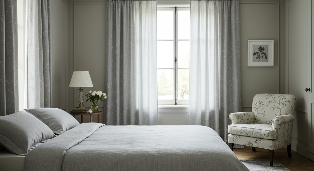
Light, subtle shades reduce visual tension. When walls and linens share gentle tones, the eye glides around without getting stuck on loud elements. Think of off-white, light beige, or soft gray. These colors act as a blank canvas that soothes. They’re also flexible enough for small or large rooms. Subtle color choices give you the freedom to rearrange decor or switch bedding without clashing.
Minimizing Visual Clutter
A calm bedroom isn’t only about color; it involves reducing clutter, too. Closets, nightstands, and open shelves can hold random items that draw attention. Keep surfaces tidy, and pick storage solutions that match the overall color palette. Clear surfaces and hidden storage help create a serene look. This step encourages a cleaner, calmer feel, and lets the color scheme remain the star.
Choosing a Base Color Scheme
Knowing Your Core Palette
Before you add accent pieces or fancy throws, figure out your core colors. You might pick one main hue and a secondary hue for contrast. Focus on gentle tones or muted versions of bolder colors to avoid a jarring vibe. This base anchors the entire space and acts as your guide for matching furniture, rugs, and accents.
Balancing Light and Dark
A restful bedroom can have both light and dark tones, as long as they blend well. For instance, a light gray wall pairs nicely with darker gray bed sheets or furniture. The contrast creates interest without feeling harsh. Aim for a few darker elements to ground the room. When balanced by lighter walls or drapes, the space feels restful but not bland.
Avoiding Overload
A single color can look flat if it’s everywhere. Consider using small pops of color to break things up. Accent pillows, throw blankets, or small decor items can inject life. Make sure they don’t overpower the core scheme. Stick to two or three accent colors at most, so the bedroom doesn’t feel chaotic. This approach helps each accent piece stand out in a thoughtful way.
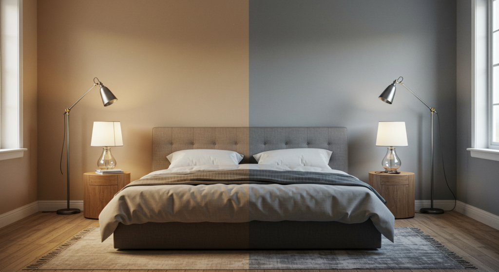
Warm or Cool Undertones
Understanding Undertones
Even subtle colors have undertones—warm or cool—that can change how a bedroom feels. Warm undertones have hints of beige, yellow, or pink. Cool undertones lean toward gray, blue, or green. Check paint swatches next to one another to see if they skew warm or cool. Small color shifts can decide whether a room reads “cozy” or “chilly.”
Selecting Based on Climate
In colder regions, warm undertones can bring a sense of snugness. In hotter areas, cool undertones might feel more refreshing. That said, there’s no strict rule. If you prefer a breezy vibe, pick a soft gray with a cool base. If you like cozy, go for warm neutrals. The key is matching the color’s effect with your preference and local setting.
Mixing for Balance
Some people choose a neutral with one undertone, then add accents with the opposite. For instance, a warm beige room might include a cool accent color, like a steel-blue throw. The slight contrast helps keep the room from feeling too hot or too cold. Plus, a mix of undertones can add complexity in a low-key, stylish way.
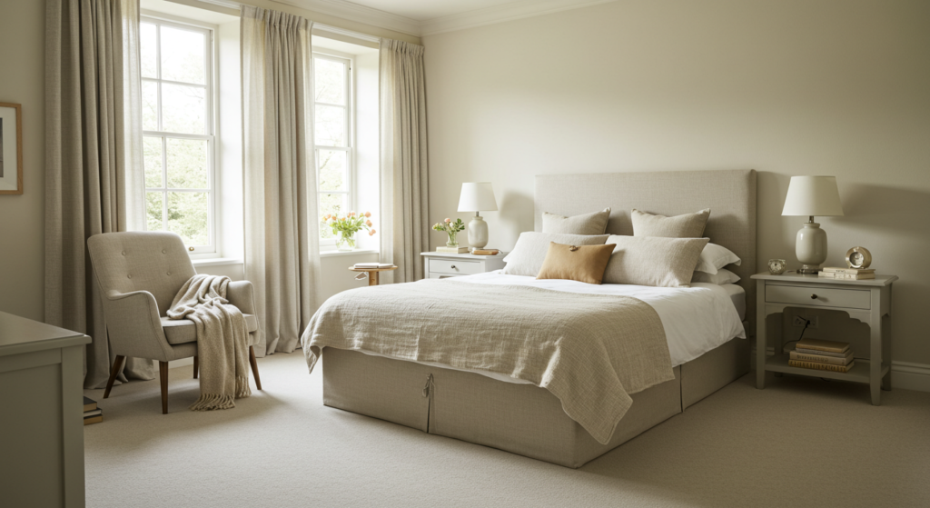
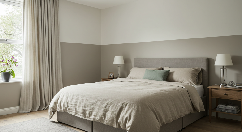
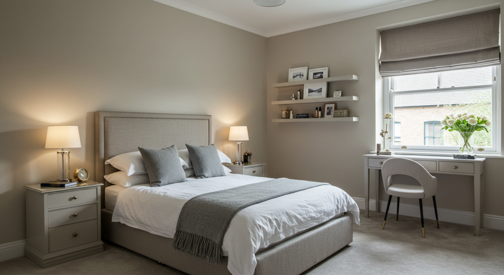
Neutral Palettes
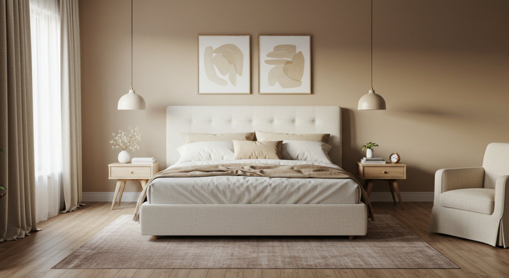
Versatility of Neutrals
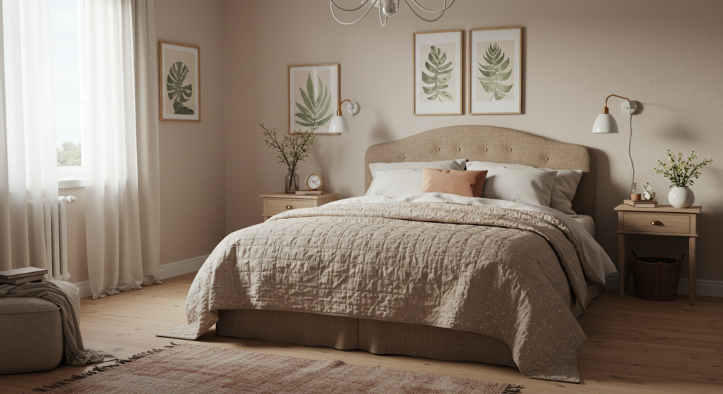
Neutrals are often favored in calming bedrooms for their versatility. Soft grays, beiges, creams, and off-whites adapt to different decor choices. You can update your bedding, add new curtains, or swap rugs without re-painting the walls. This flexibility makes neutral palettes a go-to option for people who like to switch things up.
Layering Shades of the Same Neutral
One way to keep a neutral bedroom interesting is by layering multiple shades of the same neutral. A darker gray headboard, mid-gray area rug, and pale gray wall can create a balanced scheme. Throw pillows in related shades unify the look. This layering approach avoids monotony while preserving a soothing quality.
Adding Soft Contrasts
Neutral doesn’t have to mean boring. You can add a slight pop of color, like soft sage or a hint of dusty lavender, against a background of cream or beige. The color stands out enough to grab interest but not so much that it overwhelms the room. Small accessories in these gentle hues keep things lively yet calm.
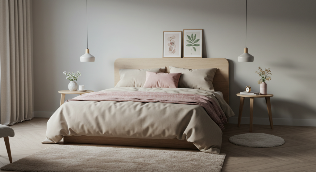
Soft Pastels
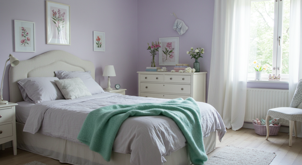
Subtle Appeal
Pastels—lavender, pale peach, or light mint—are known for their soft vibe. They suit bedrooms, thanks to their low saturation. When used properly, pastels enhance a gentle setting. Paint an accent wall in a light pastel, then carry that hue through throw pillows or artwork. This approach invites serenity without leaning on stark white or basic beige.
Pairing Pastels with Neutrals
Combine a pastel with a trusted neutral. For example, pastel pink bedding can look balanced with light gray walls. This mix keeps the room grounded. Neutrals help the pastel stand out, while the pastel adds a dash of sweetness. The combination feels airy and fresh, which promotes calm without being too cute.
Coordinating Finishes
If you’re using pastel in furniture or large surfaces, consider matte or eggshell finishes. Shiny finishes can appear loud and might clash with the quiet effect you want. Satin or matte surfaces absorb more light and blend in better with the rest of the space. When in doubt, test a small area to see how the finish interacts with room lighting.
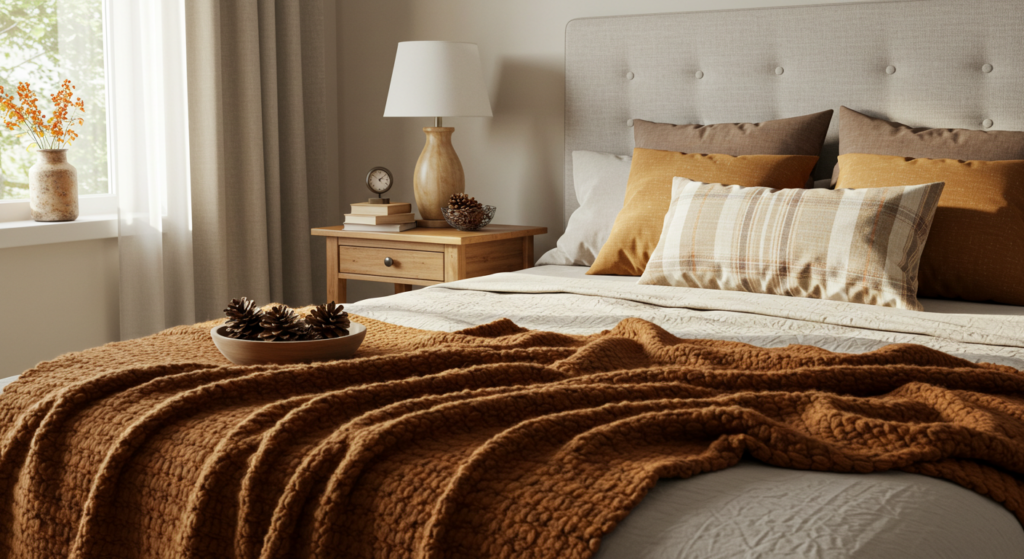
Deep, Relaxing Shades
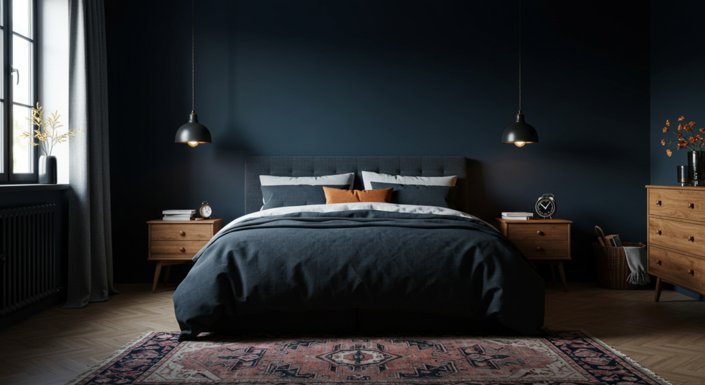
Rich Tones for Cozy Environments
Sometimes, bold, deep colors can calm more than bright whites. Navy blue, charcoal gray, or forest green can bring a cocoon-like feel. These tones work best in rooms with enough natural light, so they don’t feel too cave-like. They also pair well with light bedding and curtains, creating an intentional contrast that feels embracing rather than claustrophobic.
Strategic Accent Walls
If you’re not sure about painting all four walls in a deep shade, pick one accent wall. It can be the wall behind the bed, giving a strong backdrop to your headboard. The other walls might be a neutral or lighter tone that aligns with your accent. This technique adds drama but keeps the room from appearing dark.
Balancing with Soft Textiles
When using deep tones, balance them with soft textiles like plush rugs, thick blankets, or gentle throw pillows. These elements break up the depth of the walls or furniture. Subtle patterns on the bedding can also offset the dark hue. Aim for plush materials that invite touch and offer visual relief. The result is a snug retreat that doesn’t feel heavy.
Contrasting Textures and Accents
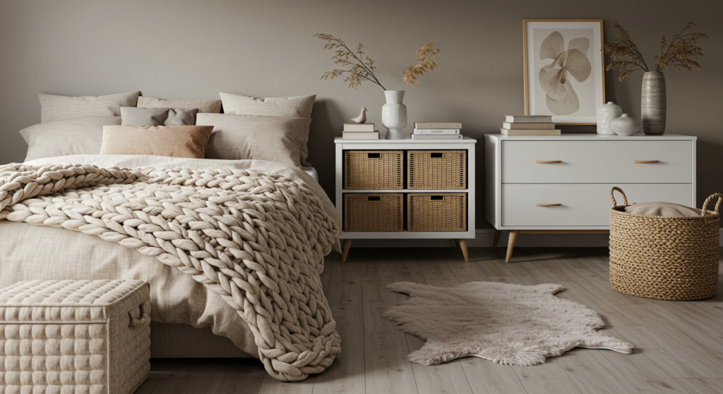
Layering Textures
A one-note bedroom can be dull, even if it’s calm. Texture helps. Think of velvet pillows, knitted blankets, or woven rugs. They add dimension without introducing jarring colors. By blending textures, you give your neutral or pastel scheme more depth. Just be sure the textures align with the overall calm theme—avoid overly shiny or loud materials.
Texture and Color Coordination
When combining textures, keep them in the same color family or within a narrow range. A beige linen duvet can go well with a chunky knit throw in a slightly darker beige. The subtle variation keeps the look unified. If you prefer more contrast, pick a gentle accent color, like dusty teal, in one textured piece. This method draws attention to the texture and the color without causing chaos.
Accents That Double as Storage
Accents aren’t limited to decorative items. Practical pieces can also be visually appealing. Consider a woven storage basket for blankets. Its texture adds charm while keeping linens tucked away. You might also hang a soft fabric wall organizer for small items. This approach blends style and function in a calming palette.
Patterns and Prints for Calm
Picking Subdued Prints
Patterns are tricky in calming spaces. Big, loud prints can overwhelm. Pick subdued, simple prints that align with your color scheme. Stripes, small dots, or tiny floral motifs can add detail without stealing focus. You might choose a light gray stripe on white curtains or a subtle geometric pattern on the duvet.
Mixing Patterns with Restraint
If you want multiple patterns, keep them in the same color range. A striped rug, a polka dot throw pillow, and a small plaid blanket could coexist if they share similar hues. Let one pattern be the main feature, while the others remain background. This keeps your bedroom from looking busy.
Minimizing Bold Contrasts
Large, contrasting patterns can disrupt a restful mood. Avoid high-contrast color combos like black and white for big surfaces. If you really want a bold pattern, try to confine it to smaller accents, like a pillow or a framed print. That way, the eye isn’t drawn away from the main vibe of the room, which should stay calm and balanced.
Lighting and Color
Natural Light and Soft Shades
Natural light can affect how colors appear in a bedroom. A beige wall might look warmer when sunlight hits it. If your room has abundant natural light, take advantage of gentle shades that glow softly. Curtains should filter light, not block it entirely. Sheer or light-diffusing fabrics help maintain a bright yet soothing atmosphere.
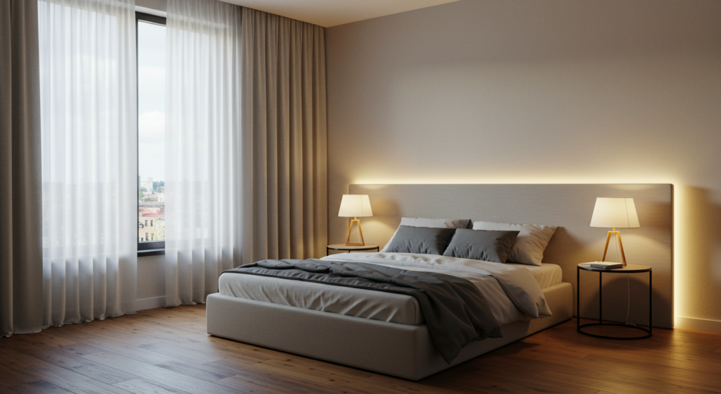
Artificial Light and Mood
Overhead lights can sometimes feel harsh. Instead, consider ambient or task lighting. Table lamps, wall sconces, or string lights create cozy pockets of illumination. Choose warm-toned bulbs for your lamps, especially if your color scheme leans toward cooler hues. This blend keeps the bedroom from feeling stark and fosters a restful state.
Coordinating Light Fixtures
Light fixtures themselves can be part of the color scheme. A neutral metal finish—like brushed nickel or a soft brass—ties in well with many color palettes. If you prefer something bolder, a pastel or muted shade on a lamp base can connect with your main color accents. Keep it subtle, so the fixture doesn’t demand all the attention in a peaceful setting.
Furniture and Color Harmony
Matching Furniture to the Palette
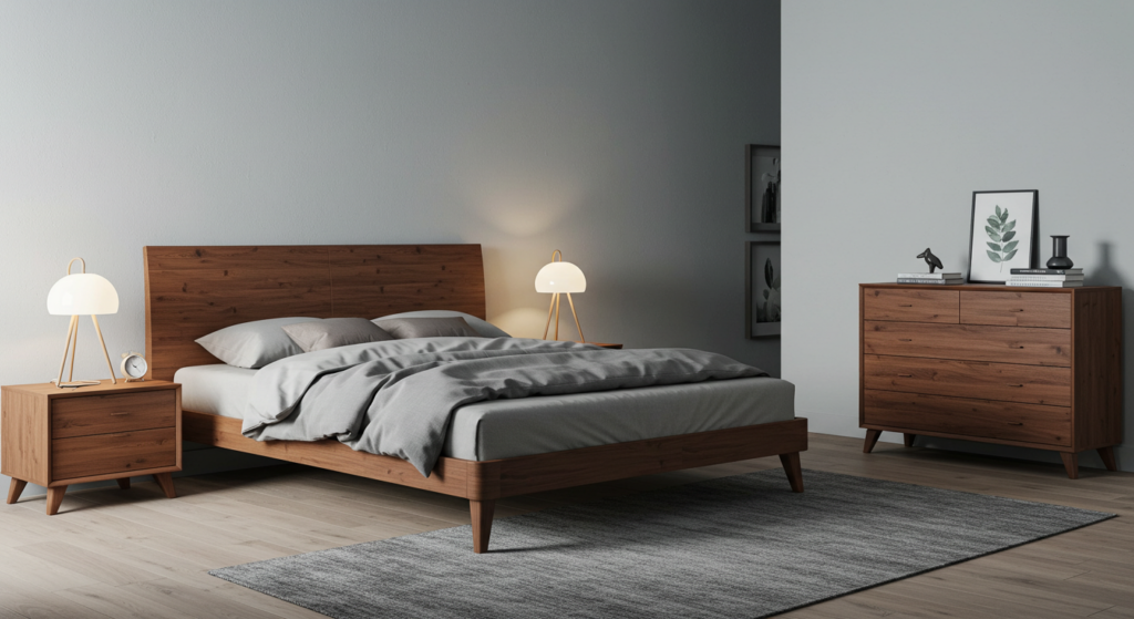
Furniture pieces, like dressers and bed frames, can take up visual space. Their color or finish should match the overall scheme. If your walls and bedding are soft neutrals, consider whitewashed wood or light gray furniture. If you love darker walls, black or deep walnut furniture might fit better. Consistent color helps the bedroom appear unified, which supports a sense of calm.
Soft Furnishings with Subtle Contrast
A cloth headboard or upholstered chair can be a place to introduce a gentle accent color. If the room is mostly light gray, try a headboard in a muted ocean-blue. This contrast breaks monotony and gives a focal point. You can tie it together with a matching throw pillow or curtain trim. Avoid intense colors to keep the focus on rest.
Scaling Furniture for Space
Large, bulky furniture can crowd a room, making it feel less calm. Consider the size of the bed, the dresser, and any nightstands. If the bedroom is small, opt for slim profiles with lighter finishes. If the space is big, you can include more substantial furniture, but space it out properly. Keep walkways clear to maintain an open, restful feel.
Accessories and Artwork
Choosing Accessories Wisely
Small decorative pieces—like vases, candle holders, or picture frames—can make or break a room’s vibe. Aim for a consistent palette across these items. If you have a neutral base, you might introduce a single accent color for all accessories. Keep them minimal to avoid clutter, and place them where they add interest without crowding surfaces.
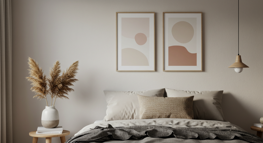
Artwork for Calm
Art can add personality to a bedroom, but avoid busy or jarring prints. Choose serene themes, like landscapes or abstract pieces in soft hues. Make sure the colors tie back to the main scheme. A large canvas above the headboard can serve as a focal point. If you prefer smaller artworks, try a gallery wall that features toned-down pieces with cohesive frames.
Reflective Elements
Mirrors or metallic pieces can enhance a room. A mirror bounces light around, which helps small bedrooms feel bigger. Metallic accent frames or small sculptures can work if they’re not too shiny. Choose finishes like brushed silver or antique gold. This subtle gleam complements neutral or pastel rooms, adding a hint of luxury without overwhelming the calm.
Seasonal Updates
Rotating Textiles
Seasons can affect how a bedroom feels. In colder months, thick blankets or flannel sheets in warming tones can add comfort. When it’s hotter, switch to lighter cotton or linen in cooler shades. This seasonal rotation keeps the bedroom from feeling stuffy. It also prevents color fatigue by refreshing your look a couple of times a year.
Seasonal Accent Colors
If you prefer neutrals on your walls, you can change up accent colors with the seasons. For instance, a mild rust tone or muted cinnamon for autumn, and a gentle mint green or dusty lilac for spring. Swap out accessories like throw blankets, accent pillows, or small decor items. This simple shift creates a fresh vibe each season without repainting.
Adapting to Temperature Shifts
Seasons also bring changes in light. Winter days may be gloomier, so you can introduce brighter lamps or lighter curtains. In summer, consider darker curtains if you need to block early morning light. Adjusting small details based on the season helps keep the bedroom comfortable and calm all year.
Maintenance and Upkeep

Simple Cleaning Routines
A calm bedroom can quickly turn messy. Dust and clutter gather fast. Set a regular schedule for simple cleaning tasks. Wipe down surfaces and vacuum floors at least once a week. Wash linens on a cycle that keeps them fresh and inviting. This minimal effort helps the space remain peaceful.
Refreshing Paint and Textiles
Walls can fade or get scuffed over time. If you spot chips or stains, keep a small container of leftover wall paint for touch-ups. For bedding, rotate sets to reduce wear. Replace older pillows and blankets that lose shape. Keeping everything in good shape supports the bedroom’s overall sense of rest.
Checking for Damage
Check furniture joints, loose knobs, and squeaky bed frames. Fix these right away so they don’t add small annoyances to your restful space. Also watch for outdated or broken decor that doesn’t fit your scheme anymore. Removing worn-out items keeps the room feeling new and serene, which is key for a calming environment.
Future-Proofing Your Bedroom
Timeless Color Choices
Trends come and go, but you don’t want to repaint every year. Timeless neutrals or soft, understated colors will likely stay relevant. If you want more excitement, keep it in accents or linens. That way, you can swap them out if you tire of a certain hue. This approach means less cost and effort over time.
Multipurpose Furniture
Bedrooms sometimes serve more than one function—like a reading nook or mini workspace. Pick furniture that’s easy to move or adapt. A small desk that doubles as a vanity, for example, can save space and keep your calm decor intact. If your needs change, you won’t have to do a total bedroom overhaul.
Flexible Decor Solutions
Hooks that hold seasonal wreaths, removable wall decals, or modular shelving units can let you update the bedroom with minimal fuss. These flexible features let you stay on top of decor trends (if desired) or adjust for new storage needs without shaking up the color scheme. That means your restful base remains consistent while your style evolves gently.
Conclusion
A calm bedroom relies on much more than walls painted in bland hues. It’s about mixing color choices, textures, lighting, and furniture in a cohesive way. From soft neutrals to muted pastels or even deeper shades, there’s a wide range of restful color routes.
Well-placed accessories, balanced light, and smart furniture scale also matter. Maintenance tasks—both seasonal and ongoing—keep the space inviting.
By choosing a gentle base palette, introducing subtle contrasts, and adding personal touches that don’t overwhelm, you create a sanctuary. This isn’t about short-lived trends. Rather, it’s about curating a timeless, restful bedroom.
The key is choosing colors and designs that fit your needs and promote a sense of calm. With these ideas, you can build a bedroom that feels peaceful and suits your taste for years to come.
Summary Table for Quick Reference
| Aspect | Key Points | Actionable Tip |
|---|---|---|
| Base Color Scheme | Focus on gentle or muted tones; balance light and dark | Choose two main colors, then add small accent pieces |
| Warm vs. Cool Undertones | Warm adds snugness, cool adds crispness | Test paint swatches under your room’s lighting |
| Neutrals | Flexible, easy to pair with accents | Layer multiple neutral shades for interest |
| Soft Pastels | Airy and soothing without being stark | Pair pastel with a neutral to avoid sweetness overload |
| Deep Shades | Cozy feel, best in rooms with natural light | Try a feature wall to prevent a cave-like setting |
| Textures & Accents | Adds depth without extra colors | Combine woven baskets, velvet cushions, or knit throws |
| Patterns & Prints | Stick to gentle prints; avoid big, bold contrasts | Keep them in similar color families |
| Lighting | Natural light complements soft hues; warm bulbs feel comforting | Use lamps or string lights for subtle ambience |
| Furniture Harmony | Match finishes and sizes to bedroom scale | Use lighter-toned furniture in small rooms; darker in spacious ones |
| Accessories & Artwork | Keep them minimal, cohesive with main palette | Choose subdued art and limit color variety |
| Seasonal Updates | Swap textiles or accent colors for freshness | Alternate between cozy flannels and lighter fabrics |
| Maintenance | Regular cleaning keeps the space neat | Touch up paint chips, replace worn decor |
| Future-Proofing | Timeless colors, flexible furniture, easy-to-update accents | Avoid major rework by sticking to a neutral base |
FAQ
Q1: How do I keep my bedroom color scheme cohesive if I like bold accents?
A1: Choose only one or two bold accent colors and keep your base palette neutral. This way, the bold items can shine without overpowering the room. Try pillows, small rugs, or wall art for those bold touches.
Q2: Is it okay to mix different wood finishes in one bedroom?
A2: It can work if you keep undertones consistent. Light oak can pair with a similar warm-toned pine, for example. If you prefer cooler undertones, match pale maple with grayish hues. Consistent undertones help everything blend seamlessly.
Q3: Can I use bright white walls in a calm bedroom?
A3: Yes, bright white can look calm when paired with soft accents. However, stark white might feel too sharp on its own. Add gentle curtains, cozy textiles, or warm lighting to prevent a sterile vibe.
Q4: How can I decorate a small bedroom without making it feel cramped?
A4: Go with lighter colors for walls and furniture. Use mirrors to reflect light, and choose minimal patterns. Keep decor functional, like a floating shelf instead of a bulky bookcase. This approach opens up the room.
Q5: Should I paint the ceiling to match the walls?
A5: Matching the ceiling can unify the space, but it might also make the room feel smaller. For most people, a slightly lighter shade on the ceiling is safest. If you want a more intimate feel, matching the wall color can create a cozy effect.
Q6: How often should I change my bedroom’s decor or color scheme?
A6: There’s no strict schedule. Some stick to minor updates each season, like swapping throw pillows or curtains. Others wait until paint starts to fade or tastes change. Keep a base that you like, then refresh accents as needed.
Crafted with a focus on clarity and practicality. This guide aims to support those looking to create a calm, inviting bedroom using thoughtful color approaches and simple decor tricks.

Neha Z. is not just any writer; she’s a storyteller who has graced the online world with her evocative prose for over half a decade. Venturing into the intricate nuances of women’s lives, she weaves stories that range from life’s highs and lows to the multifaceted essence of femininity. Each piece she pens radiates sincerity and artistry. As you delve into Neha’s musings, you’ll find reflections that echo your own journey and insights that inspire. Immerse yourself in her world, and let her stories touch your heart.
Reviewed By: Joanna Perez and Anna West
Edited By: Lenny Terra
Fact Checked By: Matthew Mansour
Photos Taken or Curated By: Matthew Mansour
