Key Takeaways
- Lighting considerations are critical for your dining room. Observe natural and artificial light levels before settling on any paint or wallpaper hue.
- Surface finishes and textures can change how color appears. Glossy, matte, and eggshell finishes each interact with light in distinct ways.
- Accent pieces such as rugs, curtains, and wall art can enhance or soften a chosen color. Thoughtful layering often boosts overall appeal.
- Color combinations help define unique design styles, from rustic farmhouse to sleek contemporary. Mix and match with care.
- Long-term practicality matters. Plan for potential updates to furniture or décor so that your color choice remains functional and appealing.
Selecting the right color for a dining room can transform a simple gathering space into a welcoming spot for festive dinners or casual bites. Color decisions are sometimes overwhelming, especially when factoring in room size, decor styles, and how each shade interacts with surrounding elements.
This guide explores a variety of color approaches and offers practical tips, all crafted to help people make solid choices for a dining area. It avoids deep theory about moods and instead focuses on real-world concerns, like how light interacts with wall paint, or how various finishes can shift a color’s intensity.
Whether the room is a large open-concept setup or a cozy alcove near the kitchen, the following sections share methods to refine each choice. Ideas about color pairings, furnishings, and even table shape get covered in detail, so the results can feel coherent and purposeful.
Different styles call for unique hues, and these insights can spark fresh inspiration while also addressing common challenges such as limited square footage or tricky layouts.
Below, find a step-by-step approach split into 14 main sections. Each section holds three practical subsections designed to help craft a dining room that pleases both the eye and the appetite.
From neutrals that showcase subtle elegance to unexpected combos that add visual interest, the information here serves as a roadmap for anyone hoping to get the most from a dining space.
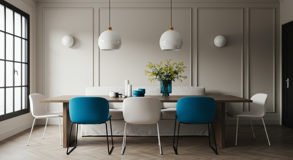
Neutrals and Their Hidden Depth
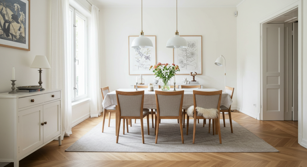
Soft White for a Fresh Canvas
Soft white walls help light bounce around, creating a clean ambiance. They suit spaces that get limited natural light or have darker furniture. When selecting a white, think about whether it leans warm or cool. Some whites feature a faint cream undertone that helps keep things cozy. Others tilt slightly gray, lending a sleeker impression. For a dining room with large windows, white can highlight scenic outdoor views while framing furniture gracefully.
Creamy Beige with Subtle Warmth
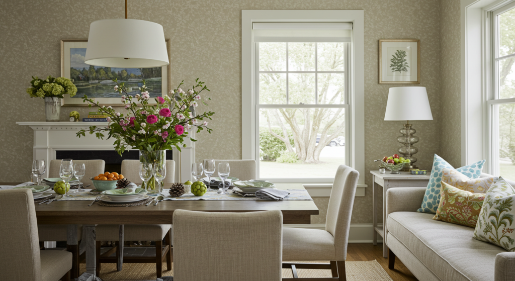
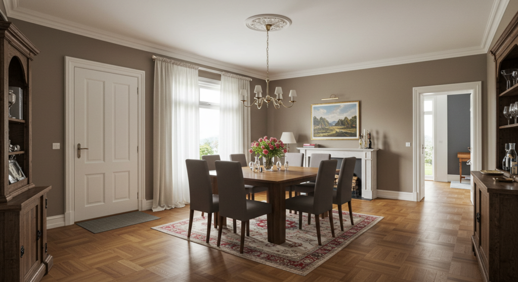
Beige sometimes gets a bad reputation for seeming bland, yet a creamy version can bring sophisticated comfort. It pairs well with darker wood furniture and intricate rugs. This shade can also act as a background for bold accent pieces, like patterned placemats or textured wall art. Choosing a beige that doesn’t lean too pink or too yellow helps the room look balanced, especially in overhead lighting.
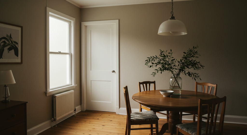
Taupe for Versatile Elegance
Taupe hovers between brown and gray, giving it flexibility. It can read as warm or cool depending on decor accents. A taupe dining room works well with metal fixtures, polished wood floors, and textured wallpapers. For trim, bright white or soft cream stands out in a pleasing way. Taupe is especially handy if the dining space connects to a living area, because it transitions smoothly from one room to the next.
Earthy Color Approaches
Olive Green for Organic Comfort
Olive green can give a dining room a grounded feeling without explicit references to color psychology. Combined with off-white trim or walnut furniture, olive resonates with natural elements. This shade can soften bold lighting fixtures or unify mismatched chairs. Neutral textiles, like a jute rug, complement the green for a more cohesive style. Subtle gold or brass accents, such as drawer handles or vases, look polished when set against olive walls.
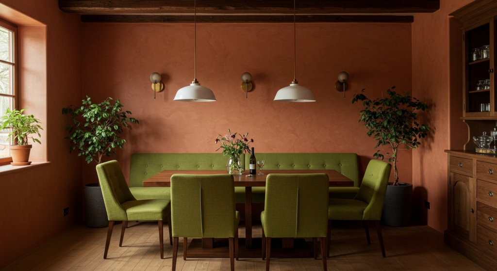
Terracotta for Warm Charm
Terracotta suggests a friendly, earthy vibe without delving into typical mood-based reasoning. Perfect for rooms that connect to a patio or garden, it creates a sense of continuity between indoor and outdoor areas. Terracotta pairs beautifully with rattan chairs, woven pendant lights, and linen curtains. A matte or eggshell finish reduces glare, allowing the hue’s warmth to feel more inviting. It also looks great with potted greenery for an extra layer of organic style.
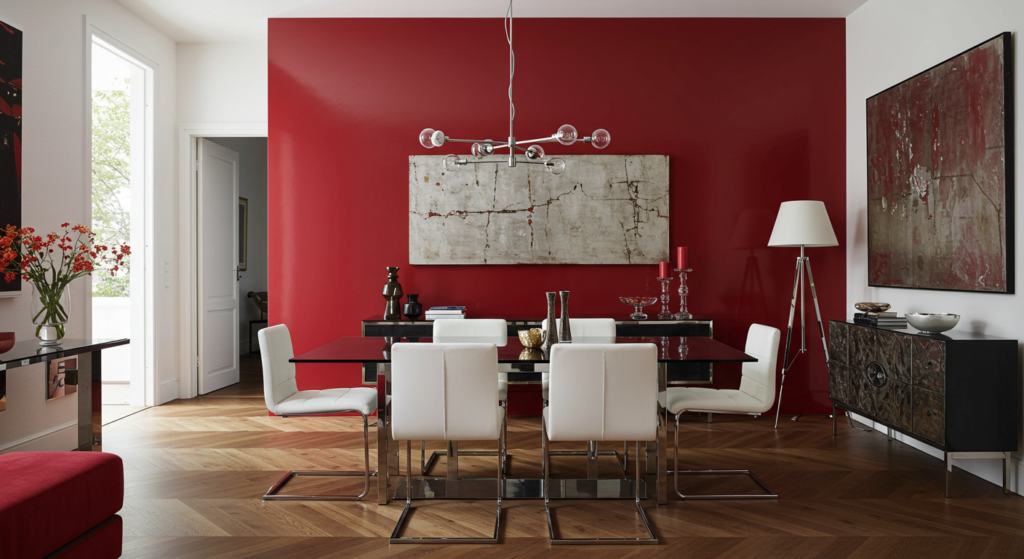
Burnt Sienna Highlights
Burnt sienna can feature as an accent wall or a broad trim color in a dining room with otherwise neutral walls. This hue anchors the space, especially when used in smaller doses around a fireplace mantel or window frames. It’s more dramatic than terracotta but still exudes that grounded charm. Punctuate it with black or dark bronze hardware to highlight architectural details. This approach works best in rooms with plenty of natural light since burnt sienna can lean intense if overapplied.
Modern Metallic Hints
Subtle Silver Accents
Some prefer to keep the walls neutral and lean on metallic finishes for shine. Silver frames, silvered mirrors, or brushed-steel light fixtures can accent lighter color palettes. Even a pale gray accent wall can carry a subtle metallic sheen if a specialized paint is applied. This approach adds visual depth to a dining room while avoiding flashy details. Silver pairs well with navy, white, black, or pastel tones that keep the palette serene.
Gold for Refined Drama
Gold elements might be introduced through a statement chandelier or gold-leaf trim on cabinet doors. For those who want a bit of glamour, gold works as a highlight on wainscoting or chair legs. When combined with deep jewel-toned seat cushions, gold stands out while still being tasteful. It’s wise to pick a brushed or antiqued finish, so it doesn’t seem too bright in everyday lighting. Subtle gold striping on an accent wall can also look striking when balanced by neutral furniture.
Copper and Rose Gold Touches
Copper and rose gold can soften a space if done with restraint. A single copper vase or a metallic table runner might be all that’s required. In a modern dining room with dark walls, copper stands out as a warm highlight. Overdoing it can make the room feel cluttered, so applying these metallics in small accents typically works best. Combine them with earthy neutrals and teak or oak furnishings for a cohesive mix of rustic and contemporary influences.
Rustic Farmhouse Inspirations

Off-White with Distressed Wood
A rustic farmhouse design often centers on natural wood textures, chipped paint finishes, and a lived-in feel. Off-white walls support that approach by shining a spotlight on reclaimed wooden beams or a vintage dining table. Soft lighting from metal or glass fixtures completes the cozy aesthetic. Accessories might include enamel pitchers or woven baskets for storing linens. It’s a look that can feel both curated and welcoming without the need for complicated color combos.
Sage Green with White Trim
Sage green is a calming yet sturdy shade that brings a subtle presence to farmhouse-inspired dining rooms. It pairs nicely with white trim, allowing the color to pop in a gentle way. Distressed wood chairs or a battered bench enhance the country vibe. For a layered look, consider incorporating a farm-style buffet cabinet in a matching or complementary shade. Dark metal hardware, like wrought iron drawer pulls, can complete the look.
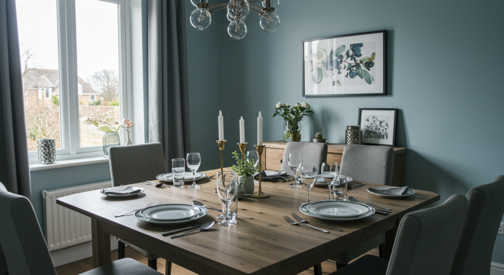
Muted Navy Accents
A muted navy accent wall stands out against lighter hues such as cream or beige. This shade can tie together wooden floors, metal pendant lights, and white place settings. In a farmhouse style, navy pairs well with gingham or striped curtains. The effect is classic but not plain. One might use it to frame a built-in cabinet or highlight a collection of vintage plates. Navy’s depth can make a modest dining room feel grounded in tradition.
Minimalist and Modern Combinations
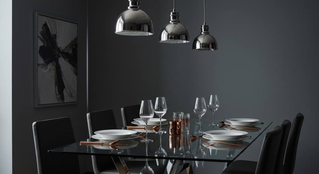
Grayscale Palette
For a sleek, modern approach, grayscale offers a strong foundation. Light gray walls can be offset by charcoal chairs or a white dining table. This color scheme focuses on contrast and precision. To keep it from looking cold, incorporate a soft rug or fabric panels in a gentle neutral shade. Modern light fixtures with clean lines enhance the minimalist vibe, while subtle greenery from potted plants prevents the space from appearing too sterile.
Warm Beige Meets Sharp Black
Warm beige walls can still serve a modern aesthetic when paired with black trim or black minimalist furniture. This interplay can create bold lines and focal points, especially in an open-concept layout. A black chandelier with geometric shapes might become a visual centerpiece. The synergy between warm beige and black appeals to fans of contemporary design who want a little warmth in the scheme. Minimal decorative items maintain the streamlined look.
Barely There Color Pops
A neutral modern space can come to life with small bursts of unexpected color. Imagine a mostly gray dining room with bright teal seat cushions or a single, bold piece of artwork. These pops energize the environment without forcing a full-on color commitment. Rotating these colorful accents by season or personal preference is easy, making it a flexible approach for dynamic decorators. Subtle shifting of accent pieces can transform the entire vibe while keeping walls a stable neutral base.
Coastal Breeze Influence

Light Blues for an Airy Feeling
Coastal-inspired dining rooms often feature breezy shades of blue. A soft sky-blue wall can hint at carefree days by the sea, especially when balanced by white trim and lighter woods. Rope-inspired pendant lights or driftwood-style furniture add a seaside touch. Simple ceramic plates, possibly in aqua or teal, complement the overall scheme. Open shelving with glassware ties into the relaxed tone without feeling forced.
Crisp Whites with Seafoam Accents
Crisp white walls combined with seafoam accessories can evoke a fresh coastal appeal. Consider seafoam seat cushions, table runners, or curtains. In a well-lit dining room, these subtle color touches feel bright and clean. Weathered finishes on accent pieces, like a sideboard or console, can further the beachy ambiance. A large window with airy drapes completes the look, letting light flow freely throughout the space.
Sandy Neutrals for Subtle Hints
Sandy neutrals, such as a buff or tan, look at home in coastal-inspired dining areas. They mimic sunlit shores without resorting to cheesy motifs. Pair them with nautical elements like rope baskets or striped table linens. White wicker or rattan chairs also fit well, giving a layered but relaxed atmosphere. If a pop of color is needed, a single turquoise vase or a few shells on a shelf can do the trick.
Vintage and Retro Twists
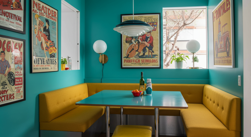
Bold Teal Walls
Retro dining rooms sometimes embrace bright teal for a nostalgic vibe. This color can link classic wood pieces and modern-day appliances in a single cohesive look. Teal pairs well with black-and-white tile floors, chrome light fixtures, or older diner-style seating. A mid-century dining table with tapered legs also complements the teal backdrop. Careful selection of additional colors is crucial, so the bold hue stays in the spotlight without getting overwhelming.
Mustard as an Accent
Mustard yellow can bring a retro flair to chairs, curtains, or even a single wall. In moderation, it offers a warm backdrop for classic mid-century furniture or geometric-patterned rugs. If the rest of the walls are neutral, a mustard accent can guide the eye and spark conversation. Pair it with teak or walnut to enhance that vintage feel. Solid white dinnerware on open shelves also stands out in a pleasing way against a mustard wall.
Powder Pink Surprises
Powder pink might sound whimsical, but in a retro context, it can look charming. It recalls the pastel style found in older kitchens or dining nooks. A pastel pink wall combined with touches of gray and metallic finishes can avoid any overly sweet impression. Set it next to a mint-green accent piece for a true retro revival, or offset it with black-and-white décor if a sharper contrast is preferred. Keeping furniture lines simple helps prevent visual clutter.
Bohemian Flair
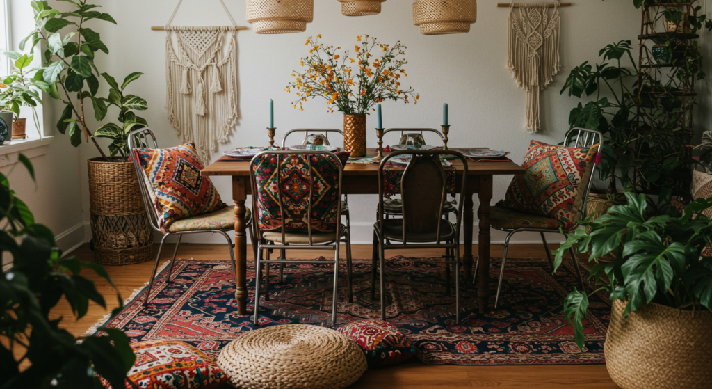
Mixed Jewel Tones
Bohemian dining rooms might showcase a tapestry of jewel tones: emerald, sapphire, or deep violet. The key is to balance these colors with neutral elements, such as natural wood floors or rattan seating. Artwork and textiles can tie all the bold shades together. For example, a patterned rug with multiple jewel tones can unify mismatched chairs or seat cushions in complementary shades. The result feels free-spirited while remaining visually grounded.
Layered Textures
In a boho setting, color is only one piece of the puzzle. Layering textures through macramé wall hangings, woven placemats, or crocheted chair covers adds depth. Colors might be bright or muted, but the variety of materials creates a sense of relaxed abundance. Subtle color differences among pillows or rugs can unify the overall design. Earthy tones—like rust, amber, or warm gray—often serve as a base, allowing the textures to shine.
Eclectic Furniture Choices
Instead of uniform sets, a bohemian dining room mixes chairs from different styles or eras. One might be painted teal, another left in natural wood, and a third upholstered in a patterned fabric. This approach injects color in unexpected ways, bypassing the need to coat an entire wall in a bold hue. A unifying element, such as a central chandelier or a large centerpiece, keeps the assortment from feeling random.
Industrial-Inspired Options
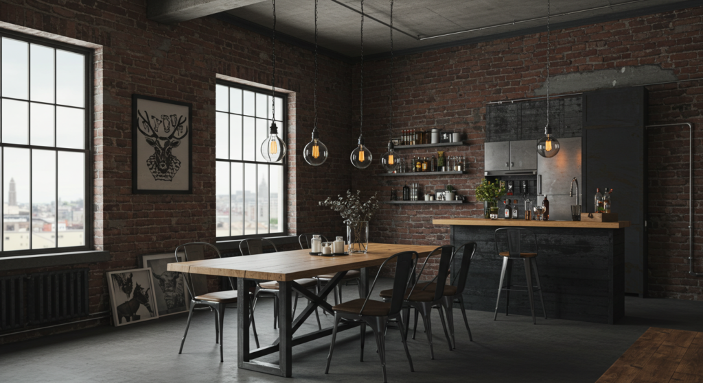
Charcoal Gray Backdrop
Industrial dining spaces sometimes favor grays that mimic concrete or metal. A charcoal wall behind open shelving or a brick-like veneer can set the stage. Wooden tables with black steel legs reinforce the industrial vibe. Exposed beams or ductwork, if available, further emphasize this style. Light fixtures might involve metal cages or Edison-style bulbs. Painting or finishing the wall in a textured way can suggest the raw authenticity that industrial themes celebrate.
Deep Brown Accents
Deep brown can appear through stained wood furniture, leather chairs, or floating wooden shelves. When combined with gray or black backgrounds, these rich browns stand out. They lend a sense of warmth that stops an industrial design from feeling too stark. Metal surfaces, such as stainless-steel sideboards, might also join the palette. The interplay of brown, black, and gray can be the main color scheme, highlighted by an occasional pop of white or rusted-red décor.
Exposed Brick Contrast
Exposed brick, whether real or faux, is a hallmark of industrial style. Brick itself has distinct color variations: reds, oranges, or browns. Pairing it with neutrals like gray or black can frame the brick as a focal point. If a dining room lacks actual brick, using brick-textured wallpaper or veneer can mimic the look. Simple metal shelving or a steel console table completes the effect. White dishware often stands out against these raw surfaces in a pleasant manner.
Sleek and Contemporary
High-Gloss Finishes
Contemporary dining rooms embrace crisp lines and modern materials. High-gloss paint on a feature wall reflects light, creating a slightly futuristic feel. Colors might include bold black, bright white, or even a deep red. The rest of the walls might remain neutral to highlight the glossy section. Sleek dining furniture, glass tabletops, or polished stone floors fit right in. This is a style that loves reflective surfaces, so mirrors or shiny metal art may also appear.
Monochromatic Schemes
A monochromatic scheme can mean picking one main color and using different shades of it. For instance, a palette of varying grays might run from pale silver to near-black charcoal, creating depth. In a dining room, consider painting trim or wainscoting in a slightly darker tone than the walls to add subtle dimension. Modern chandeliers or sculptural centerpieces can break up any monotony. Simple window treatments keep the look clean.
Bold Accents in a Neutral Room
Sometimes, contemporary design showcases one strong accent color against a base of neutrals. Bright red chairs in an otherwise white dining room spark excitement. A single aqua wall in a gray environment draws attention to a bar cart or shelving unit. Contemporary style often embraces minimal clutter, so these accents become statements. Reflective or sleek surfaces around the space ensure that each focal point stands out.
Cozy Cottage Character
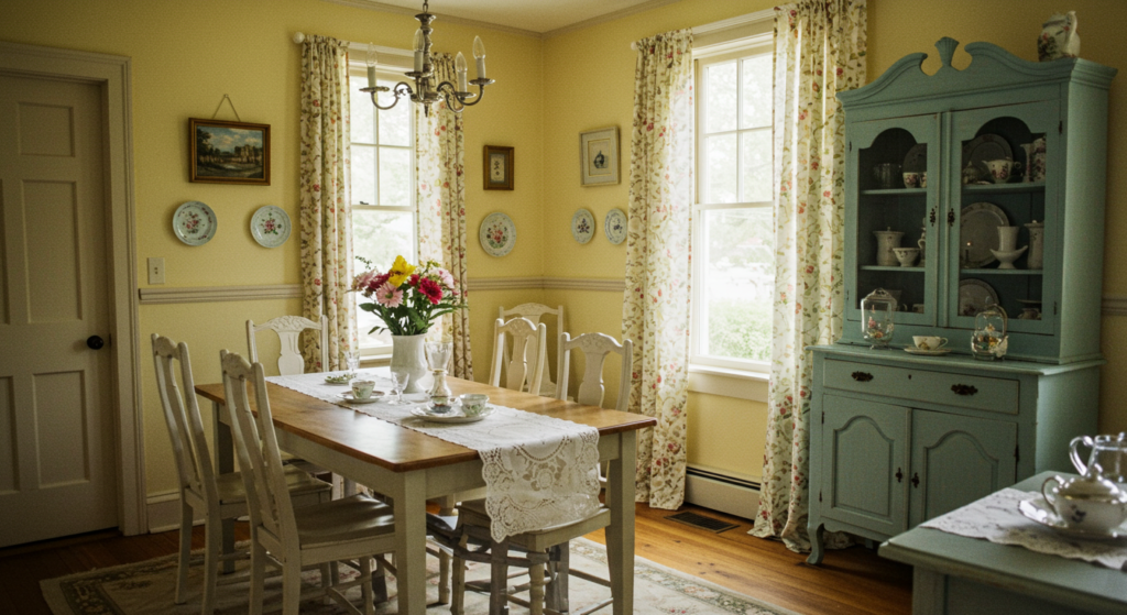
Pale Yellow Walls
Pale yellow is often associated with cottage charm. Though this color could veer into “psychology” territory, it can also be seen as a simple way to brighten a small dining nook. Natural wood chairs or white slipcovers keep the space feeling casual. Consider using beadboard or shiplap walls for added texture. Vintage floral prints on seat cushions or curtains can reinforce the quaint look without seeming too busy.
Soft Gray with Floral Details
Soft gray walls can also work in a cottage dining room, especially when paired with floral accents. Table runners, seat cushions, or window treatments in floral patterns bring gentle color. White or pastel dishware stored in open cabinetry can serve as decorative elements. Warm wooden floors or a rug with a subtle pattern will ground the space. This combination suits diners who want a gentle backdrop that allows decorative touches to stand out.
Light Wood Tones
Light wood tables, chairs, or flooring can keep the cottage vibe feeling open and airy. Pine, oak, or birch often fits. These wood tones pair well with pastel or white walls. To amplify the cottage style, add some crocheted doilies or lace curtains. A few antique plates displayed on a wall rack also hint at a cozy past. This approach invites layering with different small-scale patterns, provided the color palette stays unified.
Mixing Warm and Cool Tones
Balancing Blue and Brown
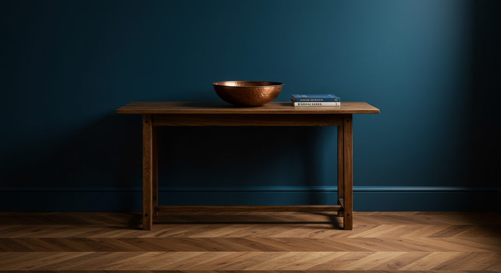
Blue and brown can harmonize when used carefully. For instance, a royal blue accent wall paired with medium-brown hardwood floors can achieve balance. Blue seat cushions or a patterned tablecloth that ties in brown elements look cohesive. A decorative vase with copper undertones can link the warm floor to the cooler wall. This combination suits those who want a bit of energy without going too bright or edgy.
Pairing Gray with Warm Reds
Gray walls often read cool. Adding warm red curtains or a crimson rug can create a dynamic contrast. It’s advisable to choose a gray that isn’t overly cold to avoid an awkward clash. If there’s a brick fireplace or a stone feature, the red can draw attention to it. Metal decor, such as black iron candle holders, can add an extra layer of interest. This scheme might suit a dining room that doubles as a family space.
Green Accents in a Neutral Space
Many neutral dining rooms gain life from a single cool color such as green. Whether it’s sage or hunter, green can appear on chair cushions, table settings, or a buffet cabinet. If the walls are beige or off-white, adding green keeps the palette from feeling bland. A tall plant in a simple pot can reinforce this emphasis on green, bridging decorative items with the room’s natural elements like wooden floors or simple textiles.
Patterned Walls and Features
Striped Walls
Striped walls can make a small dining room look taller or longer. Vertical stripes draw the eyes upward, while horizontal stripes expand the sense of width. Thinner stripes offer a subtle texture, whereas bold stripes create a strong statement. The color choices for stripes can vary—maybe a tone-on-tone approach in two shades of gray, or white stripes against a pastel background. Keeping stripes symmetrical helps avoid a busy effect.
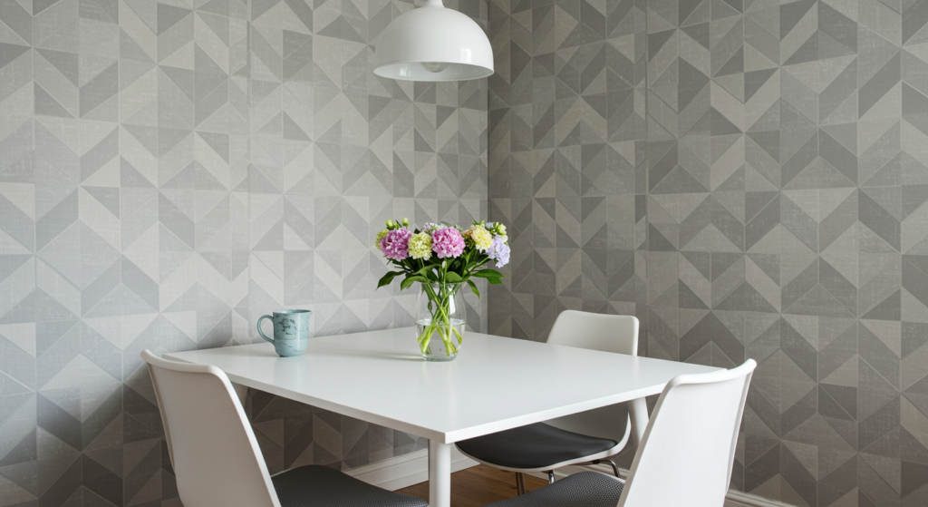
Geometric Stencils
Geometric stencils or wallpaper can introduce a modern, playful note. Patterns like honeycomb, chevron, or triangles can appear on one accent wall, behind a built-in bench, or around a serving area. The color scheme might match the rest of the room or contrast deliberately. If the pattern is large, scale back on other decor so the dining room doesn’t feel crowded. Smaller geometric prints work well for curtains or seat covers if the walls remain solid.
Floral or Damask Prints
For a more classic look, floral or damask prints deliver an elegant flair. They fit formal dining rooms with traditional furniture and ornate chandeliers. Consider a single wall in a muted floral pattern, then paint the remaining walls a coordinating solid color. This approach adds romance and detail without overwhelming the room. A table runner or matching curtains can echo the pattern, tying everything together in a graceful way.
Paint Finishes and Textures

Matte Finish for Subtle Charm
Matte paint soaks up light instead of reflecting it, giving colors a subdued strength. In a dining room, it can hide minor wall imperfections and create an intimate feeling. Matte walls benefit from accent lighting, like sconces or soft overhead fixtures. If the color is dark, adding a metallic or glossy accent can prevent a flat look. Certain brands now offer washable matte options, which helps with maintenance where food or drink might cause splatters.
Eggshell for Versatility
Eggshell is one step glossier than matte, reflecting a bit of light while still masking imperfections. It’s often chosen for dining rooms because it’s fairly easy to clean, which is useful if younger family members are around. Eggshell works with both light and dark colors. Neutral eggshell walls can highlight bolder furniture, while deep-colored eggshell paint can make a statement wall that still feels refined. Maintaining an eggshell surface is simpler than dealing with high gloss.
High Gloss for Dramatic Statements
High gloss reflects a significant amount of light. It’s usually reserved for trim, doors, or accent furniture rather than entire walls. In a dining room, painting the trim in a glossy finish can frame the space. When used on a ceiling, high gloss can introduce a mirror-like effect, especially if overhead lighting is carefully chosen. It’s more formal and can become a showstopper in a space aimed at entertaining. Dust and smudges show more easily, but some find the payoff worth it.
Seasonal Adaptations
Spring Refresh
During spring, lighter pastel accents or fresh linens might breathe new life into a dining room. Painting a small accent wall in a soft peach or mint can liven up the space. Simple flower arrangements or floral fabric on chairs can pull the look together. This strategy can be reversed or shifted once the season changes, meaning a flexible color scheme is a plus. Maintain a neutral base if frequent updates are planned.
Summer Vibrancy
Summer can inspire bolder color infusions. Bright chairs, a vivid table runner, or colorful dishware might come into play. These energetic changes don’t require repainting the entire room. If the walls are white or neutral, adding a zesty hue—like lime green or sunshine yellow—through decor can feel extra fresh. Lightweight curtains let in more air and light, enhancing the summery vibe while keeping the dining room open and breezy.
Cozy Fall and Winter Tones
For the cooler months, warmer colors and thicker textiles often appear. Burgundy, rust, and deep green table accents can create a snug atmosphere. If the walls are neutral, these pieces stand out. Some also switch to richer window treatments or a plush rug during winter. Subtle changes in linens or centerpiece arrangements can transform a dining space without repainting every season. Consider rearranging artwork to showcase deeper hues that match those cozy months.
Conclusion
A dining room often hosts gatherings, family meals, and special celebrations. Choosing the right color plays a big part in shaping its overall appeal. The sections above offered a range of ideas—from neutrals with hidden depth to industrial grays and bold retro hues.
Each approach can highlight unique design preferences, all without resorting to simple “color psychology” talk. Instead, the focus remains on practicality, cohesion, and how color interacts with decor, lighting, and texture.
An inviting dining room doesn’t need to follow strict formulas. Certain homes shine with subtle neutrals, while others may sparkle under a metallic accent or pop with a bright retro wall.
Observing a space’s natural light, noting its architectural features, and deciding on a complementary color strategy can lead to a satisfying result.
Whether the style is farmhouse cozy, bohemian eclectic, or slick and modern, the right color choice will help create a welcome environment for everyday life and memorable get-togethers.
Summary Table
| Design Approach | Key Color Focus | Recommended Pairings | Best For |
|---|---|---|---|
| Neutrals | Soft white, cream, taupe | Dark wood, subtle metallic finishes | Brightening small spaces or multi-use areas |
| Earthy | Olive, terracotta, burnt sienna | Natural wood, wicker accents | Homes with a warm, organic emphasis |
| Modern Metallics | Silver, gold, copper | Neutral walls, minimal patterns | Adding a refined, updated feel |
| Rustic Farmhouse | Off-white, sage, muted navy | Distressed wood, metal light fixtures | Cozy and welcoming style |
| Minimalist & Modern | Grayscale, beige & black | Clean lines, single accent color | Sleek, clutter-free looks |
| Coastal | Light blue, crisp white, seafoam | Rattan, driftwood finishes | Fresh, airy dining areas |
| Vintage & Retro | Teal, mustard, powder pink | Chrome, mid-century furniture | Nostalgic or playful themes |
| Bohemian | Mixed jewel tones, layered textures | Eclectic seating, woven textiles | Free-spirited, artistic designs |
| Industrial | Charcoal gray, exposed brick | Metal fixtures, raw wood surfaces | Edgy, urban-inspired layouts |
| Contemporary | High gloss, monochromatic | Reflective surfaces, sculptural decor | Sophisticated modern spaces |
| Cottage | Pale yellow, soft gray, light wood | Beadboard, floral prints | Cozy, traditional charm |
| Warm & Cool Mix | Blue & brown, gray & red, green pops | Balanced neutrals, subtle decor | Uniting contrasting palettes |
| Patterned Walls | Stripes, geometric, floral | Coordinating or matching solid walls | Adding texture and visual interest |
| Paint Finishes | Matte, eggshell, high gloss | Complementary trim or furniture | Defining the room’s overall feel |
FAQ
- How to test a color without painting the entire room?
Try paint samples on large poster boards. Move them around the dining room at different times of day. This method allows a clearer view of how the shade might shift under various lighting conditions. - Is one accent wall enough to make an impact?
Yes. An accent wall can anchor the space and highlight key features like an art collection or a unique light fixture. Even a small pop of color can stand out if the rest of the room is neutral. - Which finish is easiest to maintain in a dining room with kids?
Eggshell or satin finishes are easy to wipe clean. These finishes resist light scuffs and handle occasional spills better than matte. Consider a washable paint formula for extra durability. - Can small dining rooms use dark colors without feeling cramped?
Certainly. Darker shades can add depth if balanced with lighter furniture, reflective surfaces, or strategic lighting. Using mirrors or a glossy finish on some surfaces helps prevent the room from feeling enclosed. - Do metallic accents date quickly?
Not always. Subtler metallic touches, like brushed gold or copper, can remain timeless if matched with suitable decor. Trends come and go, but subtle finishes paired with consistent design elements tend to age gracefully. - What if the dining room opens to other areas?
Choose colors that flow with adjacent spaces. If the living room has warm neutrals, ensure the dining space ties in with a related hue or accent. A cohesive palette helps unify open-concept layouts. - How to switch from a farmhouse style to a contemporary style?
Start by repainting walls with a sleek neutral shade or a monochrome scheme. Next, replace heavy wood or distressed furniture with modern pieces that have clean lines. Introduce reflective surfaces or minimal artwork to drive the shift. - Should the ceiling color match the walls?
It depends on the height of the ceiling and desired look. Matching colors can create an enveloping effect. Painting the ceiling white, if walls are dark, can help bounce light and open up the space. - Can patterned wallpaper work with multiple colors in the same room?
Yes, but keep one main pattern as the focal point. If the wallpaper is bold, pick subtle shades for accent furniture or curtains. Too many patterns or strong hues can overwhelm the space. - How often should dining room colors be refreshed?
There’s no strict rule. Some refresh every few years to stay current. Others keep the same base color but update accessories seasonally. Regularly evaluating wear and tear, especially near high-traffic spots, might guide timing.
This comprehensive guide aims to clarify color choices for a dining room that feels both personal and enduring. By mixing practical considerations with fresh creativity, it provides a starting point for anyone ready to explore new colors, finishes, and design elements. A well-chosen dining room color scheme can bring daily meals and gatherings to life in a simple, yet striking way.

Matthew Mansour, known in the fashion world as a storytelling virtuoso, weaves captivating tales centered around the mesmerizing universe of fashion hues. Possessing a sharp eye for detail, Matthew explores the profound layers of color combinations, turning the simple act of choosing an outfit into a lively adventure. His unique ability to blend emotion and innovation into his writings sets him apart in the sartorial sphere. Each article penned by him carries a touch of magic, inspiring readers to embark on a colorful odyssey through the diverse landscape of apparel shades.
Reviewed By: Joanna Perez and Anna West
Edited By: Lenny Terra
Fact Checked By: Marcella Raskin
Photos Taken or Curated By: Matthew Mansour
