Key Takeaways
- Choose colors that match your dining room’s size, light levels, and style.
- Keep a mix of base, accent, and highlight tones in mind for depth.
- Balance furnishings, lighting, and decor elements to support your chosen palette.
- Include small touches like napkins or centerpieces that blend with your main colors.
- Think about paint finishes that add texture or reflect light without overshadowing your theme.
How do you set up an elegant dining room that invites friends to linger? Do you wonder if a dark color might shrink the space or if a bright shade might blind your dinner guests? Some folks worry about picking colors that clash with the rest of the house.
I’ve definitely made that mistake once. I painted my dining room a color that looked like wet cement. It was so sad that my guests politely said, “This is…interesting.” After that fiasco, I learned how crucial the right color palette is for entertaining.
A lovely dining room isn’t about typical design rules. It’s about a thoughtful mix of shades, accents, and textures that make your entertaining area shine.
We’ll cover ideas that help you create a feast for the eyes, from crisp white schemes to dramatic navy or subtle sage. We’ll also explore finishes, accessories, and small decorative items that tie it all together.
Get ready, because by the end, you’ll be armed with fresh ways to choose the best color palette for a refined but comfy dining room.
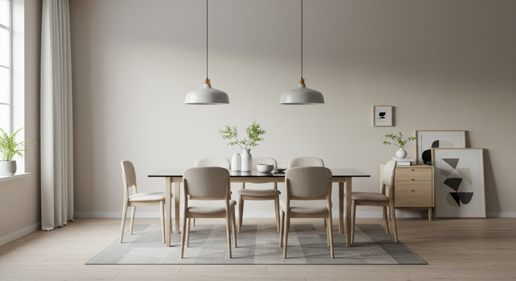
Crisp White Elegance
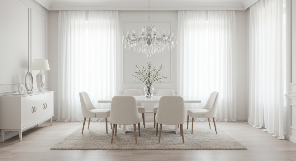
When people picture pure elegance, many see white tablecloths and porcelain dinnerware. A crisp white palette can create that clean vibe. But how can you make it feel welcoming, not sterile? Let’s see.
Layered Whites for Visual Depth
A bright white base can sometimes look flat. Instead, mix slightly off-white shades. For the walls, pick a matte white paint. For trim, pick a brighter tone with a gentle sheen. This small contrast will keep the room from feeling monotone. Some folks even choose rugs in a warmer cream hue to add depth underfoot.
Product suggestions:
- Chalky white paint for walls
- Satin-finish white trim paint
- Cream or ivory area rug
Subtle Metallic Accents
White offers a perfect backdrop for shimmer. A couple of metallic items add spark without stealing attention. Maybe a silver-framed mirror, or some brushed-gold candle holders on the table. This subdued shine keeps the room lively. People rarely guess how a tiny bit of metal lifts an all-white dining space.
Ideas:
- Silver or brass chandelier
- Gold-rimmed serving bowls
- Copper or bronze vases
Warm Textiles to Prevent Coldness
A white dining area may look chilly if you skip cozy textiles. Linen curtains, a chunky woven table runner, or plush seat cushions can soften that effect. You can also slip in woven baskets that hold napkins or cutlery. These details will keep the ambiance calm, not stark.
Tips:
- Use linen curtains in a neutral cream
- Choose seat cushions with subtle texture
- Place a warm-toned centerpiece like driftwood or rattan
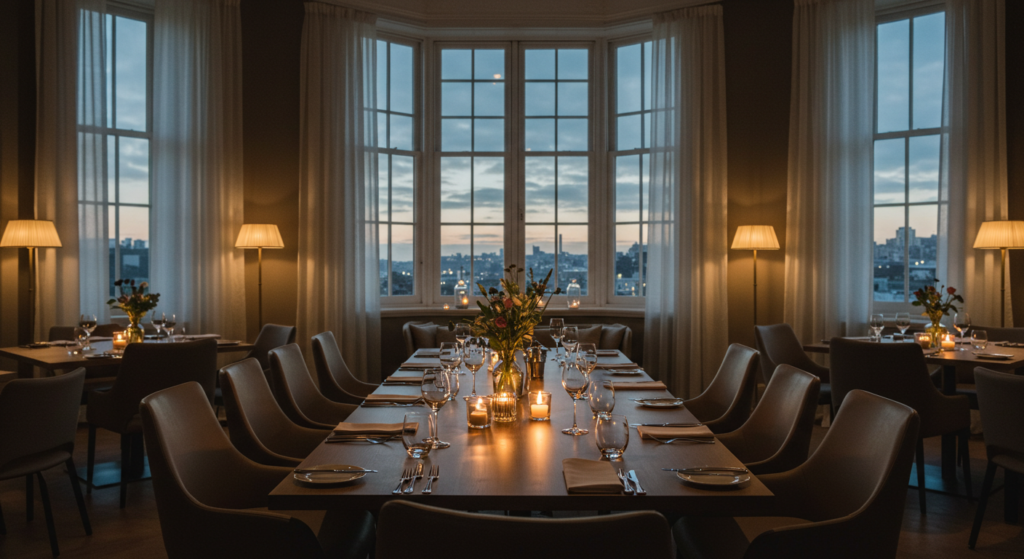
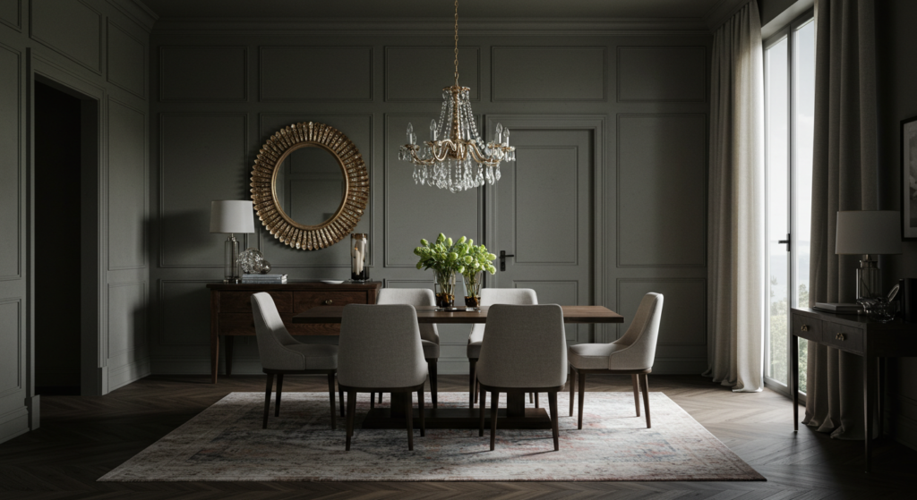
Moody Charcoal Depth
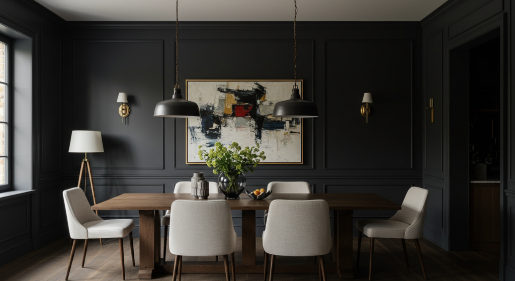
Not everyone wants a bright space. A charcoal dining room can feel bold, especially when the right accessories step up to the plate. Is it too dark? Not if you choose lighting and details that balance the drama.
Balancing Dark Walls with Lighting
A charcoal scheme thrives when you have decent light. Use a chandelier or pendant that aims soft light onto the table. Add wall sconces that scatter light outward. This helps the entire room glow, and your guests won’t feel like they’re lost in a cave.
Lighting picks:
- Mid-century modern pendant lamps
- Metallic or glass wall sconces
- Accent lamps near sideboards
Contrast with Lighter Furniture
Dark walls pair well with lighter furniture. A white dining table or chairs with cream upholstery pop against smoky walls. Some folks place a large white artwork to break up the darkness. That high contrast adds interest and keeps the space from looking heavy.
Decor elements:
- White or beige upholstered chairs
- Light wood sideboard
- Pale area rug with a subtle pattern
Using Charcoal on Accent Walls
Maybe you aren’t ready to go full charcoal. You can paint just one wall and keep the rest in a lighter gray or white. This style trick stops the room from feeling small. It can also be more budget-friendly, especially if you experiment with dramatic paint for the first time.
Tips:
- Limit charcoal to the wall behind your dining table
- Use large mirrors to reflect light
- Introduce bright linens and plates for contrast
Warm Beige Sophistication
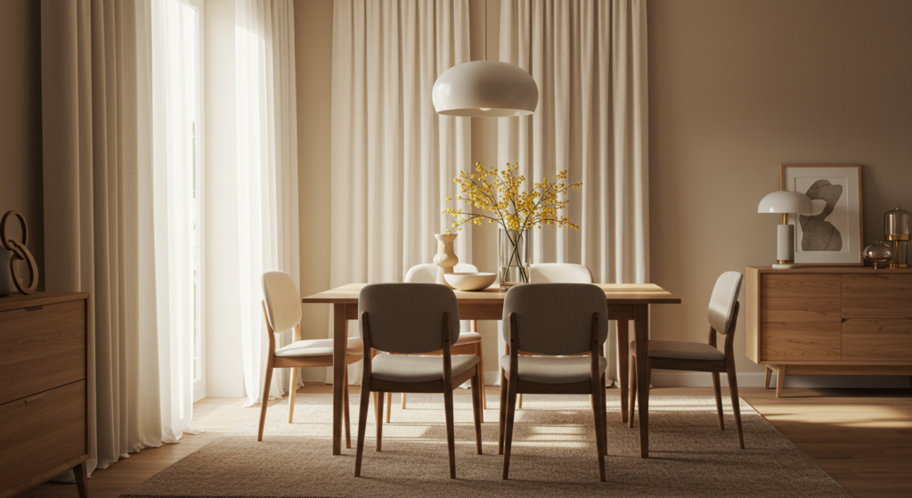
Beige often gets teased for being boring. But in a dining room, a well-chosen beige can be downright chic. Picture a cozy, upscale restaurant with creamy wallpaper. That’s the vibe you can recreate at home.
Choosing the Right Undertone
Beige can go peach, yellow, or pink. Some folks forget that not all beige is the same. Hold swatches next to your existing furniture. If your chairs have a warm brown tone, pick a beige that leans slightly golden to match. This avoids a mismatch that your eye might notice right away.
Check:
- Swatch with your wooden chair color
- Compare to your table’s undertones
- Look at paint in both morning and evening light
Pairing with Wood Accents
Beige walls pair beautifully with wooden pieces. A walnut or oak table can stand out against the backdrop, while a beige or cream hutch ties the scheme together. Add small wooden frames or bowls for continuity.
Wood synergy:
- Hang wooden frames or a wooden clock
- Display wooden salad bowls on a sideboard
- Use wooden candle holders for the table
Highlighting with Muted Colors
If you find beige too neutral, add a soft accent color. Pale blues or soft greens can brighten table runners or seat cushions. A small accent color helps the space pop but doesn’t steal the spotlight from the main scheme. Avoid bold hues that overshadow the cozy vibe.
Suggested combos:
- Beige + pale blue linens
- Beige + sage table centerpieces
- Beige + gentle lavender chair pillows
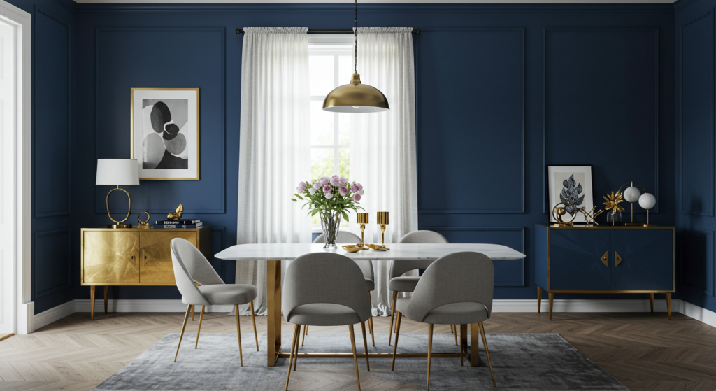
Bold Navy Accents
Navy can bring sophistication. It’s deeper than many blues and can create a memorable look. The trick is balancing navy with other design choices so the dining room remains inviting, not formal in a stiff way.
Defining a Navy Focal Wall
Paint one wall navy and let the rest stay neutral or white. This single accent can anchor your room. Place your buffet or china cabinet against that navy wall for a striking contrast. Some folks choose to hang a big painting there to push the drama further.
Wall tips:
- Use a crisp white trim for edges
- Position large framed art on the navy wall
- Let the navy serve as a backdrop for bold vases
Mixing Navy with Metallics
Navy and metallics produce a regal look. Gold, bronze, or silver touches add a glimmer that stands out against deep blue. Try gold-rimmed glassware on your table, or a set of silver candlesticks. This is especially nice if you enjoy hosting formal dinner parties.
Pairings:
- Gold or brass wall sconce
- Silver or gold charger plates
- Metallic seat cushions or chair legs
Balancing with Light Furnishings
If you paint your entire dining area navy, lighten the furniture. A white or pale wood table helps the room stay breezy. You might also consider a large neutral rug. This approach ensures your navy walls look bold, not oppressive.
Decor guidance:
- White or soft-toned table and chairs
- Light rug to offset dark floors
- Cream drapes to reflect daylight
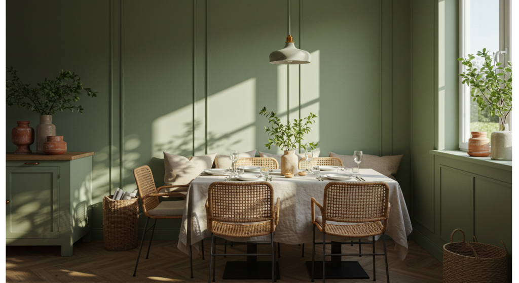
Gentle Sage Ambiance
Sage green rests somewhere between gray and green. It feels calming without veering into typical color psychology territory. It pairs well with many decor pieces, so it’s perfect if you want a color that’s subdued but not bland.
Creating an Open, Airy Feel
Sage reflects enough light to make a room appear airy. Choose a low-sheen paint for the walls and keep your ceiling a crisp white. This combination can visually raise your ceiling. People sometimes worry that green might clash with furniture, but sage is so mild it’s rarely an issue.
Essentials:
- Low-sheen sage wall paint
- White or off-white ceiling
- Strategic lighting to highlight corners
Adding Natural Textures
Sage works well with natural textures. Rattan chairs, a jute rug, or woven placemats all complement that soft green. The overall effect feels fresh and slightly organic. If you have wooden floors, sage can bring out their warmth.
Ideas:
- Rattan pendant light fixture
- Jute rug with green accents
- Bamboo place mats or coasters
Subtle Accent Colors
If you think you need more variety, you can incorporate subdued accents like dusty rose or soft mustard. Place these colors in throw pillows or placemats. Keep them minimal. The real star is the sage backdrop, so don’t let accent colors dominate.
Tips:
- Use dusty pink napkins
- Add a few muted yellow vases
- Try pastel floral arrangements
Rich Burgundy Statements

Burgundy can feel romantic and dramatic, which can be great for special dinners. How can you keep it from feeling too heavy? Focus on balanced contrasts, quality lighting, and strategic accents.
Selecting a Burgundy Shade
Some burgundies lean purple, others lean red. Choose a shade that coordinates with your furniture. If your chairs have brown leather seats, a more red-based burgundy can harmonize. If your furniture is black, a slightly purple-based burgundy might pair better.
Paint picks:
- Deep merlot for a redder look
- Eggplant undertones for a purple flair
- Satin finish to reflect a bit of light
Light and Bright Accessories
Burgundy walls can feel weighty, so bring in bright accessories. White dinnerware, shining crystal glasses, or luminous centerpieces can lighten the mood. A large mirror or reflective chandelier helps bounce light around, preventing the space from feeling like an old cave.
Accent ideas:
- Ornate mirror with silver or gold edges
- Crystal or glass candle holders on the table
- White seat covers or slipcovers
Pairing with Subtle Neutrals
Balance burgundy with soft neutral pieces like cream table linens or a beige rug. This neutral foundation makes the bold walls pop. If you want a more transitional vibe, you could use gray for some of the accessories.
Examples:
- Cream tablecloth with burgundy napkins
- Light beige rug to anchor heavy wall color
- Gray drapes or sideboard
Subtle Gray Tones
Gray has become a favorite for many interiors, and the dining room is no exception. A subtle gray can set the stage for a polished feel. It also mixes easily with various accent colors.
Light vs. Dark Gray
Light gray walls can open up a small dining area. Darker gray adds drama, but it might need bright furniture. Evaluate your space’s natural light. If you have big windows, a deeper shade can work. If the room is small or has few windows, pick a lighter tone.
Consider:
- Light grays for small or low-light rooms
- Dark grays with bright furniture combos
- Semi-gloss paint for easy cleaning
Layering Different Gray Textures
A single tone of gray can look flat. Instead, use a range of shades and textures. A heather-gray rug, a dove-gray wall color, and a charcoal sideboard can create dimension. Don’t fear mixing multiple grays. Subtle differences keep the look interesting.
Suggested layering:
- Tweed or wool seat cushions
- Faux fur throws on chairs
- Gray stone or concrete centerpiece bowl
Bright Pops of Color
A gray base can handle a strong accent color. Bold orange placemats, sunny yellow flowers, or turquoise vases give the space punch. This approach suits folks who want more excitement without repainting the entire room.
Accent picks:
- Vibrant floral arrangements
- Colorful seat covers or pillows
- Statement chandelier in an unexpected hue
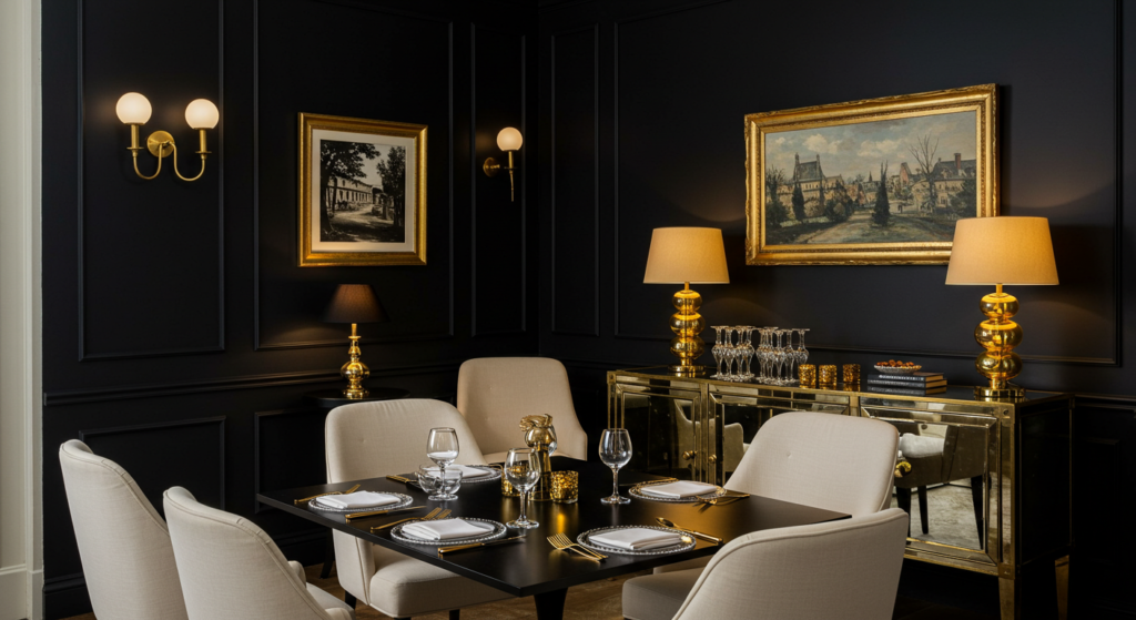
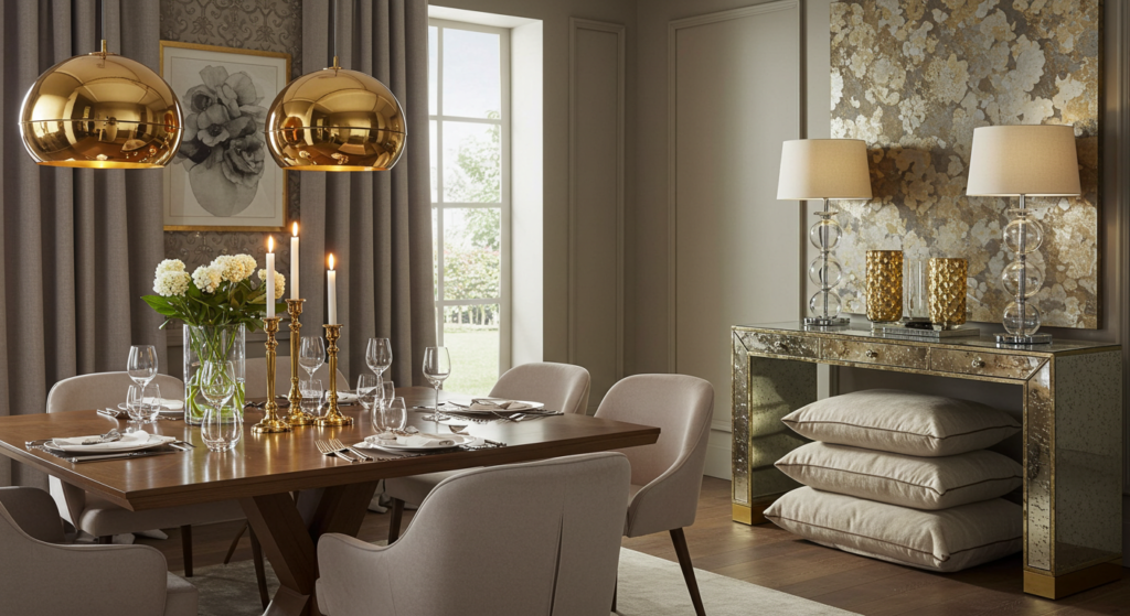
Black and Gold Opulence
Black might sound extreme for a dining room. But used well, it can create a sense of private club-like luxury. Gold or brass accents can help you land a glamorous vibe that’s perfect for memorable dinners.
Painting One Wall Black
All-black walls could be risky. Many folks choose just one black accent wall, then keep surrounding walls a lighter shade. That black backdrop can highlight a special artwork or a decorative buffet. Make sure your chosen black paint has a matte or eggshell finish to avoid glare.
Tips:
- Position a statement sideboard against the black wall
- Hang a striking gold-framed mirror or painting
- Use white or light gray on the other walls
Gold Fixtures and Hardware
Gold or brass hardware on chairs, cabinet handles, or light fixtures transforms black walls into something opulent. Even table runners with gold thread can reflect any available light. Go with subtle metallic details so you don’t blind your guests with sparkle overload.
Decor suggestions:
- Gold pendant chandelier over the table
- Brass cabinet pulls or doorknobs
- Gold-rimmed crystal glasses
Balancing with Neutrals
Black and gold can feel fancy, but to keep a comfortable atmosphere, add neutrals. White seat cushions or a soft gray rug calm the dramatic colors. Balance is key if you want a warm, inviting mood rather than a formal museum vibe.
Pointers:
- Use cozy fabrics for chair cushions
- Keep table linens in neutral creams
- Add an off-white console table
Modern Neutrals
Neutral tones like beige, gray, cream, and taupe are common picks for a dining room with a modern twist. The trick is not letting them blend into a bland swirl. Add shape, texture, and a bit of contrast to keep it interesting.
Mixing Materials and Shapes
In modern designs, shape is vital. Pair a sleek glass table with curved chairs upholstered in a neutral tone. Add a geometric area rug or a sculptural pendant light. This interplay of shapes gives dimension, even if the color palette is subtle.
Tips:
- Minimalist modern chairs
- Circular or oval dining table
- Angular rug patterns
Soft Touches of Color
A modern neutral palette doesn’t have to be colorless. Small bits of color, like a teal centerpiece or soft pink napkins, can bring a bright note. Keep the ratio mostly neutral so your color touches don’t overpower the clean lines.
Ideas:
- Teal or aqua vases on the table
- A pastel painting or print on the wall
- Pink or coral seat cushions
Emphasizing Minimal Clutter
Modern spaces often feel spacious because they avoid clutter. Store extra plates in closed cabinets. Keep the table mostly clear, except for a tasteful centerpiece. Clean lines help your neutral color scheme shine. People might find it easier to focus on your lovely dinner spread when the background is uncluttered.
Practical suggestions:
- Use built-in storage solutions
- Install floating shelves sparingly
- Choose a few large statement pieces vs. many small items
Earthy Terracotta Notes
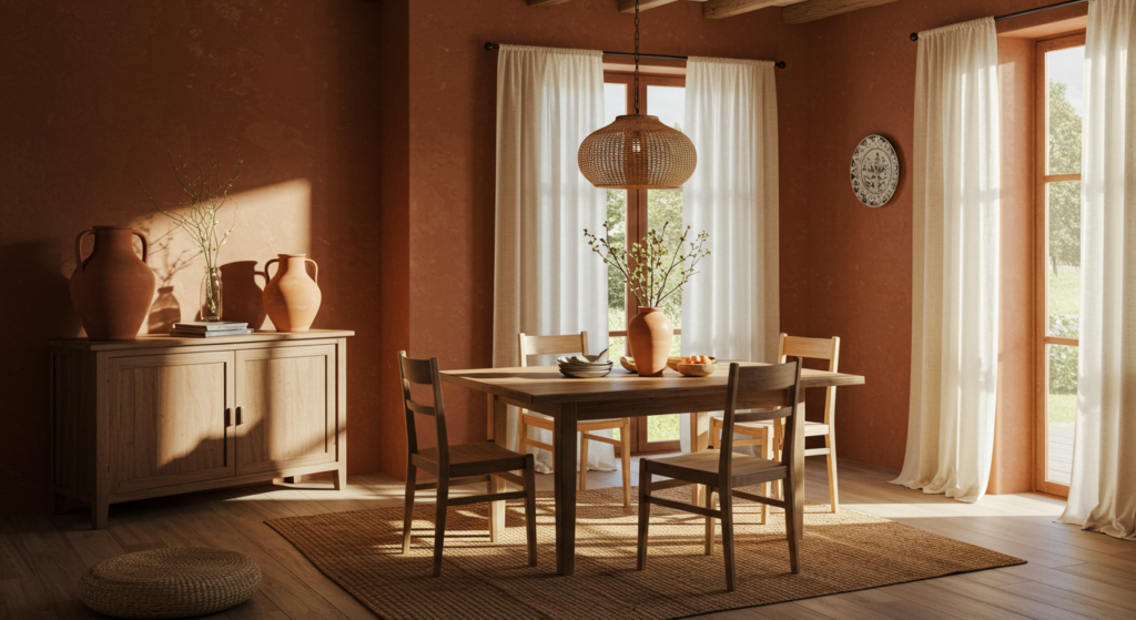
Terracotta might make you think of sunny Mediterranean courtyards. Bringing those warm tones into a dining room can create a cozy vibe that feels rustic yet refined.
Painted Terracotta Walls
For an earthy aesthetic, choose terracotta paint that has hints of brown and red. It’s a fairly strong color, so test a small patch first. This color can bring warmth to spaces with cold tile floors or a lack of natural light. Some folks say it brightens the room, even if it’s not a typical bright color.
Paint tips:
- Check swatches in both daylight and evening light
- Balance with soft neutral furnishings
- Consider painting one wall if the shade is very bold
Clay and Ceramic Accents
Terracotta pairs nicely with clay or ceramic accessories. A large clay vase in the corner, ceramic plates on a hutch, or small terracotta planters with succulents can tie everything together. This approach can look global or boho-chic without straying too far from elegance.
Decor elements:
- Clay bowls as centerpieces
- Ceramic pitchers for water or flowers
- Terracotta planters near windows
Natural Fabrics and Wood
Terracotta loves textures like linen, cotton, and wood. Add a wooden dining table with a natural finish. Drape a linen runner in a neutral shade. Place woven seat cushions on your chairs. The warmth of terracotta, combined with raw materials, can give your dining area a grounded, inviting air.
Pairing ideas:
- Distressed wood table with a light seal
- Linen curtains in cream or light brown
- Wicker or rattan baskets for napkins
Soothing Teal Contrasts
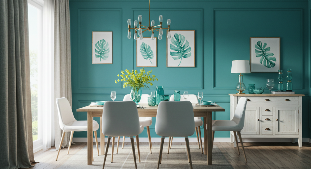
Teal has a unique balance of blue and green. It can be lively but also soothing. A teal dining room might sound bold, but paired right, it can look sleek or even contemporary.
Blending Teal with Neutrals
If you love teal but worry it might overwhelm your dining space, blend it with neutrals. Use white or gray furniture. Keep table linens plain, and let the teal walls or accent pieces shine. Small teal accessories, like patterned napkins, can also pop against a neutral tablecloth.
Color combos:
- Teal walls, gray chairs
- White curtains, teal pillows
- Neutral table linens with teal napkin rings
Teal Accent Wall
Some folks prefer a teal accent wall. That’s a nice choice if your dining room flows into another space. Paint the wall that gets the most light in teal. Let the other walls remain an airy white. That one pop of color can draw the eye without boxing the room in.
Advice:
- Position the table near the teal wall
- Hang a grouping of frames with white mats
- Use teal seat cushions to unite the theme
Metallic and Wood Contrasts
Teal stands out against warm wood or glimmering metals. Try a copper chandelier or wooden buffet. The teal background highlights these items’ finishes. This helps each piece stand out, so the room looks curated and polished.
Recommended elements:
- Copper pendant lights
- Dark walnut table for contrast
- Wood-framed artwork with subtle teal details
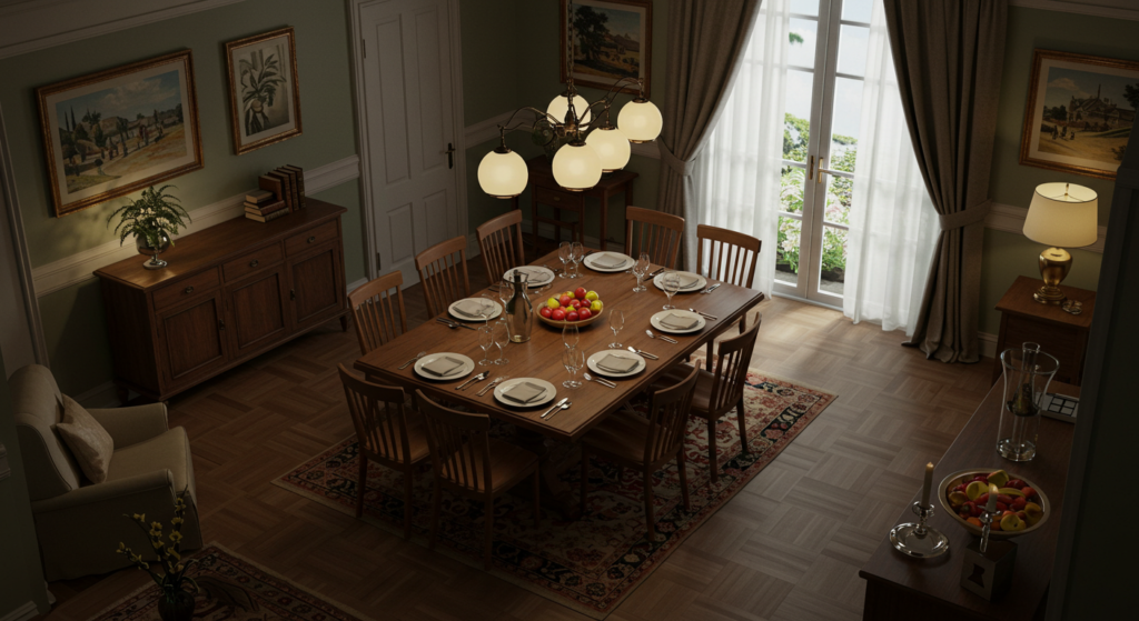
Rustic Brown and Cream
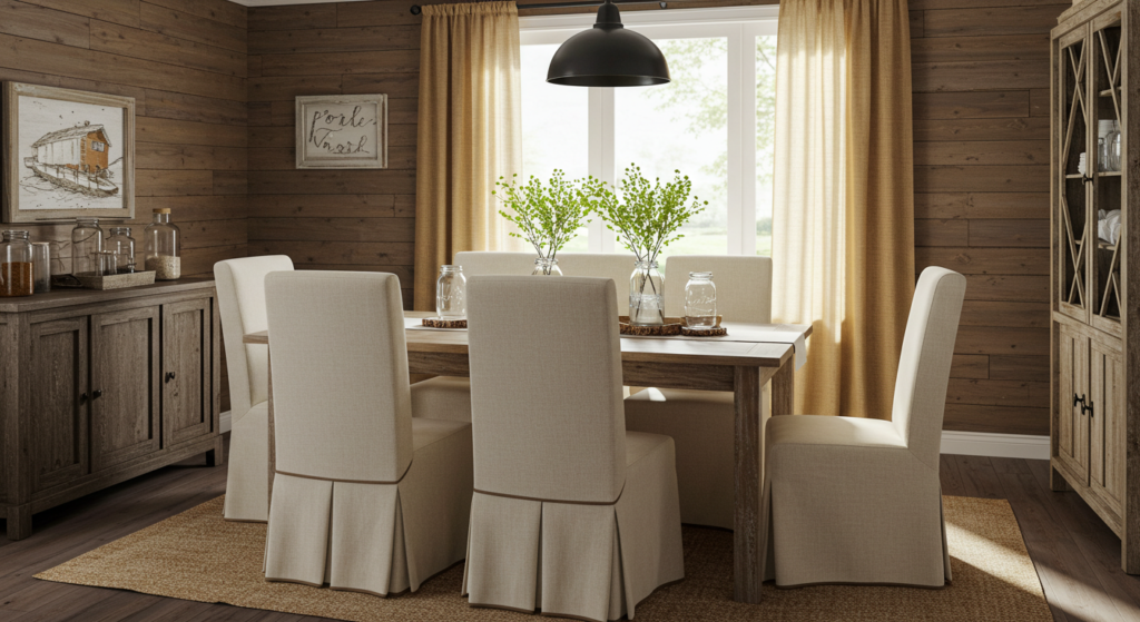
Rustic dining rooms evoke images of farmhouse tables and homemade meals. Brown and cream create a soft, country-inspired palette. The effect can still be elegant if you use quality furniture and thoughtful decor.
Muted Brown Walls
If you pick a brown paint, aim for a muted tone like cocoa or warm taupe. This avoids the room looking too dark. Balance with cream trim or pale wainscoting to lighten the mood. Some folks skip painting the entire wall brown and add vertical cream shiplap for texture.
Wall tips:
- Try wainscoting in cream along the lower half
- Paint the upper walls a cocoa hue
- Include a small wood shelf near the top
Cream Furniture for Softness
Cream furniture like slipcovered chairs or a light-colored hutch can add brightness. You could also bring in a distressed white farm table. This keeps the space from feeling heavy, while the brown walls bring warmth.
Styling:
- Distressed cream table or buffet
- Cream slipcovers over wooden chairs
- Pale patterned rug for a cozy layer
Adding Rustic Details
Use vintage or rustic details to complete the farmhouse vibe. Mason jar centerpieces, burlap table runners, or galvanized metal buckets for flowers can show your country side. Guests might comment that your dining room feels like a bed-and-breakfast in the countryside.
Decor picks:
- Mason jars with fresh flowers
- Burlap runners or placemats
- Galvanized metal trays for bread
Metallic Touches
Sometimes people want a dining room that sparkles. Metallic finishes, whether silver, gold, copper, or brass, can instantly lift the space. Balancing them with a neutral or even a rich color can prevent tackiness.
Mixing Metals with a Neutral Base
If you plan on going big with metals, keep your wall color neutral. Whites, grays, or beiges form a solid canvas that lets metallic pieces shine. Then, you can sprinkle in gold or silver chairs, tableware, or mirrored decor. Be sure not to overdo it—too many metals can distract.
Metal picks:
- Silver dining chairs with velvet upholstery
- Gold candle holders on the table
- Mirrored sideboard for extra reflection
Coordinating Metal Finishes
Think about whether you want to mix finishes. Gold and silver can go together if they share a similar sheen level. For instance, brushed gold and brushed nickel might harmonize better than glossy gold with matte nickel. A consistent vibe across your metals looks more intentional.
Tips:
- Choose all brushed or all polished metals
- Limit yourself to two metal finishes
- Use accessories like doorknobs and drawer pulls to unify the theme
Statement Metallic Ceiling
For those who want something different, consider a metallic accent on your ceiling. A copper or gold tinted paint on the ceiling can create an almost magical glow, especially with the right lighting fixture. This might sound bold, but it can be quite elegant if balanced with calm wall colors.
Ideas:
- Use a metallic paint with subtle shimmer
- Install a matching metallic chandelier
- Pair with neutral or pastel walls
Timeless Monochromatic
A monochromatic palette focuses on one color in various shades. It can look timeless and refined in a dining room, especially if you enjoy a cohesive, calming environment.
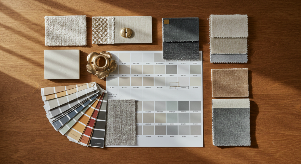
Choosing the Main Hue
Pick a color you can live with in multiple tones. Think about navy, gray, beige, sage, or even a light brown. Gather swatches of lighter and darker shades. Start with the main mid-tone on your walls, use a lighter tone for trim, and add a deeper shade in accessories.
Hue selection:
- Test multiple shades of your chosen color
- Pick 2-3 tones that work together
- Pay attention to warm or cool undertones
Layering Textiles
In a monochromatic scheme, texture is key. Use different fabrics in similar tones. A velvety table runner, a plush rug, cotton seat covers, or woven placements all add dimension without bringing in new colors. This approach ensures your one-color plan doesn’t feel dull.
Texture combos:
- Velvet or chenille for seat cushions
- Linen or cotton for table runners
- Patterned rug in the same color family
Adding Subtle Contrasts
Even in a monochromatic scheme, a little contrast helps. You can bring in white or black details that keep the room grounded. For example, a black vase on a gray table might look stylish. Or white dinnerware with a deeper gray tablecloth might break up the uniform color.
Finishing touches:
- Black frames or light fixtures for a slight contrast
- White dishware on matching placemats
- Metallic or glass centerpieces for reflection
Conclusion
What if your dining room told its own story? Your color palette sets the stage for memorable evenings and good conversation. Whether you go crisp white for a classic vibe or charcoal for a moody twist, each palette shapes how your guests see and experience your table.
Color is more than just a backdrop. It affects how big or cozy your room feels, how your decor items pop, and how you present your meals.
By choosing the right palette—paired with proper finishes, lighting, and accents—you can create a dining area that is both welcoming and statement-making. Now it’s your turn to explore these ideas and infuse your personal style for an elegant dining room where friends and family love to gather.
Summary Table
Here’s a quick reference to keep handy:
| Palette | Key Idea | Main Accents | Ideal For |
|---|---|---|---|
| Crisp White Elegance | Mix off-whites for depth | Metallic touches (silver/gold), warm textiles | Airy, bright, classic look |
| Moody Charcoal Depth | Balance dark walls with bright lighting | Light furniture, statement art | Dramatic but cozy atmospheres |
| Warm Beige Sophistication | Pick the right undertone (yellow/pink) | Wooden accents, soft muted colors | Refined spaces with wooden pieces |
| Bold Navy Accents | One bold wall or entire space with balanced furniture | Metallic details, white or cream furnishings | Formal dinners, striking backdrops |
| Gentle Sage Ambiance | Light, fresh, opens small rooms | Rattan, jute, pastel accents | Calm, nature-inspired settings |
| Rich Burgundy Statements | Dramatic red or purple undertones | Light accessories, mirrors | Romantic or special-occasion dining |
| Subtle Gray Tones | Vary shades & textures for dimension | Bright pops of color, multiple grays | Flexible, modern styling |
| Black and Gold Opulence | One black accent wall plus gold hardware | Neutrals (cream/white) to balance | Glamorous, private-club feel |
| Modern Neutrals | Mix materials & shapes, minimal clutter | Small color highlights, bold rug patterns | Clean, contemporary spaces |
| Earthy Terracotta Notes | Warm red-brown paint, clay accessories | Natural fabrics like linen | Cozy, rustic Mediterranean vibe |
| Soothing Teal Contrasts | Accent or full walls in teal balanced by neutrals | Metallic or wooden pieces for contrast | Fresh, bold style without overdoing it |
| Rustic Brown and Cream | Farmhouse look with cozy brown and cream | Vintage details like burlap or galvanized metal | Homey, bed-and-breakfast atmosphere |
| Metallic Touches | Keep base colors neutral for metallic spark | Copper, gold, silver or mixed finishes | Glam detail without color overload |
| Timeless Monochromatic | Vary shades of one color & layer textures | Subtle contrasts in black, white, or metallic | Unified, calming themes |
FAQ
Q: Is it okay to paint a small dining room a dark color?
A: Yes, if you use good lighting and balance the darkness. Consider painting just one accent wall. Use mirrors or lighter furniture to keep the space from feeling cramped.
Q: Can I mix metal finishes, like gold and silver, in one dining room?
A: Absolutely, if they share a similar sheen. Brushed gold and brushed nickel can harmonize. Keep it limited so it doesn’t become too busy.
Q: How do I make sure the color I pick works with my chairs or table?
A: Bring home paint swatches and compare them under your dining room’s actual lights. Your furniture might look different at night than it does in daylight, so check multiple times.
Q: Will bright white walls look too harsh in a dining space?
A: Bright white can feel glaring if you lack soft, warm elements. Add textured curtains, cushions, or a warm-toned rug to keep the space cozy.
Q: Should my dining room color match the rest of my house?
A: It doesn’t have to match exactly, but aim for some flow. If your home uses mostly warm tones, a warm-hued dining room will feel connected. If your house is neutral, pick a color that doesn’t clash with the hallway or connected areas.
Q: Any suggestions for affordable decor items?
A: Thrift stores often have unique vases or frames you can spray-paint to match your palette. Discount home stores offer budget-friendly rugs, cushions, and curtains in many colors.
Q: What if I want to change decor often?
A: Stick to a neutral or light base color. Then rotate accessories like seat covers, centerpieces, and wall art. Swapping smaller items is cheaper and simpler than repainting the room.
Q: Does paint finish matter?
A: Yes, it can alter how light reflects. Matte finishes hide flaws but can be harder to clean. Eggshell or satin bounce light gently and wipe down more easily. High gloss is reflective but can show imperfections.
Q: Can I use wallpaper instead of paint?
A: Of course. Choose a wallpaper that suits your taste, whether it’s a subtle pattern or a bolder design. Just ensure it coordinates with your furniture and decor for a cohesive look.
Q: How do I make a statement without using bright colors?
A: Focus on textures, shapes, and contrasts. A monochromatic gray or beige room can be just as striking if you layer textiles and bring in statement lighting or artistic centerpieces.
Q: Is it okay to paint the ceiling a color other than white?
A: Yes, that can add drama or warmth, especially if your walls are neutral. Some folks paint the ceiling a paler shade of the wall color. Others add metallic or bold tones for an unexpected twist.
Q: How can I incorporate patterns in my dining room?
A: Use patterned wallpaper on one wall or add patterned rugs, curtains, or seat cushions. If the color palette is already bold, keep patterns subtle. If your palette is neutral, you can experiment with bigger patterns.
Q: Should I consider my lighting color temperature?
A: If you have warm-toned bulbs, your walls might look more yellow or orange. Cool-toned bulbs can make some colors look washed out or stark. Pick a lighting temperature that flatters your chosen palette.
Q: Do I need to match my dining room color to my table linens exactly?
A: Matching exactly can be overkill. Instead, pick linens in complementary or related shades. A bit of variation makes the room look natural and pleasing.
Enjoy creating your elegant dining room! Don’t stress if you change your mind. You can always experiment with new accessories or a fresh coat of paint.
After all, your dining area is a place for comfort, fun, and good meals—so let your color scheme reflect that welcoming spirit.

Sam Goldman, with his intuitive grasp on the art of color selection, navigates the vibrant tapestry of fashion shades, ensuring each ensemble reflects the pulse of modern trends. His knack for crafting unique yet cohesive color combinations unravels the complexities of the fashion spectrum. Beyond being a mere sentinel, Sam’s dedication transforms every reader’s wardrobe journey into a harmonious blend of contemporary elegance and timeless allure. Dive into his writings and emerge with a refreshed perspective on fashion colors.
Reviewed By: Joanna Perez and Anna West
Edited By: Lenny Terra
Fact Checked By: Matthew Mansour
Photos Taken or Curated By: Matthew Mansour