Key Takeaways
- Comfort-First Approach: When choosing pajama colors, focus on softness, breathability, and the overall coziness of the design.
- Color Coordination: Mastering color balance in your sleepwear helps you look and feel more put-together at bedtime.
- Versatile Shades: Neutral, pastel, and jewel tones are all on the table. Select hues that match your personal style and climate needs.
- Mix-and-Match Techniques: Experiment with color blocking, subtle patterns, and accent pieces to create endless pajama looks.
- Lifestyle Considerations: Take into account your home temperature, your personal taste, and even your laundry habits when finalizing your pajama color range.

Sleepwear isn’t just about function. It’s about feeling comfortable, confident, and restful at night. Gone are the days when pajamas were purely practical or plain. Today, we have an entire world of color choices—each adding its own twist of style, coziness, and versatility.
When you’re winding down after a busy day, the colors you wear can set the tone for a more restful evening. At the same time, pajamas are also an extension of your personal style. With so many options available, you can curate a pajama palette that is as versatile as your day-to-day wardrobe.
Think of cozy nights in fluffy loungewear, airy summer nights in crisp cotton sets, or layered flannels for chilly winter evenings—each scenario calls for its own unique color approach.
Below, we’ll explore everything you need to know about selecting and combining comfortable pajama colors. From the role of neutral and pastel tones, to the subtle art of mixing stripes with solids, to easy-care tips that help preserve your pajama colors, this guide will help you build a satisfying nighttime wardrobe that doesn’t skimp on style.
Neutral Foundations

Neutrals form the foundation of most wardrobes—why should pajamas be any different? While neutral shades may seem straightforward, there’s a depth to these tones that’s surprisingly flexible.
Classic Whites and Creams
White pajamas can seem basic at first glance, but the simplicity is a huge advantage. White or cream sets reflect a fresh look and pair wonderfully with nearly any accent color. These hues are ideal for layering, making them easy to incorporate into cooler-weather ensembles or pair with a patterned robe.
- Fabric Choice: Crisp cotton or satin can give white pajamas an elevated aesthetic.
- Stain Awareness: Whites can show wear-and-tear more quickly, so make sure you’re prepared to keep them bright.
- Trimming and Piping: Small design details, like black piping on a white set, can instantly elevate the look.
Grays and Charcoals
Shades of gray offer a laid-back but polished vibe. They’re easy to wash and can hide minor wear well. Whether you pick a light heather gray or a deep charcoal, gray is one of the most versatile bases for mixing and matching with other pieces.
- Layering Potential: Soft gray pants can pair with colored sleep tops for a more playful effect.
- Transitional Appeal: Gray pajamas transition effortlessly between seasons.
- Pairing with Patterns: If you like patterned slippers or robes, gray sets act as a neutral base.
Earthy Tones
Taupe, tan, and light browns bring a cozy, grounded aura to your sleepwear collection. If you love rustic or minimalist aesthetics, you might find these earthy tones perfect for relaxing at home.
- Texture Matters: Chunky knit or flannel in earthy tones amplifies the sense of warmth.
- Easy to Accessorize: Earthy pajamas can be dressed up with a pop of brighter color in your slippers or an eye-catching robe.
- Year-Round Use: Although these colors feel autumnal, lightweight fabrics can keep them relevant in summer, too.
Pastel Comforts

Soft, muted pastels can be especially comfortable for bedtime. They lighten the mood without being too flashy, and they can adapt to your personal style seamlessly.
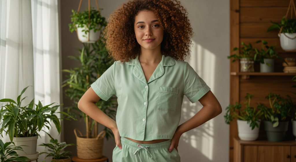
Mint Greens
Mint green pajamas feel fresh and lightly playful. They work well in cotton or jersey fabrics for breathability.
- Summer Vibe: Mint pairs well with white slippers or a cream cardigan for cooler nights.
- Layering Options: Mint bottoms can go with subtle patterned tops if you want to mix things up.
- Ideal Fabrics: Look for soft modal or bamboo to enhance the cooling effect of mint.
Powder Blues
A powder blue pajama set feels easygoing and airy. This color stands out as a soothing nighttime tone without steering into typical color psychology.
- Match with Neutrals: Pair powder blue tops with gray or off-white bottoms for contrast.
- Cooling Aesthetic: Ideal for warmer climates or summer nights.
- Detailing: Contrasting buttons or piping can add a pop of excitement to a pale blue set.
Dusty Pinks
Dusty pink is muted enough to avoid being overly sweet or bright. It can flatter various skin tones and adds a touch of subtle romance without going over the top.
- Tone Pairing: Mix dusty pink with burgundy or gray for a more dynamic color duo.
- Floral Prints: This shade is perfect for minimal floral patterns that don’t feel childish.
- Transitional Style: Wear dusty pink through all seasons if you choose the right fabric weight.
Warm and Cozy Tones
When you’re seeking something richer for cooler nights, warm tones can add a snug, comforting feel to your pajamas.
Rust Reds
Reddish browns or rust tones bring a unique, understated warmth to nightwear. They’re bold enough to stand out yet remain soft enough to feel comforting.
- Coordinating Neutrals: Pair rust bottoms with a black or gray top for a sophisticated twist.
- Suitable for Flannel: This color shines in flannel fabrics, especially in checks or simple stripes.
- Autumnal Aesthetic: Perfect for cooler months, but still versatile enough for year-round comfort.
Mustard Yellows
Mustard might seem like a risky choice, but it’s actually a fun, vibrant color that feels cozy. It’s a great way to liven up your evening routine without going too bright.
- Patterns and Solids: Experiment with minimal patterns, like simple dots in mustard, to keep your pajamas from feeling too busy.
- Layer-Friendly: A mustard pajama top can be combined with neutral bottoms for a pop of color.
- Attention to Skin Tone: Make sure the shade aligns with your natural undertones if you’re wearing it close to your face.
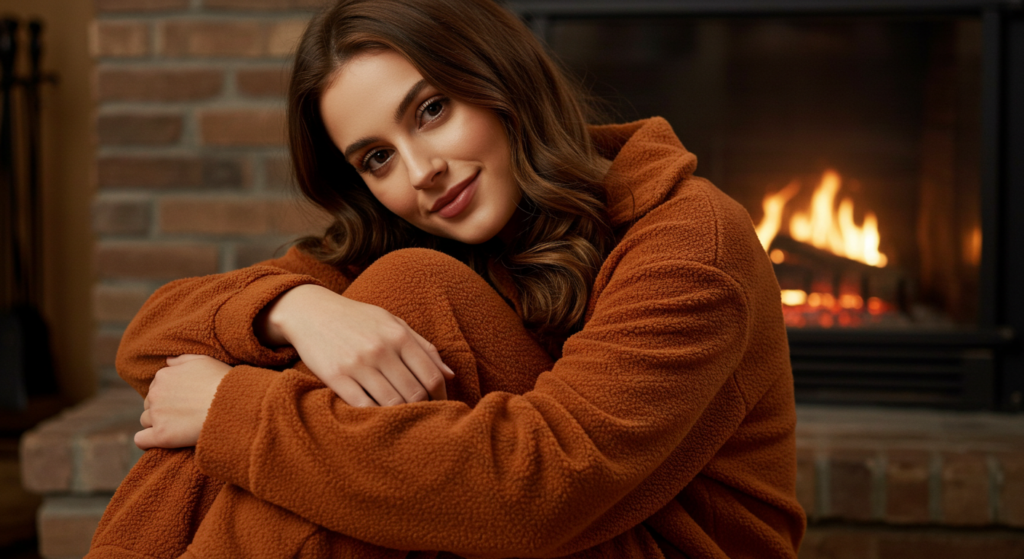
Deep Oranges
Deep orange pajamas, especially in a terracotta or burnt orange hue, can bring a warm, inviting feel. You can wear this color in heavier fabrics like fleece or lighter knits depending on the season.
- Textural Contrast: Pair a fuzzy orange top with smoother, neutral bottoms.
- Retro Influence: Deep oranges can add a vintage flair if you like retro-inspired looks.
- Practical Care: These darker shades can hide small stains or signs of wear over time.
Jewel-Toned Statements

For those who crave a little more drama in their sleepwear, jewel tones like emerald, sapphire, or amethyst can be surprisingly comfortable, especially when paired with the right fabric.
Emerald Greens
Emerald green pajamas feel rich and are a great choice for special evenings in or even wearing around the house on a lazy weekend.
- Fabric Choices: Satin or silk are popular for jewel tones due to how they reflect light.
- Pairing Options: Emerald pairs well with black or charcoal gray to keep the look grounded.
- Long-Term Wear: High-quality fabrics in emerald maintain their vibrancy if cared for properly.
Sapphire Blues
Sapphire blue might seem like an evening gown color, but as pajamas, it feels both relaxed and refined.
- Versatile Shade: Sapphire blue can appear more subtle in cotton, or luxurious in silk.
- Accentuate with Neutrals: Add a simple shawl or robe in white or silver tones for a layered look.
- Visual Depth: The richness of sapphire blue can soften as the fabric ages, often looking even more appealing over time.
Amethyst Purples
Amethyst pajamas are a fantastic way to inject color without diving into brightness. They’re easy to style and can be surprisingly flattering across different skin tones.
- Fashionable Twist: It’s a color rarely chosen for casual wear, so it can feel unique as sleepwear.
- Color Blocking: Mix amethyst bottoms with a pastel top for contrast without clashing.
- Printed Detailing: Subtle stripes or small shapes in amethyst can add visual interest without overwhelming.
Patterned Pajamas and Color Mixes

Patterns bring a lively element to your sleepwear. From subtle stripes to more daring prints, you can balance color and design to create fun bedtime looks.
Subtle Stripes
Stripes can be understated while still adding extra style. Think thin stripes in neutral combinations or minimal lines in pastel shades.
- Vertical vs. Horizontal: Vertical stripes can elongate your silhouette, while horizontal stripes can create a more relaxed vibe.
- Monochrome Stripes: A black-and-white striped pajama set is timeless and easy to accessorize with a pop of color.
- Stripe Width: Thinner stripes tend to be more subtle, while thicker stripes feel bolder.
Playful Polka Dots
Polka dots can range from tiny, refined designs to large, whimsical spots. Pick your scale based on how playful or reserved you want your pajamas to look.
- Two-Tone Dots: Simple black-on-white polka dots, or white-on-navy, keep it classic.
- Colorful Dots: If you crave more color, consider pastel dots on a neutral background.
- Complementary Pieces: Polka-dot bottoms and a solid top can strike the right balance.
Mixed Prints
Feeling adventurous? Experiment with mixed prints that bring a splash of creativity to bedtime.
- Scale and Color Unity: Keep your color palette consistent even if the patterns vary.
- Coordinating Elements: Combine a floral top with striped bottoms if they share at least one common hue.
- Confidence Factor: Pattern mixing works best if you own the look—wear it with a sense of fun.
Season-Smart Color Picks

Different seasons can influence how we dress for sleep. Let’s explore color strategies to match the weather and keep you cozy or cool.
Spring Highlights
Spring signals renewal, so it’s an ideal time to introduce delicate tones into your pajama drawer.
- Light Layers: A pastel top with neutral shorts and a thin robe can accommodate fluctuating spring temps.
- Floral Accents: Subtle floral prints or embroidered details can capture the season’s spirit.
- Breathable Fabrics: Cotton and linen blends in lighter shades help regulate temperature on cool nights and mild days.
Summer Brights
Summer is the time for fun, airy colors. Lighter fabrics and bolder shades can complement the season’s warmth.
- Vibrant Hues: Coral, aqua, and lemon-lime can be joyful choices without being overwhelming.
- Moisture-Wicking: Opt for lightweight cotton or bamboo in bright or pastel palettes.
- Sleeveless Sets: Go for tank-top pajama sets or shorts in summery colors for maximum comfort.
Fall and Winter Depth
As temperatures drop, deeper tones and plush textures come into play.
- Cozy Materials: Flannel, fleece, or waffle-knit in darker neutrals or jewel tones feel snug.
- Layering: Thermal tops in burgundy, navy, or forest green can be matched with warm bottoms.
- Seasonal Prints: Plaid pajamas in rich hues add a festive yet laid-back vibe.
Mixing and Matching Pajama Sets

Gone are the days of wearing the same top-and-bottom set every single night. You can create a more versatile sleepwear wardrobe by mixing and matching.
Color Harmony
When you mix items, pick tones that flow together naturally rather than clash. If one piece is patterned, pull a color from the print for the second piece.
- Monochrome Variations: Choose different shades of the same color for an understated match.
- Contrasting Accents: If you have a neutral top, a bold bottom can become the highlight.
- Choosing a Focal Point: Let one piece be the star, and keep the other understated.
Fabric Coordination
Sometimes, mixing different textures can add interest. A smooth satin top can pair with comfy cotton bottoms if the colors complement each other.
- Weight Considerations: Keep the fabric weights similar if you care about even temperature coverage.
- Visual Balance: Heavier fabrics in darker tones, lighter fabrics in softer tones.
- Consistent Care: Mixing machine-washable items with delicate ones might be inconvenient, so plan accordingly.
Practical Combinations
Try building a small capsule wardrobe of pajamas. A few neutral tops and bottoms, plus a couple of color statements, can create many looks.
- Neutral Base: Gray, cream, or white sets that all go together.
- Pop of Color: A bright or deeper-toned bottom to change up the ensemble.
- Add a Robe: A patterned or colored robe can unify mismatched pajamas in a stylish way.
Layering Strategies

Temperatures aren’t always consistent from night to night. Layering is key to staying comfortable while still looking stylish.
Robes as Statements
A robe can be more than just an extra layer. It can also be a color statement that ties your look together.
- Bold Robe, Subdued Pajamas: If your robe is patterned or brightly colored, wear neutral pajamas underneath.
- Short vs. Long: Short robes show off more of your pajama set, while long robes create a more dramatic look.
- Material Mix: Match the season—light robes for summer, plush robes for winter.
Cardigans and Sweaters
For a cozy approach, especially in cooler months, throw on a soft cardigan or sweater over your pajama top.
- Neutral Sweaters: Cream, beige, or gray cardigans pair nicely with a wide array of pajama colors.
- Oversized Comfort: Opt for a slightly bigger size for easier layering and a comfy vibe.
- Textural Contrast: Combine a fluffy sweater with satin pajamas for an interesting mix.
Long-Sleeve and Short-Sleeve Combos
If you enjoy short-sleeved pajama sets but worry about chilly nights, consider layering a long-sleeve top beneath or over your short-sleeve top.
- Over-the-Top Layer: A thin, long-sleeve thermal under your main pajama shirt can keep you warm without adding bulk.
- Color Contrast: Choose complementary colors so the peek of the long-sleeve top adds style, not distraction.
- Practical Balance: This is especially helpful in transitional seasons or homes with varying indoor temperatures.
Special Occasion Pajamas

Not all pajamas are for simple, lazy nights. Some are meant to celebrate or just to make you feel extra special.
Holiday Themes
From classic red-and-green sets during winter festivities to pastel-themed pairs for spring gatherings, holiday-themed pajamas can add a joyful touch to your lounge time.
- Subdued vs. Bold: Some holiday prints can be loud. If you prefer subtlety, choose pajamas with small festive motifs rather than large prints.
- Matching Family Sets: If you enjoy coordinating with family, keep color synergy in mind to ensure everyone looks cohesive.
- After the Event: Pick patterns and colors that can be worn beyond the holiday to get more use out of them.
Luxe Fabrics
For anniversaries or birthdays, consider pajamas in silk or satin. A luxurious color like black, sapphire, or champagne can set the tone for a special evening.
- Comfort vs. Appearance: Silk is visually stunning, but ensure you can still move comfortably.
- Care Instructions: High-end fabrics often require specific laundering or dry cleaning.
- Investment Pieces: While pricier, they can be a long-lasting part of your sleepwear rotation.
Personalized Monograms
A monogram or embroidered initial can make a pajama set feel extra unique. Choose a contrasting thread color that stands out against the pajama fabric.
- Placement: Common spots for monograms include the chest pocket, sleeve cuff, or near the hem.
- Color Selection: Keep it minimal by matching or contrasting with the piping or trim.
- Gift Potential: Monogrammed pajamas can be thoughtful presents for close friends or family.
Travel Sleepwear and Color Choices

When traveling, pajamas should be functional yet still reflect your personal style. The right color choice can make packing easier and bedtime smoother.
Climate Considerations
Research your destination’s climate before deciding on your pajama palette.
- Tropical Trips: Pack lighter fabrics in pastel or bright shades that resist showing sweat.
- Colder Getaways: Opt for heavier fabrics in darker colors to hide any accidental spills or wear.
- Versatile Pieces: Neutral or mix-and-match sets that you can layer easily if temperatures fluctuate.
Space Savers
Pack pajamas that can double as lounge or workout gear if necessary. These transitional pieces often come in basic colors or subtle patterns that fit many situations.
- Two-in-One: Leggings in a neutral color can serve as pajamas at night and yoga pants by day.
- Foldable Fabrics: Lightweight cotton and jersey knits take up less space in your luggage.
- Wrinkle Resistance: Darker colors or prints can look less wrinkled when you unpack.
Durable Colors
Travel often involves tight schedules and limited laundry access, so choose pajama colors that can handle repeated wear.
- Camouflage: Mid-tones like charcoal, navy, or medium brown hide small stains well.
- Quick-Dry: Some fabrics are designed to dry faster, which is great if you need to do a quick sink wash.
- Odor Resistance: Bamboo or certain polyester blends might also resist odors if you can’t wash them nightly.
Accessories and Sleepwear Color Coordination

Accessories can elevate the look and feel of your pajamas. Think slippers, eye masks, or even decorative pins.
Slippers and Socks
Slippers and socks need not be an afterthought. Their color can either reinforce your pajama palette or provide a striking contrast.
- Matching Colors: Choose slippers in a similar tone to your pajamas for a seamless look.
- Contrasting Pop: If your pajamas are neutral, a bright slipper can add a fun dimension.
- Seasonal Materials: Fuzzy slippers in winter, cotton socks in summer—practical and stylish.
Eye Masks
An eye mask doesn’t have to be plain black. Coordinating or contrasting with your pajamas is a simple way to feel more put-together.
- Silk or Satin: These materials are gentle on your skin and can match luxurious pajamas.
- Playful Prints: If your pajamas are solid, a printed eye mask can add personality.
- Adjustable Straps: Comfort is key, so ensure the mask fits well without pinching.
Lightweight Scarves
Though often overlooked for sleep, a lightweight scarf can keep your neck warm or act as a style statement in transitional months.
- Breathability: Choose cotton or a soft blend that won’t overheat you.
- Color Integration: Align the scarf’s color with a highlight from your pajama set.
- Multiple Uses: Use it around the house in the evening, then keep it on for early morning warmth.
Care and Maintenance of Pajama Colors

Keeping your pajamas looking fresh requires proper care. Colors can fade or bleed if you’re not attentive to washing and drying.
Laundry Best Practices
Follow manufacturer guidelines to avoid color fading. When unsure, stick to cold water washes.
- Color-Safe Detergent: This helps preserve fabric vibrancy.
- Sorting: Separate darks from lights, especially for brand-new pajamas.
- Gentle Cycle: Reduces friction and lessens pilling or color dulling.
Air-Drying vs. Machine-Drying
While machine drying is faster, it can lead to color fading over time. Whenever possible, air-dry pajamas to preserve their look.
- Sunlight Exposure: Prolonged direct sunlight can bleach colors, so choose partial shade if drying outdoors.
- Fabric Sensitivity: Delicate fabrics like silk or satin usually fare better with air-drying.
- Time and Convenience: If you’re short on time, a low-heat tumble dry cycle is a compromise.
Stain Solutions
Whether it’s spilled tea or a nightcap gone wrong, stains happen. Quick action can save your pajamas.
- Spot Treat: Blot stains as soon as possible with mild soap or stain remover.
- Cool Water Rinse: Hot water can set certain stains, so rinse first in cool water.
- Fabric-Specific Remedies: Different weaves handle stains differently, so do a patch test before using harsh chemicals.
Sustainable and Ethical Color Choices
While not everyone prioritizes sustainability, there are growing options that combine eco-friendly fabrics with on-trend colors.
Organic Cotton
Organic cotton is popular for its breathability and softness. Brands now offer a wide color range without harmful dyes.
- Certifications: Look for labels like GOTS (Global Organic Textile Standard).
- Long-Lasting Hues: High-quality organic cotton retains color well over multiple washes.
- Feel-Good Factor: Conscious shopping can enhance your emotional comfort in your sleepwear.
Bamboo and Hemp Blends
Bamboo and hemp-based pajamas are strong, breathable, and can be dyed in various shades. They’re also known for minimal environmental impact.
- Moisture-Wicking: Keeps you cool on warmer nights.
- Color Palette: From soft neutrals to bright fashion colors, these fabrics handle dyes well.
- Texture: These blends often have a silky-smooth or linen-like texture.
Low-Impact Dyeing
Some companies use low-impact or natural dyes that don’t involve harsh chemicals. These processes can still offer vibrant results.
- Soft Color Variation: Natural dyes often lead to a slightly variegated finish, giving pajamas a unique look.
- Hypoallergenic Option: Reduced chemical use can benefit sensitive skin.
- Color Longevity: With proper care, low-impact dyed fabrics can stay vibrant for a decent lifespan.
Out-of-the-Box Pajama Color Tips
If you’re eager to push past the usual neutrals and soft pastels, there are more adventurous ways to integrate color into your bedtime attire.
Ombré and Gradient Effects
Ombré pajamas fade from one hue to another, adding visual interest without a busy print.
- Vertical Gradient: This can create a lengthening effect.
- Horizontal Gradient: Usually more casual and playful.
- Pairing: Keep accessories neutral to let the gradient stand out.
Bold Color Blocking
Large blocks of contrasting color can make your pajamas look modern and fun.
- Complementary Colors: Pair shades opposite each other on the color wheel for maximum contrast.
- Similar Intensity: Ensure both blocks have the same saturation level to avoid clashing.
- Minimalist Styling: Let the color block be the star, and skip heavy prints.
Neon Accents
Neon might sound shocking for pajamas, but a small pop of neon can spice up a neutral foundation.
- Trims and Piping: Neon piping on the cuffs or collar can be eye-catching without dominating.
- Subtle Panels: A small neon stripe on the pant leg or across the chest adds a sporty touch.
- Balancing Act: Neon pairs best with muted, earthy tones or other neutrals to avoid overload.
Building a Pajama Capsule Wardrobe

A pajama capsule wardrobe ensures you have enough variety without overwhelming your drawer space.
Select a Color Scheme
Choose 3-4 main colors you love—usually a balance of neutrals and a couple of statement hues.
- Core Neutrals: White, gray, or black.
- Accent Colors: A pastel and a jewel tone, or one warm shade (e.g., rust) and one cool shade (e.g., navy).
- Fabric Variety: Within your color scheme, pick different fabrics for different seasons.
Interchangeable Pieces
Make sure each piece can pair with at least two others. That way, you get maximum mileage from fewer garments.
- Simplicity is Key: Avoid overly complex prints that clash with the rest of your wardrobe.
- Layering Options: Include at least one cardigan or robe in a neutral shade.
- Accessory Coordination: If you have statement slippers or socks, ensure they match multiple pajama pieces.
Seasonal Rotation
Don’t stuff everything into one drawer year-round. Rotate your heavier or lighter pieces as the seasons shift.
- Clutter Control: Keep off-season pajamas in storage to maintain a clean, organized space.
- Fabric Preservation: Proper folding and careful storing preserve colors and fabrics.
- Refresher: Wash and air out items before storing them for an extended period.
Conclusion
Curating a comfortable and stylish pajama palette is more than just picking random sets. It’s about understanding color mixes, choosing fabrics that complement those colors, and weaving your own sense of style into your nighttime routine.
From soft pastels that cool you off during summer months to deep jewel tones that add warmth in winter, your pajama drawer can become a reflection of your personal tastes—just as much as your everyday wardrobe.
The key is balancing practicality with color harmony. Let neutrals form a sturdy foundation, then layer in your bolder or lighter shades for variety. Don’t forget about patterns, layering pieces, and small accessories that can elevate your bedtime looks from average to extraordinary. And while comfort is paramount, there’s no reason you can’t bring a dash of flair to your sleepwear collection.
Ultimately, the best pajamas are the ones that make you excited to slip into them. Whether you’re a neutral purist or a lover of bright prints, there’s a color palette out there waiting to transform your nighttime attire. Keep experimenting, keep mixing and matching, and enjoy a restful night’s sleep in a color scheme that feels truly you.
Summary Table

| Color or Technique | Best For | Additional Info |
|---|---|---|
| Classic Neutrals (White, Gray, etc.) | Year-round, easy mixing | Simple styling; can layer with bold accessories |
| Pastels (Mint, Powder Blue, Dusty Pink) | Light, airy comfort | Ideal for warmer climates; can pair with neutrals |
| Warm Tones (Rust, Mustard, Deep Orange) | Cozy fall/winter vibes | Hides minor wear; match with neutrals for balance |
| Jewel Tones (Emerald, Sapphire, Amethyst) | A touch of luxury | Satin or silk recommended; color stays vibrant |
| Patterned Sets (Stripes, Polka Dots) | Playful, stylish variety | Mix scale or keep prints subtle for versatility |
| Layering (Robes, Sweaters) | Adapting to temperature changes | Choose complementary colors and fabrics |
| Special Occasion Pajamas | Holidays, celebrations, unique gifts | Festive prints, luxe fabrics, monogram details |
| Travel-Friendly Colors | Versatile, hides stains, minimal care | Mid-tones, neutral patterns, quick-dry fabrics |
| Sustainable Fabrics (Organic, Bamboo) | Eco-conscious comfort | Choose low-impact dyes for color longevity |
| Out-of-the-Box Ideas (Ombré, Neon Accents) | Unique, modern looks | Integrate carefully for a stylish statement |
| Pajama Capsule Wardrobe | Minimalism with maximum options | A few core neutrals + accent shades for variety |
FAQ

Q: Should I match my pajamas to my bedding?
A: There’s no hard rule, but coordinating pajamas and bedding can create a cohesive look. If you enjoy a thematic bedroom style, feel free to blend colors and patterns. Otherwise, stick to what you find most comfortable—your pajamas can remain independent of your sheets without issue.
Q: Are dark pajamas always warmer?
A: Color doesn’t necessarily dictate warmth, fabric weight does. A dark-colored pair of pajamas made of lightweight cotton won’t be as insulating as a light-colored fleece set. Choose colors you like, and match the fabric weight to your preferred sleeping temperature.
Q: Do bright colors fade faster in pajamas?
A: Sometimes. Vibrant or neon pajamas can fade if washed improperly. Use color-safe detergent, wash them in cold water, and avoid over-drying. High-quality fabrics are less prone to fading, even for intense shades.
Q: What’s the easiest color to keep looking new?
A: Medium-to-dark neutrals like charcoal, navy, or brown tend to look fresh longer. They’re less likely to show small stains or laundering wear-and-tear. Light neutrals, like white, may require more frequent TLC to remain bright.
Q: Can patterned pajamas clash with patterned robes?
A: They can if you’re not careful. If your robe has a busy print, opt for a simple pajama pattern—or stick to solid colors. If the patterns share a color palette or have complementary scales, you can pull off a more fashion-forward clash.
Q: How many pajama sets do I really need?
A: Quality over quantity is usually best. For most people, around 3–5 sets work well, depending on how often you do laundry and whether you need seasonal variations. A small pajama capsule can save space and still keep you stylish and comfortable.
Q: Are pastel pajamas only for summer?
A: Pastels are often associated with spring and summer, but they can work year-round if you select thicker fabrics or layer them properly. A pastel-colored flannel set is just as cozy in the winter as a pastel cotton set is in the summer.
Q: What’s a good way to mix and match pajamas?
A: Start with a neutral base (like gray or cream). Add a second piece in a complementary or contrasting color. If you use a pattern, echo one of its colors in the solid piece. This keeps your outfits cohesive without being monotonous.
Q: How can I make my pajama set feel more special without spending a fortune?
A: Accessories like eye masks, slippers, or even a unique belt tie on a robe can elevate your look. Adding small touches like stylish piping or playful buttons can also give your sleepwear a more polished appearance.
Q: Is there a difference in color durability between cotton and satin pajamas?
A: Satin often holds color vibrantly, but it can show signs of wear if not laundered gently. Cotton is more forgiving but can fade over repeated washes. Proper care, like cold-water washing and gentle drying, helps extend the lifespan of both.
Crafting a cohesive pajama palette can turn bedtime into a relaxing yet stylish routine. Whether you prefer quiet neutrals or bold jewel tones, the main takeaway is to blend comfort, functionality, and personal flair. With the right balance, your sleepwear collection will feel as curated as your daytime wardrobe—inviting you to enjoy every moment of winding down in your perfect set of colors. Sweet dreams!

Neha Z. is not just any writer; she’s a storyteller who has graced the online world with her evocative prose for over half a decade. Venturing into the intricate nuances of women’s lives, she weaves stories that range from life’s highs and lows to the multifaceted essence of femininity. Each piece she pens radiates sincerity and artistry. As you delve into Neha’s musings, you’ll find reflections that echo your own journey and insights that inspire. Immerse yourself in her world, and let her stories touch your heart.
Reviewed By: Joanna Perez and Anna West
Edited By: Lenny Terra
Fact Checked By: Matthew Mansour
Photos Taken or Curated By: Matthew Mansour
