Key Takeaways
- Colors matter in clothes. Learn to mix them well.
- Primary colors are bold. Secondary colors are balanced. Tertiary colors are subtle.
- Combine colors for great outfits. Know what works best.
- Use color combos to boost your style. Make people notice you.
- Fashion uses color in fresh ways. Stay on trend with color.
Unlock Your Style with Color

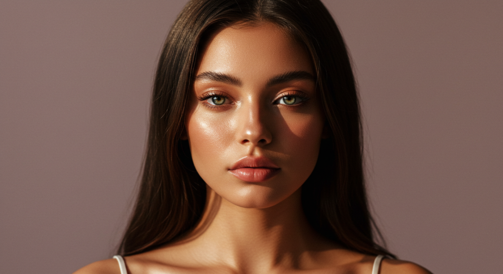
Color fills our world. It paints sunsets. It colors flowers. It also powers fashion. Clothes gain life from color. The right colors boost any outfit.
Do you pick clothes by color? Maybe you grab black pants. Then a blue shirt. Is that all there is? No way! Color goes much deeper.
This article is your guide. We will explore color in clothing. Learn about primary, secondary, and tertiary hues. See how to mix colors like a pro. Ready to make your wardrobe pop? Let’s start now.
1. Understanding Primary Colors

1.1. What Are Primary Colors?
Think back to art class. Remember primary colors? Red, yellow, and blue. These are the base colors. You cannot make them by mixing others. They are the starting point. All other colors come from these three.
Primary colors are strong. They are pure and basic. They grab your attention. Think of a fire engine red. Or sunshine yellow. Ocean blue. These are primary powerhouses.
1.2. Primary Colors in Clothing
How do primary colors work in clothes? Very well! A red dress shouts confidence. A yellow top feels cheerful. Blue jeans are a classic for good reason.
Wear one primary color at a time. Let it be the star. Pair it with neutrals. Black, white, gray, or beige work great. A red shirt with black pants looks sharp. Blue jeans with a white tee are timeless.
Don’t wear all three primary colors at once. It can look too much. Pick one. Make it the focus. Keep the rest simple.
1.3. Power of Primary Colors
Primary colors send a message. They are bold and direct. Red means passion. Yellow shows joy. Blue brings calm.
Wearing primary colors shows confidence. You are not afraid to stand out. These colors are easy to spot. People will notice you.
Use primary colors when you want impact. A job interview? Maybe blue for trust. A fun party? Red can show energy. Think about the message your color sends.
2. Exploring Secondary Colors

2.1. Mixing Primary Colors
Now, let’s mix it up. Secondary colors come from primaries. Mix red and yellow. You get orange. Mix yellow and blue. You get green. Mix blue and red. You get purple.
Orange, green, and purple are secondary colors. They are a step away from pure primary. They are still bright. But they have a bit more depth.
Think of sunset orange. Or forest green. Deep plum purple. These are richer than primaries alone.
2.2. Secondary Colors for Wardrobe
Secondary colors add flavor. Orange is lively. Green is fresh. Purple is regal. They bring more choices to your clothes.
An orange sweater is warm. A green skirt feels natural. Purple pants are unique. Secondary colors offer variety.
Pair them with neutrals too. But also with each other. Green and purple can work together. Orange and green can too. Just be careful. Balance is key.
2.3. Balance with Secondary Colors
Secondary colors need balance. They are not as in-your-face as primaries. But they can still be strong. Don’t use too many at once.
Pick one or two secondary colors per outfit. Let them work together. Or pair one with neutrals. A green jacket with gray jeans is easy. A purple top with a black skirt is chic.
Think about the shade. A light green is softer than a bright green. A deep purple is calmer than a neon purple. Shade matters with secondary colors.
3. Delving into Tertiary Colors

3.1. Creating Tertiary Colors
What comes after secondary? Tertiary colors! These are made by mixing. Mix a primary with a secondary. For example, mix red (primary) with orange (secondary). You get red-orange (tertiary).
There are six tertiary colors. Red-orange, yellow-orange, yellow-green, blue-green, blue-violet, and red-violet. See the pattern? It’s always primary then secondary name.
Tertiary colors are more muted. They are softer. They are less bold than primaries or secondaries. Think of peach (yellow-orange). Olive (yellow-green). Teal (blue-green). These are complex and interesting.
3.2. Tertiary Color Palette for Fashion
Tertiary colors are fashion gold. They are sophisticated. They are versatile. They work for many styles.
Olive green pants are stylish. Peach blouses are gentle. Teal dresses are elegant. Tertiary colors add class. They are not too loud. But they are not boring either.
Use them as base colors. Or as accents. A full outfit in tertiary colors can look amazing. Mix different tertiary shades for depth.
3.3. Subtlety of Tertiary Colors
Subtlety is the key with tertiary colors. They whisper style. Not shout it. They are for those who like understated looks.
Tertiary colors are easy to wear. They often look good on many skin tones. They are less risky than bright colors. If you like to keep things low-key, try tertiary colors.
They work great for work outfits. Or for casual days. They are not just for special events. Tertiary colors fit into everyday life.
4. Primary and Secondary Color Combinations

4.1. Classic Primary + Secondary Pairings
Time to mix colors! Primary and secondary combos can be great. Some are classics. Think red and green. Blue and orange. Yellow and purple.
Red and green is bold. Think holiday colors. Or nature. A red top with a green skirt is eye-catching.
Blue and orange is lively. Think sunsets. Or sports teams. A blue dress with orange shoes pops.
Yellow and purple is unique. Think royalty. Or art. A yellow shirt with purple pants is daring.
4.2. Unexpected Primary + Secondary Combos
Want to be different? Try unexpected mixes. Break the rules a bit. Who says red and blue don’t work? Or yellow and green?
Red and blue is patriotic. But also modern. A red jacket with blue jeans is cool.
Yellow and green is fresh. Think spring. Or gardens. A yellow top with a green skirt is fun.
These combos are less common. That’s why they stand out. Be brave. Try something new.
4.3. Occasions for Primary & Secondary Mixes
When to wear these bolder combos? For fun events! Parties. Concerts. Casual hangouts. Places where you want to show energy.
Primary and secondary mixes are not for every day. Or for formal events. They are too strong for serious settings. Save them for when you want to be playful.
Think about the mood. Do you want to feel bold and bright? Then primary and secondary combos are for you.
5. Primary and Tertiary Color Combinations

5.1. Harmonious Primary + Tertiary Combos
Now for softer mixes. Primary and tertiary colors can be harmonious. They balance each other out. The primary color adds pop. The tertiary color adds calm.
Think red with olive green. Blue with peach. Yellow with teal. These are gentler than primary-secondary mixes.
Red top with olive pants is stylish. Blue shirt with peach skirt is soft. Yellow dress with teal shoes is chic.
5.2. Contrasting Primary + Tertiary Combos
Contrast can be good too. Primary and tertiary colors can create subtle contrast. It’s not harsh. But it’s still interesting.
Try red with blue-green (teal). Blue with yellow-orange (peach). Yellow with red-violet (mauve). These have a bit of tension. But in a good way.
Red scarf with a teal coat is smart. Blue top with peach pants is cute. Yellow bag with a mauve dress is trendy.
5.3. Primary Colors as Accents
Sometimes, less is more. Use primary colors as accents. Let tertiary colors be the main show. A small pop of primary can make a look.
Wear an olive green dress. Add a red belt. Wear peach pants. Add a blue scarf. Wear a teal skirt. Add yellow earrings.
Primary color accents draw the eye. They add a spark. Without being too loud. It’s a subtle way to use primary power.
6. Secondary and Tertiary Color Combinations

6.1. Elegant Secondary + Tertiary Mixes
Secondary and tertiary colors together? Very elegant! These mixes are sophisticated. They are smooth. They work well for classy looks.
Think green with peach. Purple with olive. Orange with teal. These are not too bright. But not dull either.
Green blouse with peach pants is refined. Purple sweater with olive skirt is posh. Orange top with teal jeans is polished.
6.2. Playful Secondary + Tertiary Blends
Don’t think secondary and tertiary are only for serious looks. They can be fun too! Mix them in playful ways. Get creative.
Try green with yellow-orange. Purple with red-orange. Orange with blue-green. These are unexpected. But they work.
Green jacket with yellow-orange pants is zesty. Purple shirt with red-orange skirt is lively. Orange dress with blue-green shoes is fun.
6.3. Building Outfits with Secondary & Tertiary Colors
Want a full outfit idea? Start with a secondary color. Then add tertiary colors. Think in layers.
A green dress (secondary). Add a peach scarf (tertiary). And olive shoes (tertiary). That’s a complete look.
A purple skirt (secondary). Add a teal top (tertiary). And red-orange earrings (tertiary). Another great outfit.
Secondary and tertiary combos are easy to build. They are versatile. They can be dressy or casual. Experiment and find your style.
7. Analogous Color Schemes

7.1. What are Analogous Colors?
Analogous colors sit next to each other on the color wheel. Think of a rainbow. Red, orange, and yellow are analogous. Blue, blue-green, and green are too.
Analogous colors are harmonious. They blend smoothly. They feel natural together. Like colors in a garden. Or a sunset.
Using analogous colors creates calm looks. They are easy on the eyes. They are pleasing and balanced.
7.2. Analogous Colors in Outfits
How to wear analogous colors? Easy! Pick three colors next to each other. Wear them together.
A red top. An orange scarf. Yellow shoes. That’s analogous. A blue dress. Blue-green earrings. Green bag. Also analogous.
Analogous outfits are subtle. They are not too loud. They are great for everyday wear. Or for times you want to look put-together but not flashy.
7.3. Depth with Analogous Colors
Analogous colors can add depth. Use different shades. Light and dark versions of the same colors.
Light blue shirt. Medium blue jacket. Dark blue jeans. All blue, but with interest. Light green top. Olive green pants. Dark green shoes. Green shades create texture.
This trick makes analogous outfits more dynamic. It stops them from looking flat. Play with light and dark for extra style.
8. Complementary Color Schemes

8.1. Understanding Complementary Colors
Complementary colors are opposites. They sit across from each other on the color wheel. Red and green are complementary. Blue and orange are too. Yellow and purple also match.
Complementary colors create contrast. They pop next to each other. They are bold and exciting. Like fire and ice. Or day and night.
Using complementary colors makes outfits vibrant. They grab attention. They show you are daring with style.
8.2. Complementary Color Outfits
Wearing complementary colors takes guts. But it pays off. Keep it simple at first. Use one color as the main. The other as an accent.
A blue dress. Orange earrings. That works. A yellow shirt. Purple scarf. Also great. Red pants. Green top. Classic contrast.
Don’t wear equal amounts of both colors. It can be too much. Let one color lead. The other just adds a spark.
8.3. Toning Down Complementary Colors
Complementary colors too bright? Tone them down! Use softer shades. Dusty rose and sage green. Powder blue and muted peach. Light yellow and lavender.
These softer versions are still complementary. But they are gentler. Easier to wear every day. They give contrast without shouting.
Try these for a more subtle complementary look. You get the pop. But in a quieter way.
9. Triadic Color Schemes

9.1. What are Triadic Colors?
Triadic colors are three. They are evenly spaced on the color wheel. Imagine a triangle inside the color wheel. The points land on triadic colors. Red, yellow, and blue are triadic (primary colors!). Orange, green, and purple are also triadic (secondary colors!).
Triadic colors are balanced. They offer variety. But still feel harmonious. They are more complex than analogous or complementary. But not chaotic.
Using triadic colors makes outfits interesting. They show you know color well. They are stylish and clever.
9.2. Triadic Color Combinations for Clothes
Wearing triadic colors can be fun. Pick three colors from a triadic set. Wear them together.
A red jacket. Yellow top. Blue jeans. Primary triadic. An orange dress. Green bag. Purple shoes. Secondary triadic.
Triadic outfits are bolder than analogous. But less intense than complementary. They are a good middle ground. For those who want color but not too much.
9.3. Mastering Triadic Color Outfits
Triadic outfits need care. Don’t use equal amounts of all three colors. Pick one main color. Use the other two as accents.
Blue dress (main). Yellow belt (accent). Red shoes (accent). See how blue leads? Orange pants (main). Green shirt (accent). Purple scarf (accent). Orange is the focus.
This way keeps triadic outfits balanced. Not too busy. Still stylish and colorful. Practice makes perfect.
10. Monochromatic Color Schemes

10.1. Monochromatic Color Basics
Monochromatic means one color. But in different shades. Light blue. Medium blue. Dark blue. All blue. That’s monochromatic.
Monochromatic schemes are simple. They are elegant. They are easy to wear. They always look put-together.
Using monochromatic colors creates smooth looks. They are refined and chic. They are great for any occasion.
10.2. Building Monochromatic Outfits
How to make monochromatic outfits? Pick one color. Then use different shades of it. Light to dark. Or dark to light.
Light gray top. Medium gray pants. Dark gray jacket. Gray monochromatic. Light pink dress. Rose pink belt. Fuchsia pink shoes. Pink monochromatic.
Monochromatic outfits are easy to create. They always look stylish. They are a safe bet when you are unsure.
10.3. Texture in Monochromatic Looks
Monochromatic can be plain. How to fix that? Texture! Add different fabrics. Leather, silk, denim, wool.
Denim jacket (blue). Silk top (light blue). Wool pants (dark blue). All blue, but interesting textures. Leather skirt (black). Cashmere sweater (gray). Cotton shirt (white). Texture mix makes it pop.
Texture adds depth to monochromatic looks. It stops them from being boring. It’s a key trick for monochrome style.
11. Neutral Color Schemes with a Pop

11.1. What are Neutral Colors?
Neutral colors are the basics. Black, white, gray, beige, brown, navy. They are not bright. They go with everything. Like the background of an outfit.
Neutrals are versatile. They are timeless. They are essential in any wardrobe. They form the base for many looks.
Using neutral colors makes outfits easy to wear. They are safe. They are always in style.
11.2. Adding a Pop of Color to Neutrals
Neutrals can be plain on their own. How to spice them up? Add a pop of color! A bright scarf. Colorful shoes. A bold bag.
Black dress. Red shoes. Pop of red! Gray pantsuit. Yellow scarf. Pop of yellow! Beige coat. Blue bag. Pop of blue!
This trick makes neutral outfits fun. It adds interest without being too much. It’s a great way to use color if you like neutrals.
11.3. Color Pop Placement
Where to put the color pop? Think about focus. Shoes? Scarf? Bag? Jewelry? Pick one or two spots. Don’t go overboard.
Red shoes grab attention down low. A yellow scarf draws eyes up. A blue bag adds color to the side. Think about what you want to highlight.
Small pops of color are effective. They are stylish. They are easy to do. Try it and see the difference.
12. Seasonal Color Palettes

12.1. Colors for Spring
Spring is fresh. Think light and bright colors. Pastels are perfect for spring. Light pink, baby blue, mint green, pale yellow, lavender.
Spring colors are cheerful. They are airy. They reflect the season’s mood. New beginnings and fresh starts.
Wearing spring colors makes you feel light. They brighten your look. They are perfect for warmer weather.
12.2. Colors for Summer
Summer is hot. Think bold and vibrant colors. Bright blues, sunny yellows, hot pinks, coral, lime green.
Summer colors are energetic. They are fun. They match the season’s vibe. Long days and sunny skies.
Wearing summer colors shows confidence. They are eye-catching. They are great for parties and vacations.
12.3. Colors for Fall and Winter
Fall is warm and earthy. Think rich and deep colors. Rust orange, mustard yellow, burgundy red, olive green, chocolate brown.
Fall colors are cozy. They are warm. They reflect the season’s change. Leaves falling and cooler days.
Wearing fall colors feels grounding. They are sophisticated. They are great for work and casual wear.
Winter is cool and deep. Think jewel tones and dark neutrals. Deep blues, emerald green, ruby red, sapphire, black, gray, white.
Winter colors are elegant. They are strong. They match the season’s feel. Short days and colder weather.
Wearing winter colors looks polished. They are classic. They are great for formal and everyday looks.
13. Skin Tone and Color Harmony
13.1. Understanding Skin Tones
Skin tones vary. Warm, cool, neutral. Warm skin has yellow undertones. Cool skin has pink undertones. Neutral is a mix.
Knowing your skin tone helps. It guides color choices. Colors can enhance your natural look. Or wash you out.
Finding your skin tone is easy. Look at your veins. Green veins? Warm tone. Blue veins? Cool tone. Both? Neutral.
13.2. Best Colors for Warm Skin Tones
Warm skin tones shine in warm colors. Yellows, oranges, reds, browns, olives. These colors bring out your skin’s glow.
Gold jewelry looks great on warm tones. Think of sunset colors. Or autumn leaves. These palettes flatter warm skin.
Avoid cool colors near your face. Blues and grays can make warm skin look dull. Stick to warm hues for best results.
13.3. Best Colors for Cool and Neutral Skin Tones
Cool skin tones rock cool colors. Blues, grays, purples, silvers, pinks. These colors enhance cool undertones.
Silver jewelry looks amazing on cool tones. Think of winter colors. Or ocean shades. These palettes suit cool skin.
Neutral skin tones are lucky. They can wear almost any color. Warm or cool, both work well. Experiment and have fun!
14. Fabric and Color

14.1. How Fabric Affects Color
Fabric changes color. Shiny fabrics make colors brighter. Matte fabrics make colors softer. Texture also plays a role.
Silk makes colors vibrant. Velvet makes colors deep. Cotton makes colors casual. Denim makes colors rugged.
Think about fabric and color together. They work as a team. The right fabric can boost a color. Or tone it down.
14.2. Best Fabrics for Bright Colors
Bright colors shine in shiny fabrics. Silk, satin, sequins. These fabrics reflect light. They make colors pop even more.
Bright red silk dress. Neon pink satin top. Electric blue sequin skirt. These are showstoppers. For when you want to sparkle.
Use shiny fabrics for bold color moments. They amplify the color’s impact. Perfect for parties and events.
14.3. Best Fabrics for Subdued Colors
Subdued colors look great in matte fabrics. Cotton, linen, wool, suede, velvet. These fabrics absorb light. They make colors softer and richer.
Olive green cotton pants. Dusty rose linen shirt. Burgundy wool coat. These are refined and elegant. For everyday style.
Matte fabrics enhance subtle colors. They add depth and sophistication. Ideal for work or casual chic looks.
Conclusion: Color Confidence Unleashed

Color is powerful. It shapes style. It shows personality. Mastering color unlocks your wardrobe.
Primary, secondary, tertiary. Analogous, complementary, triadic. Monochromatic, neutrals, seasonal. Skin tone and fabric. So many ways to play with color!
Don’t be afraid to experiment. Try new combinations. Break the rules sometimes. Find what colors make you feel great.
Color confidence is key. Wear what you love. Own your color choices. Let your style shine.
Summary Table: Color Combinations Quick Guide

| Combination Type | Description | Best Occasions | Example Colors |
|---|---|---|---|
| Primary & Secondary | Bold, high contrast | Parties, casual fun | Red & Green, Blue & Orange, Yellow & Purple |
| Primary & Tertiary | Harmonious, balanced | Everyday wear, casual chic | Red & Olive, Blue & Peach, Yellow & Teal |
| Secondary & Tertiary | Elegant, sophisticated | Work, dressy casual | Green & Peach, Purple & Olive, Orange & Teal |
| Analogous | Smooth, harmonious, calming | Everyday, relaxed events | Red, Orange, Yellow; Blue, Blue-Green, Green |
| Complementary | High contrast, vibrant, daring | Parties, making a statement | Red & Green, Blue & Orange, Yellow & Purple |
| Triadic | Balanced variety, interesting | Casual outings, stylish events | Red, Yellow, Blue; Orange, Green, Purple |
| Monochromatic | Simple, elegant, refined | Any occasion, work, formal | Light, Medium, Dark Shades of One Color |
| Neutrals + Pop | Versatile, easy, with focal point | Everyday, adding interest | Black & Red, Gray & Yellow, Beige & Blue |
FAQ: Color Questions Answered

Q: How many colors should I wear in one outfit? A: Stick to 2-3 main colors. Plus neutrals if you like. Too many colors can look busy.
Q: Can I mix warm and cool colors? A: Yes! But do it carefully. Use one as main. The other as accent. Or use muted shades of both.
Q: What are good colors for job interviews? A: Blues and grays are safe and professional. They show trust and competence.
Q: How do I find my best colors? A: Look at your skin tone. Try on different colors. See what makes you glow. Ask friends for feedback too.
Q: Are there colors I should never wear together? A: Not really! Fashion is about breaking rules. But some combos are harder to pull off. Practice and experiment.
Q: What about black? Is it really neutral? A: Yes, black is a classic neutral. It goes with almost everything. But don’t rely on it too much. Color is fun!
Q: How can I use color to look taller or slimmer? A: Darker colors can slim. Vertical color blocks can lengthen. Monochromatic looks can also create height.
Joanna Perez, with a degree in Creative Writing, excels in recommending distinctive clothing color mixes and trends that deeply connect with readers. She simplifies the often daunting task of color selection, making fashion decisions more personalized and impactful. Her passion for vibrant color palettes and the stories they tell makes her an indispensable voice in the fashion community.
Reviewed By: Marcella Raskin and Anna West
Edited By: Lenny Terra
Fact Checked By: Sam Goldman
Photos Taken or Curated By: Matthew Mansour