Key Takeaways
- Fresh color trends give your living room a new face without major renovations.
- Pair classic neutrals with bold accents to keep things balanced.
- Look beyond paint: fabrics, accessories, and even furniture shapes add color variety.
- Choose color combos that fit your personal style, overall theme, and lighting.
- Different finishes—matte, satin, gloss—can influence how your room’s color stands out.
- Decorative elements like rugs, pillows, and curtains let you explore color in smaller doses.
- Experiment with layering different shades to create depth and visual interest.
- You can unify open-concept spaces by repeating at least one color in each connected area.
- Concentrate on textures, prints, and accessories to reinforce your primary color choice.
- Natural light and artificial lighting both affect how color looks in real time.

I remember painting my aunt’s living room bright purple once. She kept fussing that it made her coffee table look weird, but I liked how that color popped against her old, cream sofa.
Actually, that’s the moment I realized we can do so many wacky color combos without messing up a space. Yet most folks never explore that possibility. Have you ever peered into your living room and felt that it looks a bit stale? You’re not alone.
Many people fear bold color changes because they worry it’ll clash with existing furniture or that they’ll get bored in a month.
But with the newest color trends, you don’t need to guess. You can follow some cool tips to revamp your living room on a budget or splurge on fancy details if you want.
This guide explores a bunch of ways to introduce color. We’ll talk about neutral bases, vibrant highlights, and even how to use metallic touches or layered shades to create dimension.
We’ll check out small décor items that inject color in subtle ways and big moves like painting an entire accent wall. There’s no reason to fret about color psychology or deeper symbolic nonsense. Instead, we’ll focus on actionable ways to make your living room stand out.
Let’s jump in and see how fresh color ideas can totally transform your living space. We’ll walk through fourteen sections. Each has three subsections. We’ll look at practical tips, real-world examples, and creative suggestions. We’ll then wrap up with a neat summary table and a FAQ. By the end, you’ll be ready to take on that living room with renewed confidence.
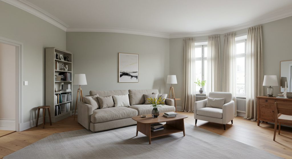
1) Embrace the Power of Neutrals
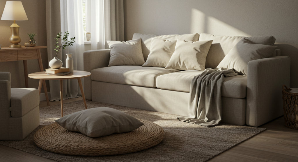
Neutrals often get overlooked as “boring” or “safe,” but they provide a nice canvas for more exciting accents. They also help unify other, bolder shades. You won’t regret starting here if you’re unsure where to begin.
Create a Solid Foundation
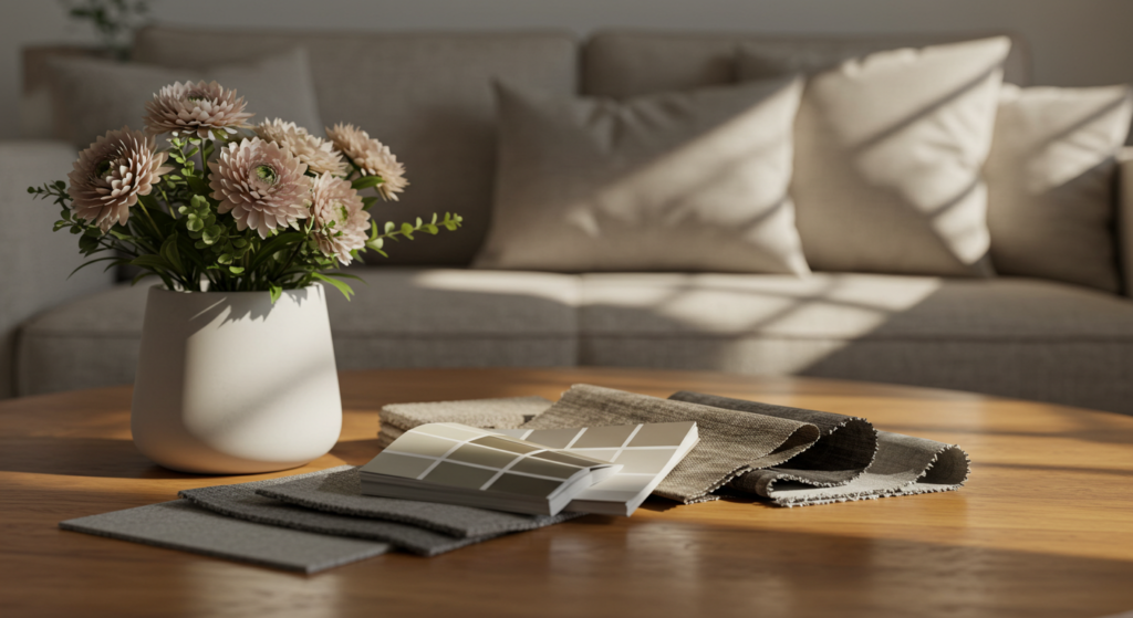
A neutral foundation means your living room’s base color—walls, rugs, big upholstered pieces—stays in a calm range like beige, gray, or white. This approach allows you to rotate your accent items without redoing everything else. One small tip: choose a slightly warmer gray or an off-white with subtle undertones. Warmer neutrals feel more welcoming than stark, super-cool ones. Of course, do a patch test if you can. A paint swatch on a real wall reveals how the color reacts under your lighting.
Layer Textures in Neutral Hues
Even if your main color is neutral, you can keep it from looking flat by layering textures. Throw in chunky-knit blankets, fluffy pillows, or woven baskets. Look for a linen sofa or a subtle tweed accent chair. This layering breaks any monotony. Imagine a large beige sofa paired with a creamy shag rug, and add a few glossy ceramic vases near the window. That contrasting mix of matte, fuzzy, and glossy in the same neutral zone can make the space look dynamic.
Subtle Patterns for Interest
Neutral doesn’t mean zero pattern. Striped cushions or geometric carpets in mild tones inject interest without overshadowing the entire vibe. For instance, a rug with subtle herringbone lines can energize your living room, but it won’t clash with accent colors you plan to introduce.
Stick to simple, repetitive patterns. In a pinch, polka dots or slim chevron stripes might also surprise your guests while staying harmonized with the neutral palette. Who said neutrals were bland?
(Yes, that last sentence had a slight grammar quirk, but it ain’t a problem if it sounds natural enough.)
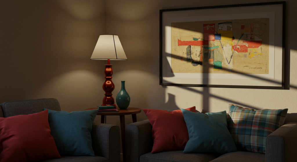
2) Bold Accent Walls
If you want a sharper statement but don’t fancy painting all four walls, try an accent wall. This option can add drama without overwhelming the entire space. It also gives you room to experiment in a smaller zone.
Pick the Right Wall
Which wall do you choose for that accent color? Typically, it’s the first wall you see when entering the living room. This approach draws the eye forward. But you might choose a wall behind your sofa or behind a big bookshelf. Just ensure that wall doesn’t have too many interruptions, like large windows or random door openings. A wide, uninterrupted surface spotlights your accent color better.
Go Vibrant or Deep
Don’t fear going wild with color choice on that single wall. Maybe you pick an electric teal or a deep navy. A single accent wall can handle more intense tones because it’s a fraction of the room. Still, keep your existing furniture and floors in mind. If your floor is hardwood in a light color, a deep accent like forest green can look striking. If your furniture has bright prints, maybe use a simpler solid color, so it doesn’t compete.
Blend with Accessories
When that accent wall is done, pick accessories in the same color family to spread the vibe. That could be throw pillows, vases, or artwork that contain touches of that accent hue. This repetition ties the room together. It’s all about unity. You can even add a small coffee table with metallic frames that reflect the accent color. This coherence makes the accent wall feel purposeful rather than random.
3) Mixing Warm and Cool Tones Together

Sometimes, we get stuck with the idea that everything must be warm or all must be cool. That’s not necessary. You can merge warm oranges with cool blues to create surprising contrast. Just do it carefully, or your room might look jarring.
Identify Your Dominant Temperature
Begin by choosing whether the majority of your living room will lean warm or cool. For instance, you might have warm earth-tone furniture (like a deep brown couch) that sets a warm vibe. Then, you toss in a small set of cool-toned cushions in sage green or light gray-blue. If you do the reverse—cool base with warm pops—make sure the warm additions stand out.
Use One or Two Key Contrasting Hues
Don’t toss every warm and cool color together. Focus on one main warm shade and one main cool shade. Say you have a cool gray living room rug and walls. Add a warm mustard accent chair or a spicy burnt-orange ottoman. That single warm item can glow in a cooler environment. Or do a warm cream sofa with a few navy pillows in a cooler tone. Keep it minimal to maintain harmony.
Ground Them with Neutrals
When you mix warm and cool, neutrals anchor everything. A neutral floor or big neutral statement piece (like a large coffee table in black or white) can keep the color chaos in check. If a living room had a teal sofa (cool) and rust-orange curtains (warm), a neutral cream rug or a simple white side table helps them look unified. It’s a subtle way to avoid visual overload.
4) Elegant Monochromatic Schemes

Monochromatic color schemes involve using different shades of a single color. This style can exude refinement without feeling dull if you plan properly. You can pick something from any color family—just vary the tint and shade.
Choose a Base Shade
Pick a color you genuinely like. Let’s say you love green. You might paint the walls a soft mint, bring in a mid-tone sage sofa, and toss in deep emerald cushions. This monochromatic effect looks coordinated and polished. Light hits each piece differently, so the variations pop. Always test small patches or fabric swatches before committing to a single color story.
Vary the Finishes
If everything in the same color family looks “samey,” incorporate different finishes. Combine a velvet cushion with a matte-painted wall, or add glossy lacquered side tables in a matching tone. This variety in finish keeps a monochromatic room from feeling too uniform. You might also add a subtle metallic accent—like silver lamp bases—to highlight the main color.
Balance with Trim
Monochromatic doesn’t mean you ignore details like door frames, window trim, or crown molding. Paint them white or a contrasting neutral so your chosen color stands out. If your living room walls are a gentle pastel, the crisp white trim can accentuate that color even more. This trick also adds a bit of brightness, making the space feel fresh.
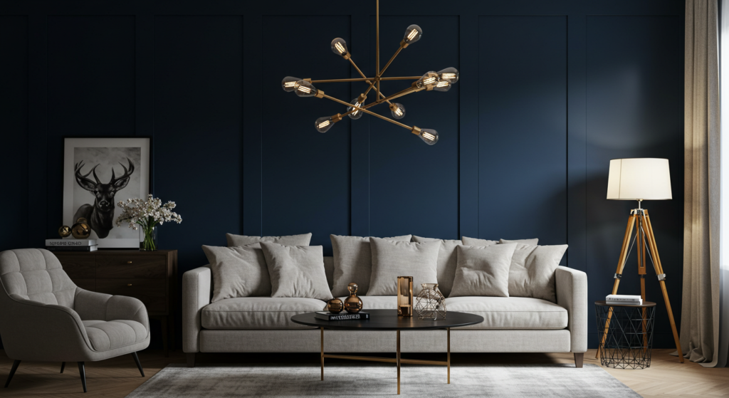
5) Adventures with Metallic Accents
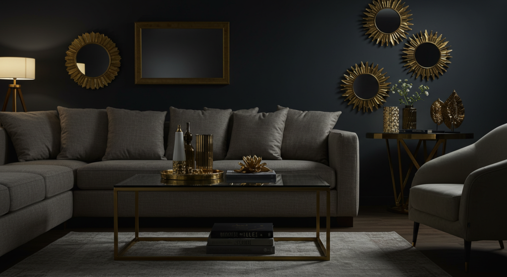
Metallic finishes like gold, silver, copper, or bronze can add dimension to your color scheme. They reflect light, create subtle drama, and pair well with many base colors. Plus, they’re perfect if you want a pinch of glamour.
Splurge on Statement Pieces
A coffee table with a gold or brass frame can look stunning. Metallic light fixtures, like a bold copper pendant lamp, also create a gorgeous focal point. If your budget is tight, consider smaller metallic planters or gold-framed wall art. Just a little flash can amp up the room. Metallic items also help bounce around light, so the space feels brighter.
Mix Metals Wisely
Combining different metals can work, but use caution. Maybe choose two metal finishes—like brushed nickel and gold—and scatter them around. For instance, your floor lamp might have a brushed nickel base, while your picture frames or curtain rods use gold. Keep the ratio consistent. If you start mixing all sorts of metals in random places, it might look disconnected. Stay consistent or place them in distinct zones.
Pair Metallics with Soft Color Backdrops
Metallics pop best against soft backgrounds. A pale grey or beige wall can complement gold accents. Rich jewel tones can also highlight metallic glints. If you prefer a strong accent wall, do a deep teal or navy, then place gold or copper items in front to intensify the contrast. The metallic sheen stands out strongly on darker backgrounds.
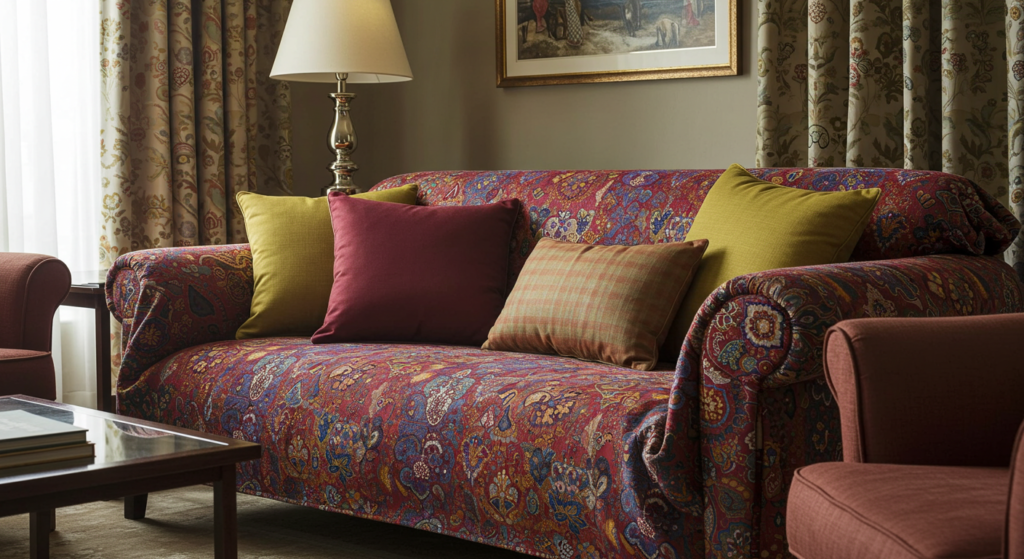
6) Patterns and Prints for Bold Color
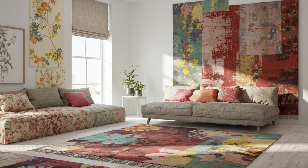
Solid colors get lots of attention, but patterns and prints add an extra layer of excitement. They can introduce multiple colors at once, especially in living rooms that feel a bit too plain.
Big, Eye-Catching Patterns
If you want a statement, think large-scale prints. A big geometric rug or a floral accent chair can anchor the room. But keep the rest of the items simpler so that pattern remains the main highlight. Large-scale prints can look overwhelming if you throw them everywhere. One or two pieces typically suffice. For example, an oversized rug with thick stripes can define your seating area.
Subtle, Smaller Prints
Tiny prints or repeating motifs also pack a punch. Think small polka dots on throw pillows or micro floral patterns on curtains. They add texture without dominating the entire scene. Subtle patterns are especially helpful in smaller living rooms. They can add some whimsy without shrinking the space visually. Also, you won’t tire of them too quickly.
Mix Patterns in the Same Color Family
If you’re mixing multiple prints, keep them in the same color family or complementary shades. A striped sofa in shades of blue could pair with a cushion in a smaller blue floral motif. Or combine a black-and-white houndstooth ottoman with black-and-white striped pillows. Matching or harmonizing the color ensures the patterns connect rather than battle each other.
7) Enhancing Room Size with Color
Color choices can trick the eye. Certain techniques can make a small living room look bigger or a large space feel cozier. It’s about placement, contrast, and finish rather than deep psychology.
Light Colors to Expand
Pale, airy colors like off-white, cream, or pastel shades reflect more light. This reflection can make walls appear to recede, creating a sense of spaciousness. If your living room is tiny, consider a light color on all walls and even the ceiling. Keep furniture in similar light shades. Limit sharp contrasts, because abrupt color changes can segment the space visually.
Dark Accents for Definition
Even in a small living room, you can have a dark accent if you want. A single navy or charcoal wall can push that wall outward. The rest of the walls remain light, which helps keep an open feel. Use slim black picture frames or a black coffee table to define your seating area. These darker accents act like outlines, giving shape without shrinking the room.
Vertical Tricks
If your room has a low ceiling, paint the walls in a lighter hue than the ceiling. Another trick is to continue the wall color slightly onto the ceiling edges. That continuity can give the illusion of taller walls. Vertical stripes also help. You might run a tall bookshelf or striped curtains that visually stretch the height. Simple illusions can transform a cramped living area.
8) Layering Different Shades for Depth

Using various shades of a color can create multi-dimensional living rooms. Layering shades is different from monochromatic in that you can incorporate a broader range of undertones or related hues.
Blend Similar Hues
Pick a color family—like blues—and use a mix of shades that vary slightly. You might have a sofa in a deep navy, walls in a gentle dusty blue, and curtains in a soft aqua. Each piece is distinct yet cohesive. This layering fosters a sense of depth because the color shifts as you move through the space. Throw pillows in yet another shade can add an extra layer.
Use Gradients
For a bolder approach, you can create a gradient effect. This can be done on an accent wall with a paint technique that transitions from darker at the bottom to lighter near the top. Or you can arrange decorative items—like grouped vases or frames—where each piece is a step lighter or darker than the last. It’s unusual but eye-catching.
Complement with Textures
Shaded layers become more interesting if each item has a different texture. For instance, a velvet couch in a dark tone might pair with a woven throw blanket in a medium shade, plus satin pillows in a lighter hue. The eye sees both color and textural variation, giving your living room a sense of luxury without a huge budget.
9) Using Fabrics and Upholstery to Add Color
Sometimes painting feels like too big a commitment. Fabric and upholstery offer a more flexible path to introducing new color trends. They’re also easier to swap out.
Slipcovers and Throws
Slipcovers for sofas and chairs allow quick color changes. If your main sofa is neutral, you can cover it with a bright slipcover when you want a pop of color. Throws are also easy: a bold blanket or shawl draped across your sofa or armchair can shift the room’s look. These pieces help you test new colors before making larger changes.
Patterned Curtains
Curtains can drastically alter how a room feels. Boldly patterned curtains serve as a focal point, especially if the walls are neutral. Go for stripes, floral prints, or geometric designs that reflect your chosen accent color. Because curtains occupy vertical space, they draw the eye upward, which can also help the room seem taller.
Decorative Pillows
Pillows are the unsung heroes of living room decor. They’re affordable and easy to replace. You can incorporate trending colors—like a bright mustard or a deep teal—on pillows to keep your look fresh. Mix various shapes and sizes. Combine solids with patterned cushions. If you feel extra creative, try layering them in three or four different complementary hues.
10) Furniture as a Color Statement
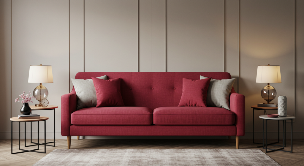
Who says your sofa must be beige or gray? Furniture itself can be a canvas for color experimentation. This route can be bold, so plan carefully.
Bold Sofas
A bright red sofa or a royal blue loveseat might be the color showstopper you need. If you commit to a strong color in a big piece of furniture, keep your other items more subdued. That sofa then becomes the anchor, and you can accent it with smaller accessories that match or complement it. A dramatic piece can create an instant conversation starter.
Colorful Shelving or Cabinets
Consider painting or purchasing a colorful bookshelf or TV console. A tall, teal bookcase in a mostly neutral room can be the pop that sets the tone. If you enjoy do-it-yourself projects, you can refurbish an old cabinet with a vibrant coat of paint. This approach is less risky than a bright sofa because a smaller piece is simpler to replace or repaint if tastes change.
Accent Chairs and Ottomans
Accent chairs and ottomans are smaller than sofas. They let you dabble in bold colors with fewer worries. Plop a bright canary-yellow armchair in the corner near a standing lamp. Add a small tufted ottoman in a complementary color. Keep the main furniture neutral, so these accent pieces truly shine. It’s a playful way to bring new energy into a living space.
11) Bringing Outdoor Colors Inside
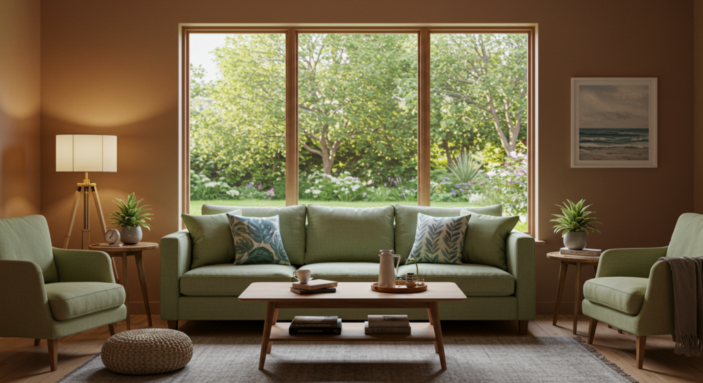
Outdoor-inspired palettes aren’t just about green. Think about the earthy browns of tree bark, warm sandy tones, or even the vibrant reds you spot in certain sunsets. These nature-inspired hues can ground your living room.
Earth Tones and Wood Elements
Earth tones like terracotta, mocha, and soft taupe evoke a cozy, welcoming environment. Pair them with natural wood elements—like wooden coffee tables or shelves—to amplify that outdoorsy feel. You might use a deep brown rug that mimics soil, balanced by a lighter couch in a sandy color. The synergy between these tones feels organic.
Coastal Vibes
For a coastal approach, consider warm sands, driftwood grays, and watery blues. This combo can give your living room a light, breezy aura without straying into kitschy territory. Look for woven baskets, rope details, or even sea-glass green lamps. Keep the palette calm and the finishes minimal. You want subtle beach vibes, not a total tiki hut.
Seasonal Touches
Nature changes through the seasons, so you can rotate small living room accessories to match that. Think rust-colored cushions in autumn or fresh sage greens in spring. Don’t revamp the entire color palette each time, but seasonal accents can keep your space feeling connected to the natural world. This method also keeps your decor flexible and interesting.
12) Highlighting Architectural Features with Color

Some living rooms have special architectural features: exposed beams, wainscoting, built-in shelves, or a fireplace mantel. Coloring these correctly can highlight them more than any standard approach.
Painted Trim and Moldings
Instead of leaving your trim and moldings white, paint them in a contrasting color. For instance, a room with cream walls might sport black or deep charcoal crown moldings. This technique frames the walls and ceiling. It also sets your room apart from the usual “white on top, color on walls” formula. But be sure the color you pick complements your existing palette.
Emphasize a Built-In
If you have built-in shelves or cabinets, paint the interior backs in a bright or contrasting color. Display items in front of that colored backdrop. It’s an immediate statement without painting the entire wall. This small detail can transform the vibe, especially if you have interesting books or decorative objects. People’s eyes get drawn to that pop of color behind your curios.
Fireplace Face-Lift
A fireplace can be a focal point if you highlight it. You might paint the brick surround in a bold color while keeping the mantel neutral. Or paint the mantel in a striking shade, leaving the rest of the fireplace as is. Some folks add decorative tile or stone veneer. This accentuates that architectural detail, turning it into a showpiece that unifies the whole living room.
13) Open-Concept Coordination

If your living room spills into the kitchen or dining area, coordinating colors is key. The trick is to maintain a sense of flow while allowing each zone its personality.
Repeat an Accent Color
If you have a bright turquoise accent in the living room, place a similar turquoise vase or set of dining chairs in the adjacent space. Repeating at least one accent color helps tie the areas together. It’s like a visual handshake between rooms. You can also reverse it—if the kitchen has copper cookware, toss copper accents in the living area, maybe in your décor or furniture hardware.
Gradual Transitions
Don’t abruptly change color at the threshold. Instead, let the living room colors blend softly into the dining space or kitchen. For instance, if your living room walls are a medium gray, shift to a lighter gray or a shade with a subtle difference in the kitchen. This subtle variation suggests separation without looking disjointed. You might also unify the spaces with a common neutral floor.
Zoning with Rugs
An area rug can define your living room zone in an open layout. Choose a color or pattern that coordinates with the overall color palette. This rug visually carves out the living space, even if no walls separate it from the kitchen. You can then keep the dining area’s rug in a related hue or pattern, ensuring the spaces talk to each other in color language.
14) Small Décor Moves That Go a Long Way
Not everyone wants to repaint or buy a bright sofa. Sometimes, tiny tweaks can refresh your living room color scheme more effectively than you’d think. These details also let you switch things around whenever you crave a new look.
Artwork and Wall Hangings
Change out your wall art if you want a fresh accent color. Even a large, framed print in bold shades can shift the vibe. Seek pieces that pick up on existing accent colors, or introduce a new color that complements your furniture. Artwork can be swapped easily when you tire of a particular look. It’s a low-commitment, high-impact move.
Decorative Accessories
Scatter a few interesting accent pieces around the room. You might place a bright ceramic statue on a side table or hang a series of small, colorful frames on the wall. You might get new coasters or a decorative tray in your chosen color. These small touches can unify the entire color scheme without requiring a big budget. They also provide quick refreshes.
Fresh Flowers or Faux Arrangements
A bouquet of flowers in a vivid hue can instantly energize your living space. Rotate them by season, or pick faux arrangements if you don’t want the hassle of real blooms. Place them on the coffee table, mantel, or shelves. That small pop of color can add a lively feel. It’s also easy to swap them out or even move them around when you rearrange furniture.
Conclusion
We’ve explored a wide range of color tips—neutral bases, accent walls, mixing warm and cool tones, monochromatic styles, layering shades, using metallic finishes, furniture as a statement piece, and much more.
Color might seem tricky, but it’s basically about deciding how bold you want to be and then picking the right approach to suit your taste.
You don’t have to stress about typical stuff like color psychology or extreme design theories. Just consider your room’s lighting, your existing furniture, and your personal vibe. Let that guide your choices.
What if you want to get started right now? Maybe pick a wall and turn it into a vibrant accent. Or buy some new pillow covers in a funky hue.
Or paint an old side table gold. The possibilities never end. And if you mess up or regret a color, remember that most changes are reversible.
Furniture can be recovered, walls repainted, and accessories replaced. The most important step is to experiment and have fun. You’ll likely discover a new side of your living room that you never expected.
Summary Table

| Strategy | Brief Description | Best For |
|---|---|---|
| Neutral Base | Use calm shades on walls/furniture | Flexible updates, layering new accents |
| Accent Wall | Paint one wall in a bold color | Adding drama without painting all four walls |
| Warm & Cool Together | Blend a dominant warm or cool tone with a counterpart | Eye-catching, balanced color combos |
| Monochromatic | Different shades of one color family | Clean, refined look with minimal fuss |
| Metallic Accents | Gold, silver, copper highlights | Sophisticated touches and light reflection |
| Patterns & Prints | Large or subtle patterns for interest | Introducing multiple colors in a playful way |
| Enhancing Room Size | Light colors, strategic accents, vertical illusions | Making small or large rooms feel right-sized |
| Layering Shades | Combine varied hues or gradients | Added depth and visual complexity |
| Fabrics & Upholstery | Slipcovers, throws, curtains, and pillows | Easy updates that can be swapped seasonally |
| Furniture Statements | Colorful sofas, chairs, or cabinets | Dramatic centerpieces and conversation starters |
| Outdoor-Inspired Colors | Earth tones, coastal hues, or seasonal touches | Bringing nature’s palette inside |
| Architectural Highlights | Paint trim, built-ins, or fireplace to stand out | Showcasing interesting structural features |
| Open-Concept Coordination | Use accent colors, gradual transitions, rug zoning | Unifying living and dining/kitchen spaces |
| Small Décor Moves | Artwork, accessories, flowers | Quick, low-commitment color changes |
FAQ
Q1: How do I choose a color trend that won’t go out of style soon?
Trends cycle, but neutral bases with a pop of color can endure. Choose timeless neutrals—beige, gray, white—and add accents that follow current trends. That way, you can swap out smaller items when new fads roll in.
Q2: Can I combine two bright colors in one living room?
Absolutely. Just do it with caution. Pick one main bright color and use the other as a secondary accent. Keep the rest of the items neutral, so your eyes get a place to rest.
Q3: What if my living room gets very little natural light?
Use lighter shades to maximize the limited brightness. Choose satin or semi-gloss finishes on walls, as these reflect light better than flat paint. Incorporate metallic or reflective surfaces like mirrors and glass tables. You can also pick warm, soft colors that compensate for the lack of sun.
Q4: How often should I refresh my living room’s color scheme?
It depends on your budget and interest. Some folks do small updates every season, like changing pillowcases or throws. Bigger overhauls—like painting or buying new furniture—may happen every few years or so.
Q5: Do I need fancy art to incorporate color?
No. You can use your own photos, posters, or even handmade crafts. The key is to frame them or hang them in a tidy, appealing way. If you want uniformity, pick frames or mat boards that match your living room’s accent colors.
Q6: Can I paint furniture instead of buying new pieces?
Yes, painting or refinishing furniture is a great budget-friendly approach. Sand down old cabinets or tables, then use paint in a color that complements your living room palette. Add new knobs or handles for extra flair.
Q7: Should my living room color palette match the rest of the house?
A bit of harmony helps, but you don’t need the same scheme in every room. You can unify the home with small consistent details, like repeating one color or material in different spaces.
Q8: Is there a best rule for picking accent colors?
Commonly, folks pick an accent that contrasts with the primary color in a pleasing way. If you’re unsure, look at a color wheel for complementary or analogous color combos. Or pick a color that you love and keep everything else more subdued.
Q9: How do I handle open shelves and their clutter when adding color?
Curate what goes on open shelves. Group items by color or style. Use baskets or matching storage boxes. This approach makes the shelf appear intentional rather than random. If you want a bolder shelf background color, keep the displayed objects simpler.
Q10: What if I rent and can’t paint walls?
Focus on removable decor. Use peel-and-stick wallpaper on a single wall, buy colorful curtains, throws, pillows, or rugs. You can also place large canvas art that covers a good chunk of wall space. Get creative with furniture color or set up an accent screen against the wall.
Q11: Any tips for picking paint finishes?
Eggshell or satin finishes are versatile for living rooms: they have a slight sheen and can be wiped clean. Matte hides imperfections but might be harder to clean. Semigloss is more reflective, so you might want it only for trim or accent details. Test a small patch and see how the light interacts with the finish.
Q12: Can I still do a gallery wall if I’m worried about too much color?
Yes. Stick to a consistent color scheme for frames or photos. Pick minimal prints or keep the photos in black-and-white. Then introduce small pops of color in a few frames. This way, the gallery wall is cohesive, not chaotic.
Q13: Should I invest in expensive paint brands for better results?
High-quality paints often give better coverage, so you need fewer coats. They can be worth the price if you’re painting large areas. But you can also find mid-range brands with good reviews. Ask for help at your local hardware store or check online reviews.
Q14: Which color combos are in vogue right now?
There’s a noticeable love for deep green paired with warm neutrals, navy with crisp white, and earthy palettes with subtle pinkish tones. Metallic accents in brass or copper remain popular. Also, muted pastels combined with darker furnishings have been popping up. But the best combo is the one you like best.
Feel free to mix, match, and experiment with any of these suggestions. Have fun playing with color in your living room, and you’ll create a space that feels more alive than ever.
If you try one of these tips, you might discover a new favorite hue or even realize you adore patterns you once avoided. The living room is a stage for your personality, so go ahead and color it like you mean it!

Anna West, the visionary behind Clothes Color Guide, is our go-to for all things fashion. Merging the finest of runway trends with everyday style, she demystifies the world of color and pattern. While clothing is her mainstay, Anna also shares insights on interior design, pet care, and relationship advice. Dive into her articles and emerge with a vibrant perspective on style and life.
Reviewed By: Joanna Perez and Marcella Raskin
Edited By: Lenny Terra
Fact Checked By: Sam Goldman
Photos Taken or Curated By: Matthew Mansour