Key Takeaways
- Dress color matters more than ever in virtual meetings, as camera and lighting can alter perceptions of your outfit.
- Choose hues that enhance your on-screen presence, coordinate with your background, and communicate professionalism without blending into your surroundings.
- Pay attention to fabric finishes, patterns, and accent pieces to ensure a crisp and engaging look.
- Adapt color strategies to different platforms, meeting contexts, and personal branding elements for maximum impact.
- Focus on versatility so your wardrobe can effortlessly transition from casual video calls to important corporate presentations.

In a world where online interactions are increasingly common—whether for business, academic, or social purposes—your virtual meeting attire plays a crucial role in making a strong impression. The colors you choose aren’t just about personal preference; they directly affect how you are perceived on-screen.
The camera and surrounding environment can subtly shift color appearances, sometimes washing out certain hues or causing distracting glare. That’s why a well-chosen color palette is one of the most reliable tools to convey confidence, expertise, and approachability in virtual settings.
While the term “dress for success” has long been associated with traditional offices, it’s just as relevant in a home office or remote workspace. From video interviews to team huddles and even client pitches, your outfit should reflect a balance of professionalism and authenticity.
You want to avoid loud, overly saturated shades that overpower the screen. Conversely, wearing colors that blend into your background or cause awkward color clashes can diminish the impact of your message.
In this comprehensive guide, we’ll explore all the details of selecting the most professional, camera-friendly hues for virtual meetings. We’ll delve into practical techniques, such as how to adjust your lighting or background to emphasize your chosen attire, and provide out-of-the-box tips to keep your style fresh yet polished.
By the end, you’ll have a solid grasp of best practices, useful color combinations, and strategic styling approaches that ensure you look—and feel—your best in every online session.
1. The Role of Lighting in Color Selection

Understanding Indoor vs. Outdoor Lighting
When it comes to appearing on-screen, lighting can drastically change how colors are perceived. If you’re taking a call indoors, artificial lighting could make your outfit appear dimmer, duller, or sometimes overly warm depending on the type of bulbs you use. Outdoor lighting, on the other hand, can wash out soft colors and emphasize any wrinkles or textures in your clothing.
- Indoor Setup: Opt for balanced bulbs (like daylight or natural white) and pick clothing shades that remain true to their original tone.
- Outdoor Setup: Wear slightly deeper or richer tones to avoid appearing washed out.
Adapting Color Choices to Different Times of Day
Morning sunlight can create cool, bluish tones, while late afternoon or evening light casts warmer, golden shades. For early video calls, you might select cooler outfits like navy or charcoal to match the crisp morning look. In late-day sessions, richer hues such as burgundy or forest green can complement the warm light.
- Morning Meetings: Cooler shades offer a refreshed look.
- Afternoon to Evening: Warmer, deeper colors sustain vibrancy.
Adjust your outfit depending on the time to maintain consistency and professional flair.
Experimenting with Webcam Settings
Many webcams allow for adjustments in brightness, contrast, and even white balance. These settings can make a big difference in how your attire is displayed. If you’re wearing a lighter color, you might decrease brightness to reduce overexposure. Conversely, if you chose a darker hue, boost the brightness slightly so you don’t disappear into the shadows.
- Trial Runs: Always test your video setup prior to important calls.
- Color Accuracy: Aim for a setting that captures the true color of your clothing without distortion.
2. Setting Up the Perfect Background

Using Neutral or Minimalist Backgrounds
A neutral or minimalist background ensures your outfit is the main focus. Busy backdrops can clash with or overwhelm your color choice. Soft grays, beige walls, and simple office settings highlight the professional vibe you’re going for.
- Plain Colors: Simple backdrops keep the viewer’s eye on you.
- Muted Tones: Neutral backgrounds pair well with most outfit colors and patterns.
Complementing Background Colors with Clothing
If you can’t choose a neutral setting, work with what you have. For instance, if your wall has a subtle green hue, wear something that complements or contrasts this color effectively—like a crisp white top with a dark blazer. Avoid direct tonal matches that cause you to blend into your surroundings.
- Light Wall: Darker or mid-tone outfits stand out.
- Bold Wall Color: Choose neutrals or complementary shades so you don’t clash.
Incorporating Subtle Textures or Patterns
Even if your backdrop is plain, introducing slight texture or pattern in your clothing can create visual interest. Think heathered fabric or a gentle pinstripe. Subtle patterns offer depth without distracting.
- Micro-Patterns: Stripes or checks that are barely noticeable on camera.
- Textured Fabrics: Tweed or jacquard can add elegance without overcomplicating the look.
3. Balancing Professionalism and Personal Style

Choosing a Signature Accent Color
Establishing a signature accent color can be a great way to express your personal style while maintaining a professional aura. For instance, adding a royal-blue tie, scarf, or piece of jewelry brings a pop of color that doesn’t overwhelm. This signature hue can also become part of your personal brand over time.
- Moderation: Use the accent color in small doses.
- Consistency: Reuse the same accent in different outfits to tie your style together.
Incorporating Subtle Brand Elements
If you represent a company or run a personal brand, you might want to weave in brand colors. But remember, brand colors aren’t always camera-friendly if they’re too bright or neon. Opt for a toned-down version or use brand colors in details like earrings, pocket squares, or subtle patterns in your shirt.
- Scaled-Down Tones: Muted brand colors are less distracting on camera.
- Smart Placement: Keep the branding minimal but recognizable.
Combining Comfort with Class
While you might be at home, that doesn’t mean you should compromise on professionalism from the waist up. Choose fabrics that are both breathable and polished, like a smooth cotton blend or a wrinkle-resistant knit. Feeling comfortable boosts confidence, which translates well on-camera.
- Breathable Fabrics: Maintain comfort during long calls.
- Formality Level: Match your comfort pieces with at least one structured garment, like a blazer or well-fitted cardigan.
4. Leveraging Neutral Basics

Timeless Whites and Off-Whites
White shirts, blouses, or tops are classic choices but can sometimes be overexposed by certain camera settings. Off-white shades like cream or ivory often fare better by avoiding harsh glare. They also create a crisp, professional backdrop for accessories.
- Camera Test: Check for over-brightness when wearing true white.
- Off-White Advantage: Ivory can read warmer on camera, reducing glare.
Reliable Blacks and Charcoals
Black is usually a safe bet; it conveys seriousness and works with almost any backdrop. However, too much black in a dimly lit environment might obscure your silhouette. Charcoal is a near-black option that’s more forgiving on different lighting conditions.
- Balanced Lighting: Use adequate light to avoid disappearing into a dark background.
- Mixing Textures: Add interest with a subtle pattern or textured fabric in black or charcoal.
Flexible Grays and Beiges
Gray and beige (or “greige” tones) can be your best friends during virtual calls. They’re professional, adapt to various lighting scenarios, and rarely clash with backgrounds. These hues also give you plenty of freedom to incorporate accessories or accent colors.
- Suitability: Perfect foundation for layering pieces like blazers or cardigans.
- Versatility: Works across all meeting types, from casual to formal.
5. Exploring Cool Color Palettes

Blues for Trust and Dependability
Blues—especially navy and cobalt—are often linked to trustworthiness in professional spaces. They translate well on-screen, maintain a serious vibe, and rarely wash out. A mid-tone blue can also be less severe than black for certain complexions.
- Navy Blazers: Combine with lighter shirts for a balanced contrast.
- Light Blue Dress Shirts: Polished and welcoming without being too bold.
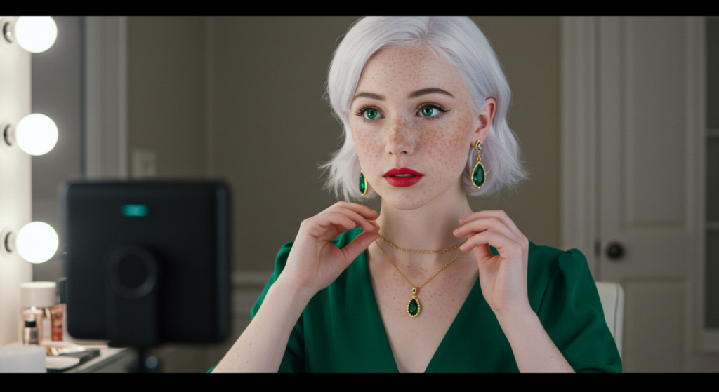
Calming Greens without the “Screen” Effect
Green is a cool color that offers a refreshing change from standard black, white, or navy. However, be cautious with bright or neon green, as it can blend into digital backgrounds if any green-screen features are in play. Forest green or olive are safer, more refined options.
- Earthy Greens: Pair nicely with neutrals like beige or gray.
- Green Tones: Choose deeper shades to avoid unintended virtual backgrounds picking it up.
Purples for a Sophisticated Twist
Purple can be tricky—some webcams shift it toward blue or pink. A deep plum or muted lavender can give a unique, sophisticated look if your camera handles the color accurately. Test it in advance.
- Subdued Shades: Aim for mid-tone or deeper purples to reduce color distortion.
- Paired Neutrals: Gray, charcoal, or beige complement purple nicely.
6. Integrating Warm Tones Tastefully

Subdued Reds and Burgundies
Reds can appear more intense on camera than in person. If you love red, opt for deeper or subdued varieties like burgundy or maroon to avoid dominating the screen. These shades often pair well with navy or charcoal.
- Depth is Key: Deep reds convey confidence without being overpowering.
- Layering: A burgundy blouse under a gray blazer offers a classy blend.
Harmonizing Earthy Browns
Browns might seem unconventional for virtual meetings, but they can impart a grounded, reliable vibe. Rich chocolate or espresso browns look fantastic with beige or a light blue top. Steer clear of muddy browns that can look dull or unkempt on-camera.
- Rich Tones: Deeper browns appear more polished.
- Contrast: Pair with lighter accent pieces to avoid a monotone ensemble.
Appealing Burnt Oranges
Burnt orange, rust, or terracotta are warm shades that can be stylish for creative or less formal settings. They convey individuality without going overboard. However, ensure your lighting setup is bright enough so these colors don’t dull on-screen.
- Strategic Placement: Use burnt orange in a sweater or accessory if your environment is neutral.
- Complimentary Hues: Grays, navy, or creams balance the boldness of warm tones.
7. Playing with Patterns and Prints

Selecting Scalable Patterns
Large, bold prints can be distracting, while very tiny patterns might cause a moiré effect on camera. Mid-scale patterns—like moderate polka dots, faint plaid, or subtle geometric shapes—tend to read best in virtual environments.
- Visual Balance: Keep patterns refined and not overly busy.
- Avoid Flickering: Tiny repetitive patterns can create strobing effects.
Blending Patterns with Solid Layers
If you adore patterns, tone them down by pairing a patterned blouse with a solid blazer, or wear a solid top under a patterned jacket. This approach draws attention to your face rather than letting the pattern overshadow you.
- Complementary Colors: Match one color from the pattern with your solid piece.
- Balanced Focus: The solid layer ensures the pattern isn’t too dominant.
Experimenting with Stripes
Stripes can be a hit or miss. Horizontal stripes might widen your on-camera appearance, while vertical stripes can elongate you. Thinner stripes are usually safer, but it’s best to test them with your webcam to avoid flicker effects.
- Vertical vs. Horizontal: Choose vertical if you want a more streamlined look.
- Pinstripes: Subtle and sophisticated, great for corporate settings.
8. Accessorizing for On-Camera Impact
Complementary Jewelry Choices
Jewelry can help you stand out, but too much sparkle can reflect oddly on camera. Select pieces that accent your outfit’s color theme—like silver earrings with cool tones or gold necklaces with warm hues.
- Avoid Excess Shine: Minimize glare with brushed or matte finishes.
- Coordinate: Ensure your jewelry’s metal tone suits the rest of your outfit.
Ties, Scarves, and Pocket Squares
For those who prefer a more formal look, ties and pocket squares can add a pop of personality. In more casual setups, a lightweight scarf can serve as an accessory that unifies the ensemble. Match or complement your primary garment color and keep patterns subtle.
- Less is More: Stick to one statement piece if you’re using bold colors or patterns.
- Shape and Style: Choose a tie knot or scarf fold that remains neat on camera.
Eyewear Considerations
If you wear glasses, ensure they don’t reflect the screen light. Anti-glare coatings or positioning a light source at a slight angle can reduce glare. If you’re choosing colored frames, coordinate them with your outfit to maintain a cohesive look.
- Lens Glare: Adjust screen brightness to reduce reflections.
- Colored Frames: Subtle or neutral frames are the safest choice for professional settings.
9. Dressing for Different Virtual Platforms

Corporate Video Conferencing Tools
On formal platforms—like Zoom calls for high-stakes business settings—wear professional hues such as navy, charcoal, or white. Traditional outfits project competence and seriousness.
- Conservative Palette: Blacks, grays, navy, and muted blues.
- Unified Look: Crisp shirt, structured blazer, minimal accessories.
Creative Collaboration Apps
If you’re using platforms like Slack’s integrated video function or more casual collaboration tools, you can introduce playful color choices. Pastels, subtle prints, or a pop of accent color can help you appear approachable.
- Artistic Edge: Muted pinks, lilacs, or vibrant accessories.
- Expressive Yet Polished: Keep it creative but maintain a professional baseline.
Informal Social Chats
For personal gatherings or quick team catch-ups, comfort and simplicity rule. This is a good moment to try out less conventional colors or patterns, as the stakes are lower. Just ensure you remain presentable enough if someone takes screenshots or records the session.
- Laid-back Colors: Soft T-shirts, casual hoodies in neutral or subdued tones.
- Still Polished: Skip anything too worn-out or obviously wrinkled.
10. Adapting to Different Meeting Contexts

Client-Facing Meetings
When meeting clients, keep your outfit polished and your color choices within a professional range. Avoid overly trendy pieces that might overshadow the conversation. Emphasize trust, stability, and attention to detail.
- Trustworthy Colors: Navy, charcoal, deep green, or burgundy.
- Minimal Distractions: Focus on well-fitted garments and subtle accessories.
Team Collaborations
If you’re brainstorming with your internal team, you can be more relaxed in your wardrobe selections. This is a good time to try new color pairings or slightly bolder patterns, provided you remain conscious of overall professionalism.
- Flexible Style: Mix neutrals with one bold accent.
- Practical Fabric: Choose comfortable, stretch-friendly materials for long sessions.
Large Webinars or Presentations
When speaking to a larger virtual audience, your outfit can be a bit more authoritative. Use color blocking to emphasize your position as a subject matter expert. Colors that “pop” just enough—like a strong navy blazer over a white top—help you stand out on a multi-panel screen.
- High-Impact Colors: Cobalt blue, deep purple, or emerald green.
- Simple Silhouettes: Avoid overly complicated designs that distract from your presentation.
11. Polishing Your On-Camera Silhouette

Fit and Tailoring Basics
A perfect fit instantly upgrades any color or pattern. Well-tailored garments ensure you look sharp from every angle. Oversized pieces can appear sloppy, while items that are too tight may look uncomfortable.
- Tailored Shoulders: Ensure jackets fit properly to frame your upper body.
- Slight Stretch: Fabrics with a bit of spandex are more forgiving on camera.
Layering for Definition
Layers add depth to your appearance. For example, wearing a well-fitted blazer over a shirt can define your torso. Cardigans can offer a softer look but still supply structure if they’re the right thickness.
- Structured Blazers: Ideal for a corporate setting.
- Light Cardigans: Casual but neat for everyday calls.
Avoiding Overly Thin Fabrics
Thin or sheer fabrics may show undergarment lines or even cause color distortions when light shines through. Opt for opaque materials that look clean and professional.
- Material Density: Heavier cotton or blends that aren’t see-through.
- Undergarment Alignment: Match undergarments to your top’s color to prevent unintended reveals.
12. Seasonal Updates for Year-Round Style

Cool-Weather Favorites
In cooler months, try layering cozy materials in sophisticated hues. Dark greens, burgundies, and navy sweaters or blazers are great staples. Scarves in subtle patterns also add warmth and dimension.
- Sweater Fabric: Wool-blend or cashmere for a polished vibe.
- Seasonal Tones: Deep jewel tones or classic neutrals like charcoal.
Warm-Weather Adaptations
Summer video calls can make heavy layers uncomfortable. Choose breathable fabrics like lightweight cotton or linen. Softer neutrals (like beige or light gray) help you avoid showing perspiration.
- Linen Blends: Wrinkle-resistant varieties look crisp on camera.
- Light Colors: Whites, pastels, or subtle patterns for a cool appearance.
Transitional Pieces for Mid-Season
In transitional weather, rely on flexible pieces such as cotton shirts with a light blazer. Earthy mid-tones (like rust or olive) align well with changing seasons while remaining camera-friendly.
- Layered Approach: Keep a neutral blazer handy if temperature or formality changes.
- Mid-Season Palette: Warm neutrals or muted jewel tones adapt to changing light.
13. Handling Common On-Camera Challenges

Dealing with Wrinkles
Wrinkled clothing can be glaringly obvious on camera, especially in bright lighting. Steam or iron your outfit ahead of time, and choose fabrics that resist creasing (like certain cotton blends).
- Quick Fix: Use a garment steamer for a speedy refresh.
- Avoid Overpacking: If you store outfits for remote work, hang them to preserve shape.
Addressing Overexposure
Light or fluorescent colors can appear blown out or extremely bright. You can adjust your webcam’s settings to reduce brightness or switch to an off-white or softer pastel if you love lighter shades.
- Technical Tweaks: Lower exposure in your video conferencing app.
- Alternate Hues: Ivory, cream, and pastel versions of brighter colors.
Minimizing Background Merging
Sometimes, a background may unintentionally match your outfit. This can create a “floating head” effect. Contrast is crucial. If your wall is light, choose darker mid-tones. If your background is dark, select a slightly lighter palette.
- Test Shots: Always verify your color contrast before an important call.
- Layering Trick: If you wore a matching color by accident, throw on a contrasting cardigan or blazer.
14. Practical Wardrobe Maintenance Tips

Organizing Color Groups
If you frequently participate in virtual meetings, organize your wardrobe by color groups. Keep your go-to neutrals, cool tones, and warm tones in separate sections, making it easy to grab the right hue for any meeting scenario.
- Quick Reference: Label or sort your clothes for faster outfit selection.
- Color Coordination: Group matching accessories with similar color palettes.
Creating a Capsule Collection
A capsule collection of versatile pieces can help you avoid last-minute fashion panics. Include a few neutral blazers, shirts in different color families, and at least one or two bolder accent items. This system ensures a balanced, camera-ready wardrobe.
- Core Neutrals: Gray, navy, beige, and off-white shirts or blazers.
- Accent Items: One or two eye-catching pieces in your favorite hues.
Routine Refresh and Replacement
Faded colors or worn-out fabrics can quickly detract from your professional image. Rotate older pieces out regularly. Modern materials and fresh hues can keep your look updated while still reflecting your personal style.
- Quality Over Quantity: Invest in fewer, higher-quality pieces that last.
- Seasonal Edits: Swap out items each season to keep your wardrobe current.
Conclusion

Selecting the right dress colors for virtual meetings isn’t just about looking good—it’s about maintaining a cohesive, professional, and approachable presence on-screen. Each aspect of your outfit, from fabric choice to accent accessories, plays a part in creating a polished look that resonates well in any remote setting.
By paying attention to factors like lighting, background selection, color contrast, and camera settings, you can ensure that your chosen hue consistently supports the impression you want to convey.
Remember that versatility and authenticity are key. Having a wardrobe grounded in timeless neutrals and carefully chosen color pops makes it easy to transition across different meeting contexts.
Whether you’re pitching a new client, leading a team brainstorm, or simply catching up with colleagues, your outfit should strike a balance between comfort and professionalism.
With all these insights at your disposal, you’re well-equipped to tackle every video call with both style and substance, guaranteeing that you stand out in the best possible way.
Summary Table

| Category | Recommendation | Benefits |
|---|---|---|
| Lighting Setup | Test indoor/outdoor settings, adjust camera settings | Prevents color distortion, maintains true hue on-screen |
| Background Choice | Opt for neutral or complementary backgrounds | Keeps focus on you, reduces visual clutter, highlights your outfit |
| Neutral Basics | Use whites/off-whites, blacks/charcoals, grays/beiges | Versatile foundation for layering, rarely clashes on camera |
| Cool Palettes | Blues, greens, purples in deeper or mid-tone shades | Conveys reliability, trust, and professional uniqueness |
| Warm Palettes | Subdued reds, rich browns, burnt oranges | Adds warmth and individuality without overpowering your presence |
| Patterns & Prints | Mid-scale, subtle stripes or checks | Provides visual interest, avoids moiré or distracting illusions |
| Accessories | Minimal reflective jewelry, ties, scarves, pocket squares | Completes the look, allows for personal flair without stealing the spotlight |
| Different Platforms | Adjust formality level based on audience/platform | Maintains credibility in corporate settings, offers creative freedom in casual contexts |
| Meeting Context | Client-facing vs. internal vs. large webinars | Tailors your color and style approach to effectively match the scenario |
| Camera Silhouette | Good fit, layered approach, avoid thin fabrics | Projects a polished, well-defined image |
| Seasonal Adaptations | Shift between cool-weather layers and warm-weather pieces | Ensures comfort and color appropriateness year-round |
| On-Camera Challenges | Address wrinkles, overexposure, background merging | Prevents distractions, ensures color clarity, keeps you visually distinct |
| Wardrobe Organization | Group by color, capsule collections | Simplifies outfit selection, saves time, keeps you consistently camera-ready |
| Updating & Maintenance | Rotate out faded items, invest in quality pieces | Preserves a polished professional look, prevents wardrobe fatigue |
FAQ

Q: Should I always stick to neutral colors for virtual meetings?
A: While neutrals like gray, beige, or navy are universally flattering and project professionalism, don’t feel limited. Subdued accent colors and carefully chosen patterns can make you stand out for the right reasons, especially in creative or casual settings.
Q: Are bright colors always a bad idea on camera?
A: Not necessarily. Vibrant shades can be eye-catching, but be cautious. If your lighting or background isn’t optimal, overly bright colors may wash you out or cause glare. Use bright tones sparingly, perhaps in accessories or subtle details.
Q: Is it okay to match my outfit to my virtual background?
A: You typically want contrast so you don’t blend in. If you have a dark background, choose a lighter outfit, and vice versa. Matching your outfit exactly with your background can create a floating effect, which is visually distracting.
Q: How can I test my outfit before a meeting?
A: Most video conferencing platforms let you launch a test meeting where you can see yourself on camera. Check lighting, color accuracy, and whether any patterns flicker. Adjust your webcam settings as needed for the best result.
Q: Do I need special lighting equipment for better color display?
A: A simple ring light or a couple of well-placed desk lamps with daylight bulbs often suffice. The goal is to have consistent lighting that doesn’t create harsh shadows or excessively brighten your face and clothing.
Q: Can I wear casual T-shirts if my meetings are informal?
A: Absolutely, as long as they’re in good condition and you’re not meeting with high-level clients or executives. Solid, neutral T-shirts, or those with very subtle prints, can still look neat. Ensure you’re well-groomed, and your background is tidy for a complete professional impression.
Enjoy building a versatile, camera-ready wardrobe that serves you well across all your virtual interactions. Remember: a thoughtful color choice can speak volumes about your professionalism, even before you utter a single word!

Anna West, the visionary behind Clothes Color Guide, is our go-to for all things fashion. Merging the finest of runway trends with everyday style, she demystifies the world of color and pattern. While clothing is her mainstay, Anna also shares insights on interior design, pet care, and relationship advice. Dive into her articles and emerge with a vibrant perspective on style and life.
Reviewed By: Joanna Perez and Marcella Raskin
Edited By: Lenny Terra
Fact Checked By: Sam Goldman
Photos Taken or Curated By: Matthew Mansour